The basic principle of the Internet is to transmit information and to receive information.
We need CSS form sections to get the information.
This is the reason why I wrote this article that consists of CSS friends. If the Internet is a lion, forms are its hairs.
Forms make all entries on the Internet.
Even when you post a post on Facebook, you fill out an advanced form. Don't think of the way as static forms that we only see on the contact pages of sites.
We fill out forms even on the pages where we pay credit cards. If you need a creative CSS from you, I recommend you to review this collection that I prepared for you.
Following the sentence, you will discover the best HTML form design examples with code.
1 - Full Page Onboarding Form

A clean example made by a creative design studio. The questions we are accustomed to seeing below are given step by step this time. The most significant advantage of asking the user questions step by step is to prevent the user from getting overwhelmed. Since they see only one question at a time, they see this page, which is necessary to fill, much more comfortable than it is.
Animations in page transitions also offer a very stylish and natural flow. It was developed in Webflow. It usually takes 3 to 4 days to make such a page, but it has been improved in Webflow for two hours.
2 - Cool Animated Login Page

Login forms are the ones we use most frequently. You may not have noticed that login is a form, but it is also a form.
This slide animated login form is widely adopted among developers, but it is impossible to see such a way on real technology companies' real websites.
Perhaps it is not used because there are too many animations and it will cause difficulties in working on computers with low capacity.
Improve this project You can reach other projects of the developer from this link. The software developer has good plans. I recommend you review.
3 - Form With Cool Placeholders
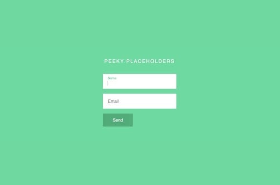
One of the most critical problems in form files is placeholders. Because the user learns from here how to fill the form, in this example, clicking on the placeholder transforms the way into the text. This animation has been prepared very successfully. There are speedy and smooth transitions.
Animation following natural physics rules helps to get more realistic results.
If you develop slower or faster animations than the eye will follow, these animations are seen as a problem, and the website is considered corrupt.
When making animations, be sure to follow the principles of physics rules.
4 - Fun Waving Animation
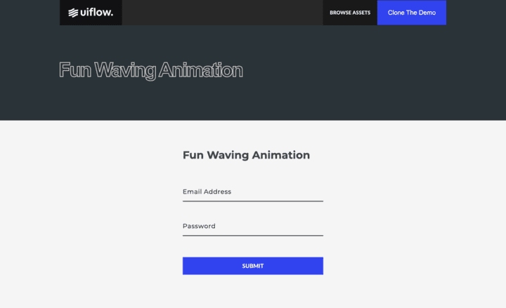
This is another animated placeholder example. It is surprising in this example that a no-code tool can create such an advanced animation.
No-code tools can now be new ways to write code. When you click on the form field, the form text takes off like a wave.
Such forms can be used on sites where child visitors can enter. Although it is too big for adults, it is a beautiful animation in a child's style when they see it.
Adults may find these kinds of animations too distracting, but children's fascinating attention will not be a problem.
5 - Google Places Autocomplete Form
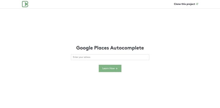
Another excellent example made with a no-code tool. One of the questions we frequently encounter in form files is location. There are two options when choosing a site.
Either the dropdown menu opens, and you select your location from there, or you write your site and automatically completed situations come from Google location. You choose the most suitable one of these locations.
This auto-complete feature is also used in Facebook and Instagram apps and sites. I don't know if they are using google's location API or using another source.
6 - Single and Multiple Files Uploader
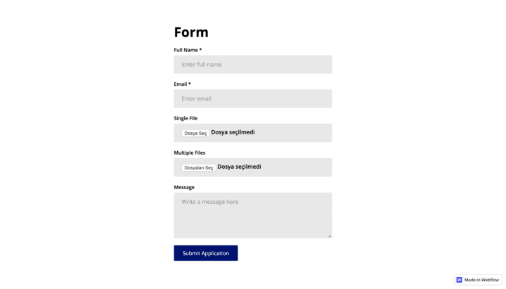
If you create a form with file upload, you can clone this project instead of doing it from scratch.
If the form project's design does not match the design of your main website, you can change the style as you wish.
This form is also designed with Webflow. A developer made it from Dublin. You can find other projects on the official site.
File upload is seen as the most challenging part of the form sections. This difficulty results from managing file sizes. If you manage your project in Webflow, Webflow does the file management job for you.
7 - Multi-Step Form Example with Input Validation
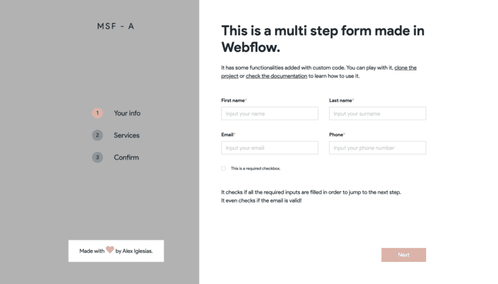
In form format, we have started to develop a lot of step-by-step styles in recent years. User experience on screens is still a very new job. Screen designs that will be the least tiring of users have not been discovered yet, but we are getting better every day.
Consider the difference between the first example of the Instagram app and its current state. It's like 100 years have passed. But only five years have passed.
Instead of list form questions, step by step form management was preferred because it is much easier to ask the problems step by step.
It may be more challenging to fill out the form when the user sees all the questions simultaneously. Step by step form will show simpler than it is.
8 - Two Column Login Page
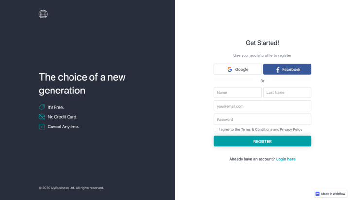
Two-column login pages are a form of entry preferred by very famous software companies. Companies like Mailchimp and Slack use this home page design.
This shows that this login page design has superior features in terms of user experience. This proposition is based on the available data.
We will see how the login page trends will be in 2022.
Users go from one site to another every day. And seeing a different home screen on each website, they enter confuses. The fact that the sites follow similar login screens makes the job easier for the user.
Of course, we provide brand awareness by feeding similar user experiences with distinctive designs and drawings.
9 - Contact Form With Gradient Button
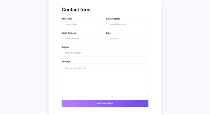
The standard form on each website is the contact form. Of course, if your site gets 100 million traffic per month, this contact form may be smaller. Maybe not at all.
But if you have a small business, these contact forms are accessible to everyone.
Although the website is suitable for acquiring new customers, every customer prefers human communication before making money. This desire has decreased gradually, though. I know most of my clients after seeing the email notification from the payment provider.
This simple and useful form is also made through Webflow.
10 - Snake Highlight Border Login Form
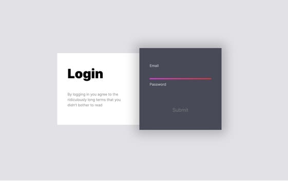
Borders have an essential role in forms. Boundaries allow you to distinguish information from each other in the form list. If you do not make borders prominently, the information may be mixed.
I explained the general role of the border in the field of web design above. Edges generally carry this task, separating countries from each other.
Borders are good.
In this example, borders are used creatively in defining boundaries. When you move from one placeholder to another, the edge comes with you.
It's very creative. Such creative approaches make the internet more beautiful.
11 - Clean Credit Card Form Example
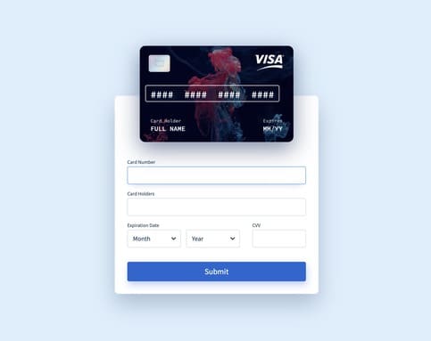
This is an excellent example of payment. Because in most payment forms, credit cards are not shown concretely. We fill in the form by entering our information on the map.
In this example, the blank card fills with your information as you fill out the form.
In this way, our brain reinforces the form filling process correctly and gains self-confidence.
They are making payment screens easy can cause doubts that there will be some problems with the payment process.
But making the payment screens more fun will cause severe increases in your sales.
It's as cheap as the assumption to try. Please try.
12 - Interactive Step By Step Sign Up Form
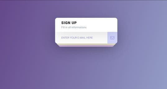
We recently started to see the forms step by step. What makes this form more beautiful than others is that it is step by step. What makes this form attractive is that animation transitions between levels are very well developed.
If all forms were as fun as this, the internet's information flow would be much faster. The most tiring subject on the internet is filling out a form.
Reading, viewing experiences have reached almost perfect form. But form screens still don't have a standard and are complicated. I think a standard should be introduced into the form language, and the forms that comply with these rules should be rewarded. It is perhaps not a good idea to set such a condition for a platform that represents freedom.
13 - Dynamic Credit Card Form Style
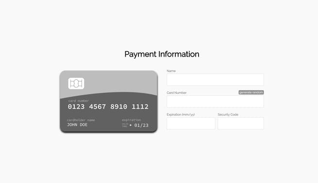
For some reason, I feel more secure when I see a credit card on the payment pages. I think the brain thinks it's a real payment when I see the credit card.
Generations that have experienced digital display and card versions like me have made physical payments with credit cards more than virtual payments.
Maybe we had a bigger relationship with a credit card than money, but our relationship with payment forms is just developing. Seeing a credit card on the form screen may, therefore, make our generation safe. I do not know how safe it makes those older than we feel.
14 - Well Styled Login Screen

We do not yet know how the screens have damaged our eyes. But we are used to seeing people who have used computers for a lifetime with thick glasses.
A good view? or the opportunities provided by the internet and computer? This is a dilemma to decide.
If you are producing something on the internet, it is excellent, but if you spend time on the screens to consume, you are probably hurting your eyes in vain.
I say all this because I think dark modes will be better for our eyes. As in this example, dark mode themes are increasing. I hope it continues to grow. Even Whatsapp has passed dark mode.
15 - Google and Facebook Sign Up

According to researches, the login success rate is higher in login screens that offer login with google and Facebook. Users do not care what data our companies will reach with such entries. All they care about is getting in faster.
This form is an excellent example of a home screen design with third-party applications.
My advice to you is to log in using apps like email for 10 minutes. If you log into each application with your account, your email box is filled with lots of unnecessary newsletters.
I suggest you use 10-minute email apps for a while to try at least.
16 - Divided Screen Login Page

I like the home screens where the screen is divided into two. I wanted the split-screen designs if there was a competition between the home screens and nobody else, but I voted.
I find it easier to use this design. Because, as you know, no matter how great you write, our brain doesn't read the screens. Scans on the screens.
Split screens also make things significantly easier when scanning. The feature that makes this screen even more beautiful is that very transparent colors are used.
Maybe these colors will become old after five years, but it is among the colors that I would prefer to use in today's world.
17 - 3 Step Lead Form Example
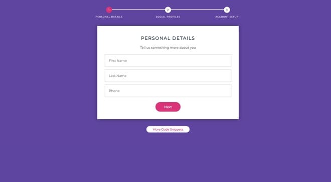
Step by step forms achieves much more successful filling rates; however, if you design a line about which question to ask in which action, the form success rate increases even more.
Users leave your page in two cases. The first case is boring. The second case is uncertainty.
The disadvantage of step-by-step forms is the uncertainty of which problem will arise in the next step. Another possibility is how long the arrangement will last.
It is at least determined how long the form will continue in each step, and the fill rate will be more successful.
18 - Night Shift Multi-Select Form Example
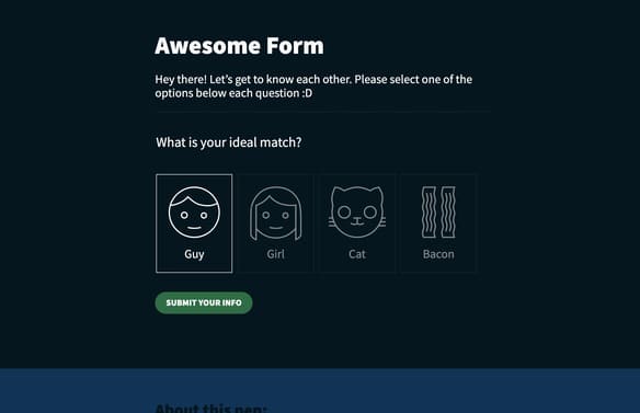
Step by step forms achieves much more successful filling rates; however, if you design a line about which question to ask in which action, the form success rate increases even more.
Users leave your page in two cases. The first case is boring. The second case is uncertainty.
The disadvantage of step-by-step forms is the uncertainty of which problem will arise in the next step. Another difficulty is how long the form will last.
At least, it is determined how long the form will continue in each step, and the fill rate will be more successful.
19 - Cross Slider Step by Step Form
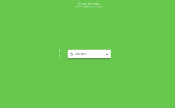
An example of a beautiful form made using the vertical slide feature. Seeing these forms, I am sometimes amazed at how the internet has developed so much in the last ten years.
Form companies started to follow these current changes.
Another eye-catching feature in this form is using a charming animation when moving from one question to another. To make these kinds of animations, you have to be a Javascript ninja.
Javascript is very deep and takes time to master. Choosing and focusing on a field may be a more logical roadmap than learning the entire code language. You will be amazed by how you have evolved over the years. Good luck.
20 - Step by Step 3D form animation
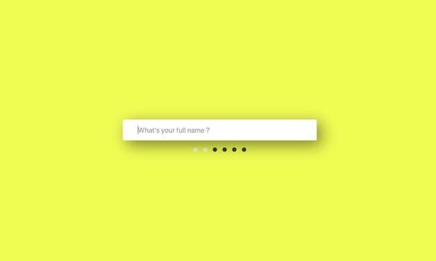
With the horizontal slider form, you can follow that you are at the stage of the structure. Thus, knowing that you are closer to each end in front of you will prevent you from leaving the form. I criticize Typeform in this regard. The questions come up step by step, but there is no clue as to when the form will end. The form can take 3 hours or 10 minutes.
Maybe they changed this situation. There is now a better form of process charts. There was considerable uncertainty about when the form would end when I used it.
Jotform forms are more successful in that regard, but it makes a lot of mistakes in Jotform. Anyway, both companies will be better over time than they are today
21 - Timeline Style Form Experience
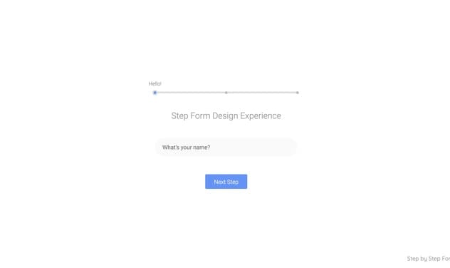
You can clone from Codepen. To do this, click on the clone button below. Although I have made this cute button as evident as possible, I sometimes get comments on how I can get to the project.
No matter how much you improve the user experience, using screens will remain difficult for some.
Using a typewriter is also tricky for us. Or we can't use a sword. Every tool is easy for people who live at that time. For this reason, you should not blame anyone for this. You have to be respectful. Thank you for listening to this little life lesson.
22 - This Form Reminded me of Google Forms
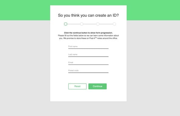
Although its colors and design are entirely different, this form reminds me of the google forms tool. Either I want to remember Google in everything I see, or the border structure and form order bear some similarities.
Although it doesn't have a great design, it's still an easy-to-use form. Many sites have worse form pages than this form. The internet would be a better place if all the forms were at least as in this example.
Anyway, let's make the internet a better place instead of complaining. After all, I wrote this article to make the web a better place instead of complaining.
23 - Twitter Login Screen Clone
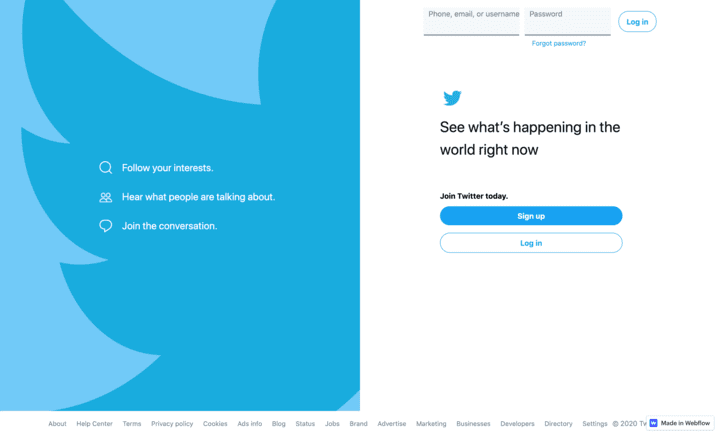
One of the first technology companies to use the split-screen login method is twitter. Twitter is a great company that has pioneered many issues. Although it grew and used by billions of people, it never ceased to be democratic.
They were also more ambitious than his competitors in the use of user data.
Twitter still has some security issues. Sometimes we see ads of fraudsters. Facebook is much more successful than Twitter in blocking these ads. But Twitter will always be my favorite social media
24 - Fed up With Drawings, Coming Soon Screen
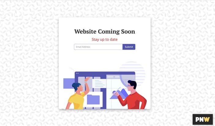
The best way to make a page better quality these days is to put 3D drawings. But this is not a very cheap way. It's an incredibly expensive way. This way will get less expensive over time like everything else, but today there is another cheap and fast way to show your page quality.
Of course, you are using drawings on your page. You can find the free illustration by googling it. Artist is willing to give away some of their craft.
25 - Login Page Form With Good Photo
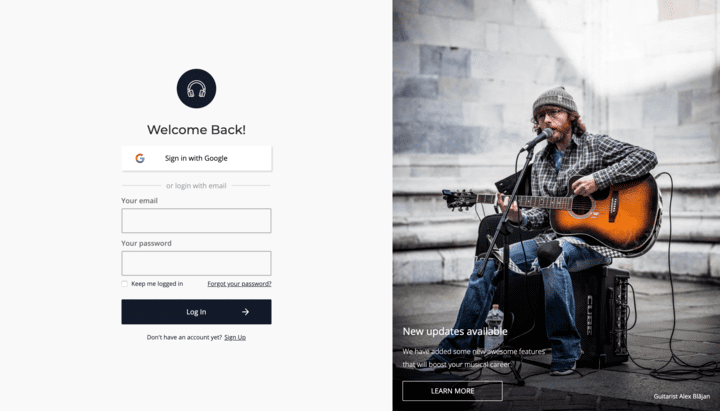
It has been understood in this decade that the login screens divided into two are the most suitable design for successful user registration. Most companies now use a split-screen design in their login forms. Although it has the same scale, companies often add drawings and three-dimensional objects to differentiate in design.
In the example above, the designer decorated his split-screen with a photo. If a simple picture is enough to express the value the company offers, there is no need to push your marketing budget with expensive drawings.
26 - Good Colored Sing In From Example
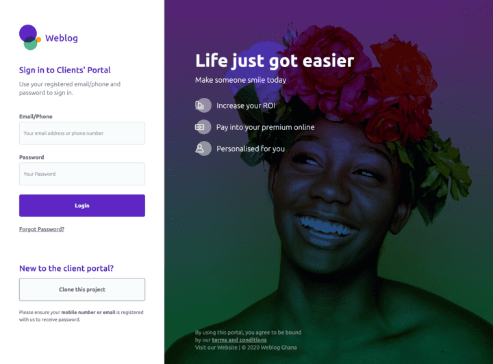
Two main features distinguish a good CSS form from the bad ones. The first is the separation of the form elements. The second is to put a screen indicating that filling out the form has been successful or failed.
This screen is not necessary for the form to work, but is required for the user to know that the form is working. In internet designs, most things are developed so that the user does not neglect the natural environment. Just like an electric car making a motor noise, some actions and warnings have been added because we need to be adhering to human nature.
The most significant proof of a successful result in a login form is that it is directed to the home page instead of the profile setting page after the user logs on.
27 - Facebook Landing Screen Page Clone
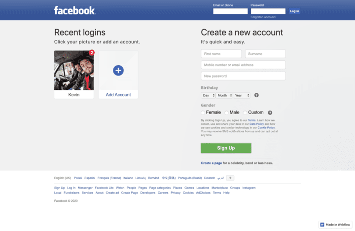
The Facebook login form is not the most successful one. But it would not be wrong to say that it is the most popular CSS form in the world. Because at least 2 out of 6 people in the world have seen this form. The world population I mean by people.
Facebook radically changes the design. But for years, they used the design you see above. 2 .4 billion users completed the form registration. This is a high figure and the most significant proof that the Facebook form works successfully.
Although people are very enthusiastic about registering on Facebook, they do everything to get inside, even if they fail on the registration form screen.
28 - Out of Box Blockchain Transfer Page

In the early 2000s, we became a member of social channels. We started to become a member of bank applications in the 2010s. Later and in the following years, e-commerce sites and online food ordering sites also followed this registration ritual.
Although no one can predict, blockchain registration screens are now made with a form and become frequent. There is a good example above. You'd better start adapting because everyone seems to be using blockchain soon.
29 - Google Search Form Clone
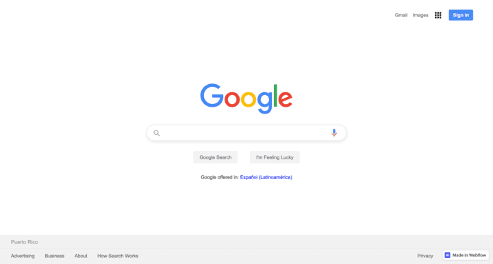
A simple search form has changed the whole world. It freed the information and made it accessible to everyone. This search form belongs to 'google.' The company that completely changed the search industry. I learn everything I need from Google. And google shares advertising revenues with anyone who generously shares information.
Anyway. A search form element and two buttons. I mostly press enter, but I'm sure that Google's number of users will drop if that button is removed.
30 - Slider Range Calculator Form
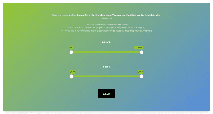
Some forms require straightforward information from you. Others need more complex information to save time. For example, a bank must prepare a more developed way to calculate a credit rating. Or a software company that will give you an offer based on the number of employees can calculate the per-employee fee as in the slider above and present it to you.
These forms are easy to make, easy to use, and incredible. If you want to know the result of a complex transaction, do it in away. Because such calculations can become more complicated in phone conversations.
The gradient usage and button design above is excellent. I think this is possible if you want to clone.
31 - Minimalist Login Screen
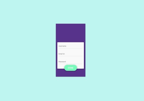
I think minimalism should be a must, not a choice in the world of design. But still, I am not as strict as I seem in this thought. I have witnessed that the design details that not only facilitate the users have made the product older over the years but also experienced that it has made it difficult to use.
If you wear things regularly, your construction costs will always repeat. This reduces your profitability. Not to mention that developing a product that is difficult to use will lead your company to bankruptcy.
32 - Multi-Step Form Clone
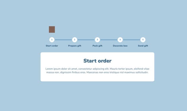
We have started to see the successful results of step by step CSS forms in recent years. Dividing the information into pieces and asking one by one prevents the user from getting bored and closing the page. But there will be users who will get bored and close the page.
The forms that get bored and close the page are always happening. If you want, say I give 1 million dollars to fill out this form. Still, someone will be bored and closed. When I entered the web design business, I understood better how distracted the human was.
33 - Multi-step Form With Great Icons
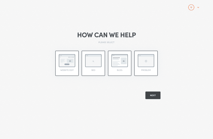
Multi-step CSS forms are my favorites. Of course, on one condition. The steps must have an end. Some multi-step ways never come to an end. My suggestion is, don't ask more than seven questions.
If you ask, show the user a statement about how close the user is to the end of the form at each step of the structure. Because if the user does not know where he or she is, he cannot know where he is going.
34 - Tab Format Sign-Up Screen Clone
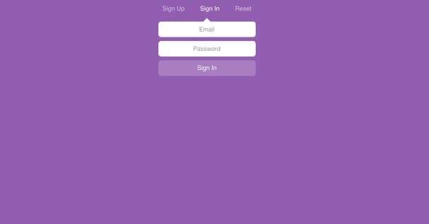
A well-working but straightforward form structure. Tabs CSS forms are often used on login screens. But this form of design is not used as the login screen of essential things. It may be used as the login screen of a forum page. You can learn the steps of this kind of development in the CSS form example above
35 - Hover Field Form Clone

Dark themes are prevalent. I love dark ideas. All apps on my phone are shady. I appreciate seeing a dark form. I applaud. If you have the opportunity, develop dark versions. Even choose dark as the main version and give the white theme optional.
Adding a dark option to a white theme seems necessary, but adding white to a dark theme sounded too stupid. It is. This makes the white arguments silly.
36 - Another Tab-Format Login Screen Page
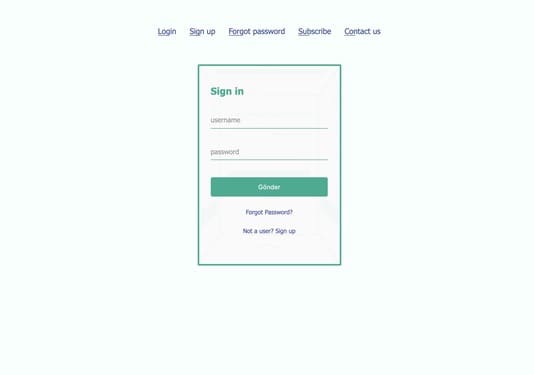
This is another tab form. But it has a more advanced design than the other. After learning the structure with the tab form above, you can improve your web design skills by examining this form's CSS.
Improving web design capabilities is the main factor for you to demand higher hourly wages.
37 - Half Screen Sign In Form Example

Split-screen and gradient are two things that appeal to me. Even when you examine the code of this split form, you can learn dozens of new CSS things.
The more successful the login screens, the higher the user registration rate. If you are a company that brings new users with ads, please pay attention to the login screen forms. Please.
38 - Nice Placeholders CSS Form Example
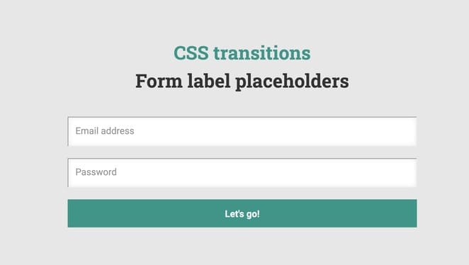
An example of a simple shade-sized form. It is understandable but not simple. This form was most likely made by a person devoted to design. Because he did not allow any unnecessary details to occupy space, it is more challenging to remove extraneous information than add them.
The fewer words you express your opinion, the more successful you are.
Understanding is a measure of success. This is only possible and smart. This rule of speech-language also applies to the design language.
39 - Nice Password Label CSS Form Clone
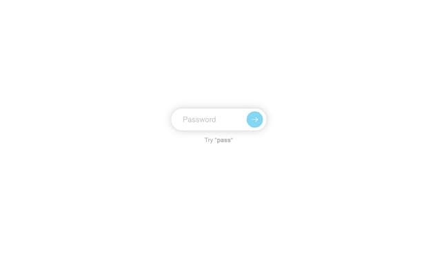
Unexpected and well-applied animations make me feel as if I were in a Pixar movie. We see these animations in their most functional form, especially in areas that contain forms.
Animation with CSS is a bit difficult. Thanks to the no-code tools, this process has become a little easier, but still requires cognitive effort.
40 - Multi-Step Fundraising Form Example
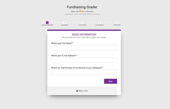
If you want to make a successful form, imitate the form structures of giants like google. But be unique in design. Because those companies work with the best designers, knowing what no one knows about the user experience. Because they have a lot of user data.
This form reminds me of Google's form service at first glance, but it's not.
This is another form. But like Google. But it is not. Anyways.
The important thing is to get the user information politely. I think you can achieve this with the example above..
41 - Paper Style Sign Screen Page
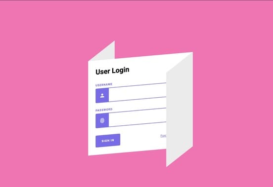
When the three-dimensional world objects are transferred to the design as it is, such sweet results come out. Forms are annoying things that consist of paper before the Internet.
The Internet has dramatically reduced the rate of using paper informs and also worked to make them more fun.
When I look at the CSS form example above, I remembered that the forms were initially made of paper. This allowed me to have an idea of how smart the designer is.
42 - Dark Admin Dashboard Example
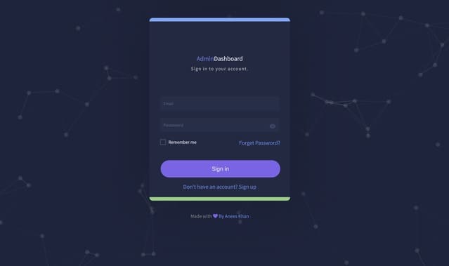
Purple is one of the colors that best suit dark CSS forms. These dark themes are called opaque but are usually made from dark navy shades because black is an eye-tiring color.
If he gets tired, the user spends less time on the screen. If he spends less time, he gets less advertising revenue. The only way to get more ad revenue is to develop themes to allow the user to spend more time.
This is the purpose of the design.
43 - Basic Simple Form Example

A straightforward form. There is no flair. Almost minimal CSS was used. So few CSS was used that they didn't even try to export the CSS file separately.
Such simple forms are not suitable for every product. Just think about buying a Tesla car, the company expects you to fill in this form. This would be a little sad.
Instead of Tesla, you would buy a Toyota that offers better forms. But it is still an excellent form to learn the principles of style.
44 - Simple To-do list

Forms are used in every field. We even use types when adding a new task to this to-do list. A way has more than one user because the internet consists of inputs and outputs—unlimited and frictionless delivery of information.
Icon selections and fonts are beneficial for the above design. My score is 7 out of ten.
45 - Finder Touch ID Screen Page
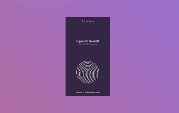
Yes, we will soon ask users for other than words. In my opinion, asking for face id or fingerprint is also a form. Information is requested from the user, and the user needs to take action to meet that information. This action needs to be conveyed by designers straightforwardly and understandably.
This forms the basis of form logic.
46 - Upload an Image From Clone
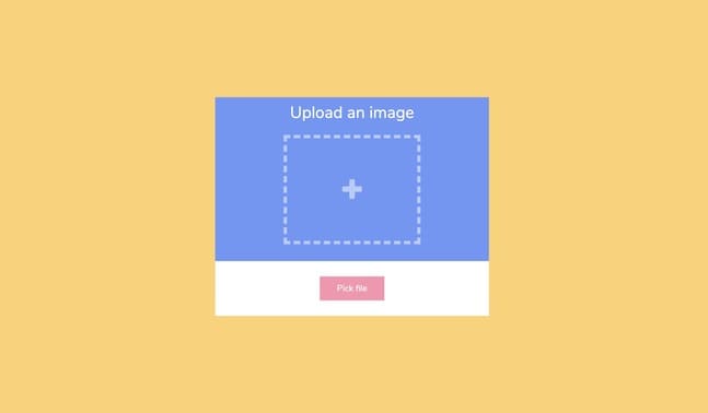
One of the things that makes a form the most complex is the image upload feature. It is easy, but the place where the photos are kept is not as small as text files. The question of where and how to store the pictures is usually answered by spending money.
There is a straightforward and useful image upload form above. I love the iloveimage.com site in this respect.
47 - Simple Login & Registration Form Example
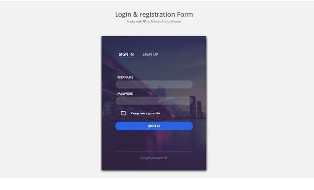
A login screen in the form of an info card, but tab features are also used. The picture is used in the background of the entrance section. The trend of 2020 is plain backgrounds, but there is no law to stop those who use different contexts.
So we have to respect all kinds of background usage.
48 - Google Form Clone

It always seems strange to me that the Google form service is entirely free. Because the form industry is growing day by day. Companies like Jotform and Typeform make millions of dollars every year. How do these people earn so much money when Google is in free form?
You don't need to know how to write a code to use the Google form service. If you know how to use a computer and are connected to the Internet, you can easily use it.
49 - Add a Payment Method Form Example
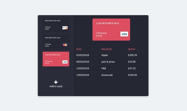
Payment screens consist of forms. But these forms do not accept the error. If you design a terrible payment form, you will lose customers ready to buy your product.
There is an example of an excellent payment form above. Hopefully, airlines will make payment screens smoother.
50 - Simple Form Card
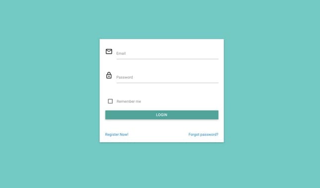
Sometimes the font used on the website is so beautiful that it helps you to ignore other errors. This above form is not the best form designed, but the font it uses is very plain and legible. This makes this form more acceptable.
51 - Custom Radio Option Form
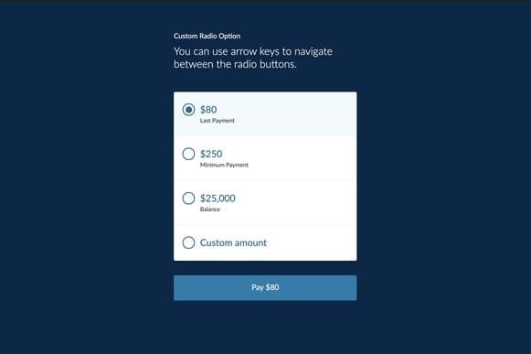
We have come across other forms of payment earlier in this blog post. This example is no different from them, but in this example, the user can make an elegant option among the payment options.
If you are offering options to the user, you have to do it very elegantly, because choosing is already a difficult task in itself. What makes it even more difficult is choosing a lousy design.
52 - Blink Password Protection
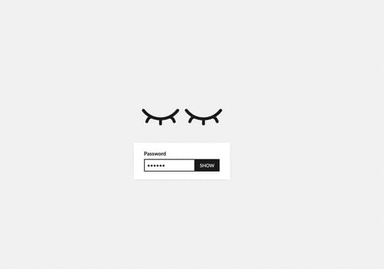
Seeing the password we wrote makes us more comfortable. Because when we do not know what we wrote, we are more likely to think that we made mistakes. You may want to see your password as you type, especially if you have added characters such as uppercase, lowercase, or symbols to your password.
In the example above, the "show password" feature is used very creatively.
53 - Simple and Bold Payment Screen
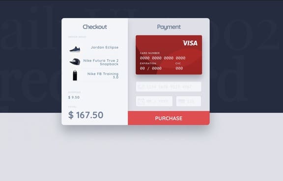
As you enter your card information, the information on the card in the image changes instantly. This is a feature that makes me happy when I see it. It is not very difficult, but for some reason, companies are not using this feature frequently. I think the developers do not take the time they deserve for this feature, requiring constant monitoring.
54 - Stripe Payment Page Clone
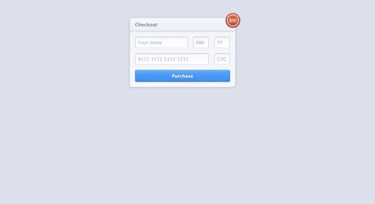
Stripe not only facilitates the work of many entrepreneurs but also sets a standard for payment forums. Many small businesses use the line. Even large startups prefer to use Stripe instead of installing payment systems from scratch.
55 - Single Input 3D Form
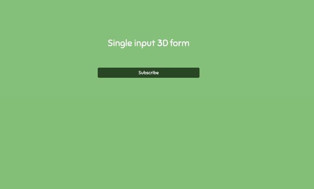
Subscribe buttons are tremendously necessary to keep incoming visitors because you need at least an email address to stay in touch with the incoming user. This three-dimensional subscribe form is one of the creative solutions applied to keep the visitor coming.
56 - Rate The Product Page
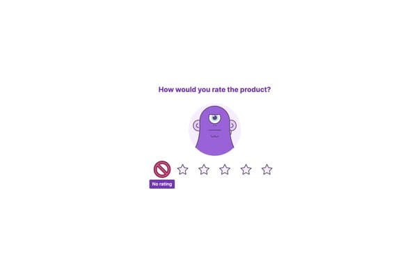
Evaluating a product is also an action we can achieve with forms. Forms are one of the essential elements of the internet. It is the cornerstone of bi-directional information architecture.
57 - Cool Sing In Example
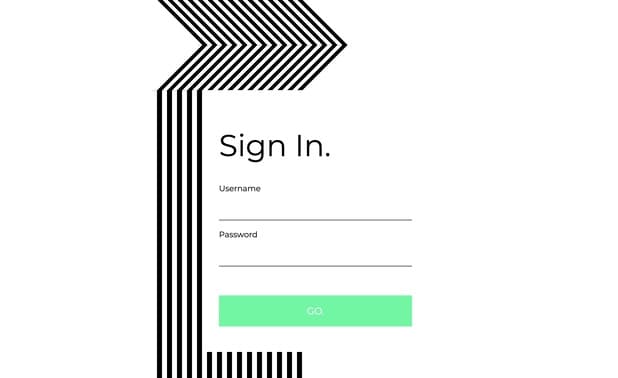
58 - Green Welcome Back Screen
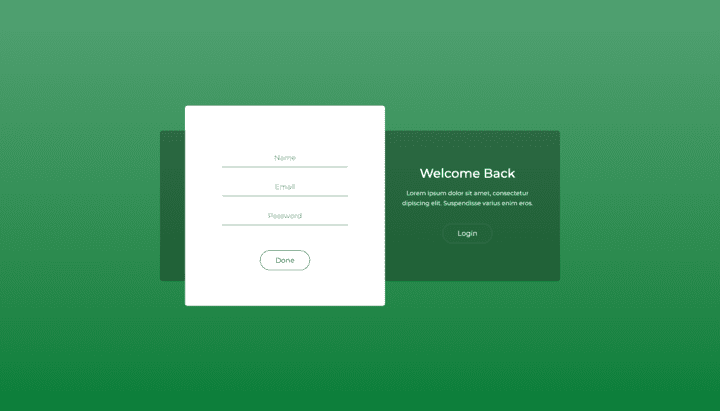
Sep 9, 2022
Best CSS Form Builders
These easiest CSS form builders allow you to build forms and surveys, collect responses, and visualize results. Build beautiful forms that work well on desktop, mobile, tablet and more.
CSS has a function called “display: inline-block;” that allows you to place your form labels and inputs in a single row. This is great for cases where you want to style the form so that it is vertically centered on the page without having to use floating elements or large amounts of CSS code.
Farry
Do you need a form on your website but don't know how to make one? Faary makes it easy by enabling you to create responsive forms without any coding required. The best part is, you get a fully functional template that's ready to be used right away, no customizations necessary.
Bootstrap Form Builder
Do you want to create responsive forms quickly and easily? Then this product is exactly what you're looking for! Try
Built with Bootstrap and Vuejs, this form builder has everything you need to create awesome online forms. Also, it comes with Prismjs support, so you have the option to highlight code snippets and use them in your form (which helps users understand what they're supposed to do much easier).
With its built-in form builder, you can create forms in just a few clicks. If you need something more advanced, then you can use the designer to insert fields manually.
Forms.io
Forms.io helps you build the most visually appealing and feature rich forms that seamlessly integrate with various apps, automatically notify you via email when someone submits a form, and collect file uploads.
JQuery Form Builder
JQuery Form Builder allows you to create an unlimited number of forms without writing any code. It is the ideal tool for creating forms for your eCommerce site, booking system, newsletter signup form or any other type of online form that you need.
.jpg)
Cover image: Alex Green