Light beige-brown palettes offer a softer, more contemporary look, whilst dark espresso and walnut tones leave a more serious, dignified and distinguished impression.
What’s more, a good PowerPoint template isn’t just about the opening slide.
Users generally want to see how the same design language works across different slides.
It is far more inspiring to see how different pages—such as the cover, agenda, data chart, process page, team introduction or closing slide—progress within the same visual system.
That is why each example below features four different slide ideas based on the same template style, rather than just a single design.
Those wishing to draft the text portion of their presentation may also make use of resources such as a help write my paper during the research or initial content planning stage.
However, when it comes to the visual aspect, layout, flow, typography and the style of the template remain key factors.
The brown PowerPoint template ideas presented here offer inspiration for those looking to give their presentations a more impactful edge.
Walnut Business Deck
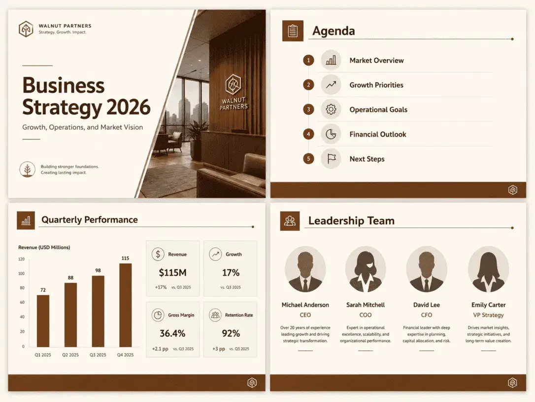
Designed in shades of walnut, this presentation template strikes a balance between professionalism and a lack of monotony in corporate content.
The cover page features a prominent title area, whilst the content slides make effective use of white space.
Its ability to appear professional without looking overly formal is this template’s greatest strength.
This type of design is particularly well-suited to strategy presentations, company profiles and client proposals.
When you consider the four different slides together, it becomes clear that the template is not just ‘attractive’ but also well-structured.
In other words, it offers the user not just a cover page, but a complete presentation experience.
Mocha Minimal Presentation
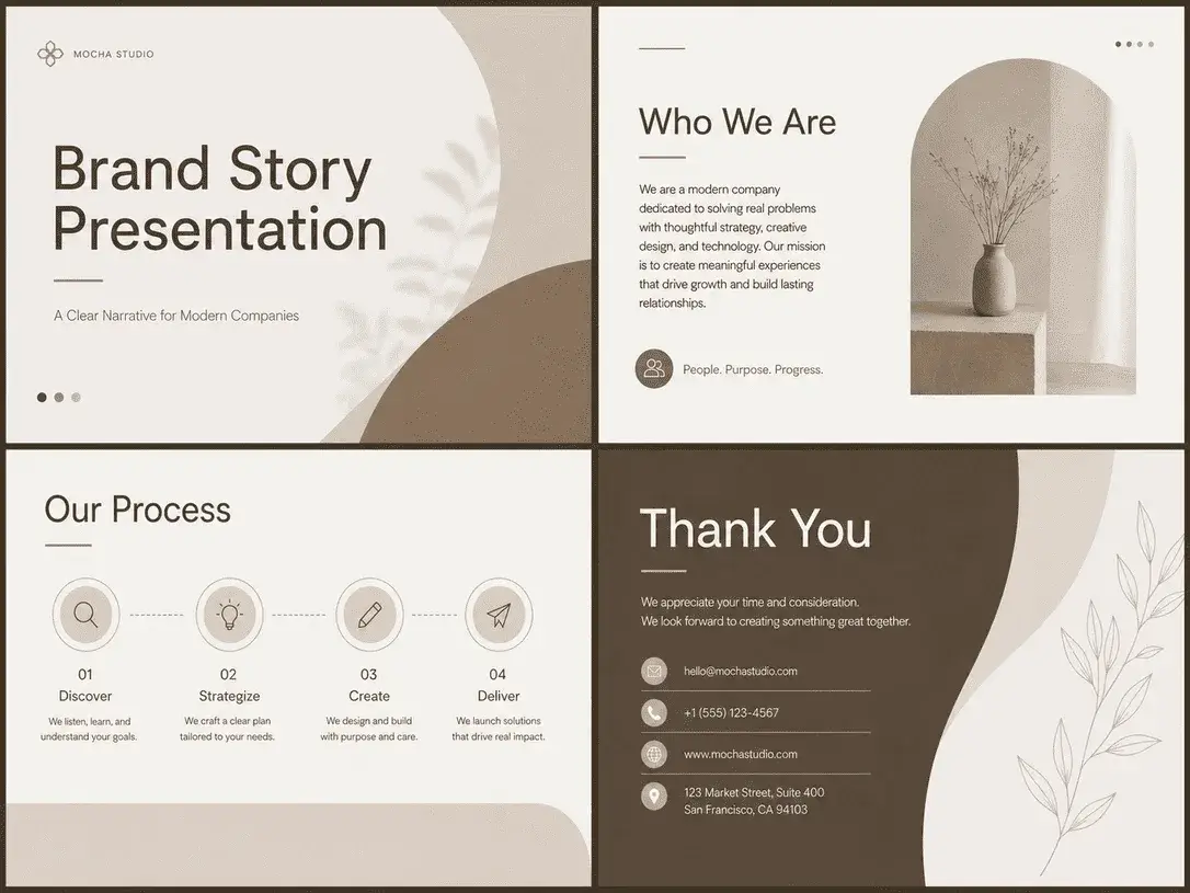
This example, which makes use of mocha tones, has a calmer, more modern and more editorial feel.
The strength of the design lies not in grand decorative flourishes, but in the use of white space, alignment and colour balance.
This makes it a more contemporary presentation template.
Presentations of this style can be particularly persuasive for brands with strong narrative content.
This is because the viewer’s attention is directed not towards unnecessary embellishments, but towards the flow of the narrative.
Seeing different pages across four panels also demonstrates that the template remains minimal yet avoids monotony.
Espresso Pitch Deck
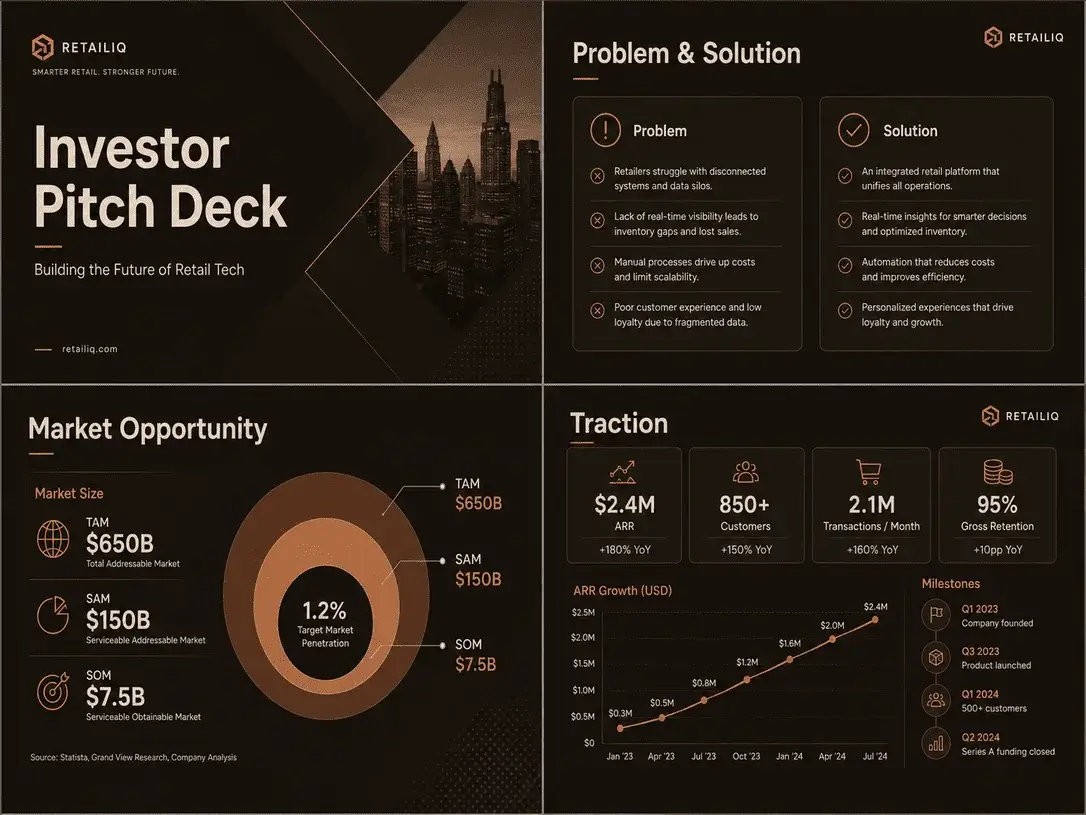
This template has a bolder, more assertive character.
Dark backgrounds in shades of espresso can create a powerful look for investor presentations or start-up pitch decks.
Light-coloured text and clear data blocks enhance the contrast, making the presentation more impactful.
What matters here is not just colour; it’s rhythm.
When a cover is followed by a problem-solution section, then a graph or traction page, the design must remain consistent.
This example captures that sense of cohesion perfectly.
Beige-Brown Creative Portfolio
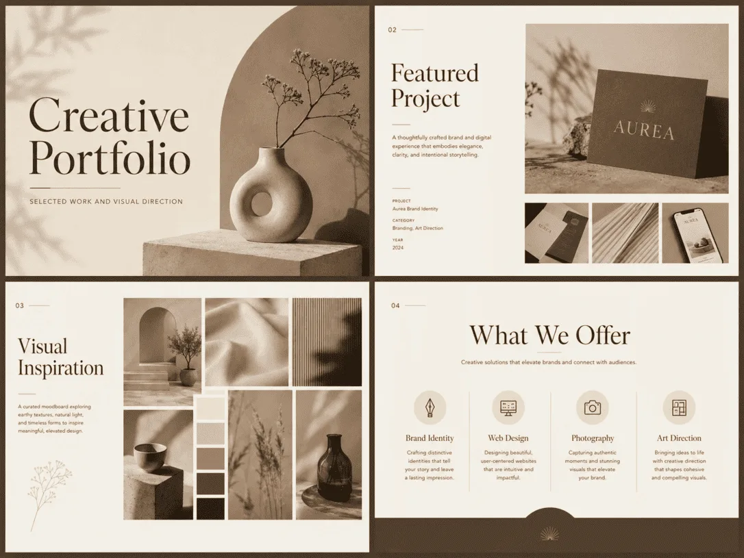
Not every brown presentation has to look corporate.
This example adopts a more creative, portfolio-focused approach with a softer visual language. Thanks to the light beige and latte tones, the slides retain an airy feel; the large visual areas, meanwhile, provide a practical structure for designers, photographers and studios.
The key with this type of template is striking a balance between aesthetics and functionality.
In other words, the pages should look attractive but shouldn’t merely serve as a mood board. When viewed alongside the four different slides, it becomes clear that the template is genuinely usable for showcasing projects.
Terracotta Workshop Template
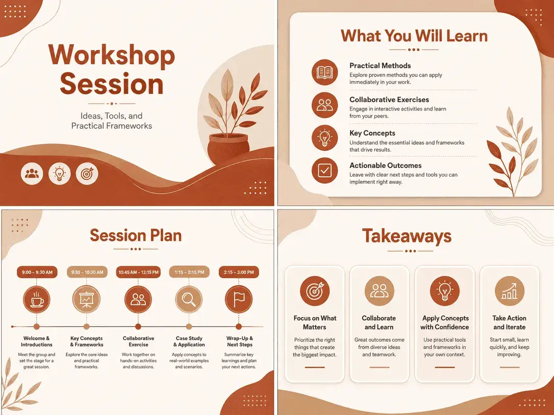
The brown tones reminiscent of terracotta create a warmer, more sociable and inviting feel.
This colour palette works particularly well for training sessions, workshops, webinars or community presentations.
Its greatest advantage is that it looks professional without feeling overly formal.
The beauty of this example is that it retains its energy even on information-heavy pages.
When viewed as a set of four slides, the template feels not only educational but also motivational.
Chocolate Data Presentation
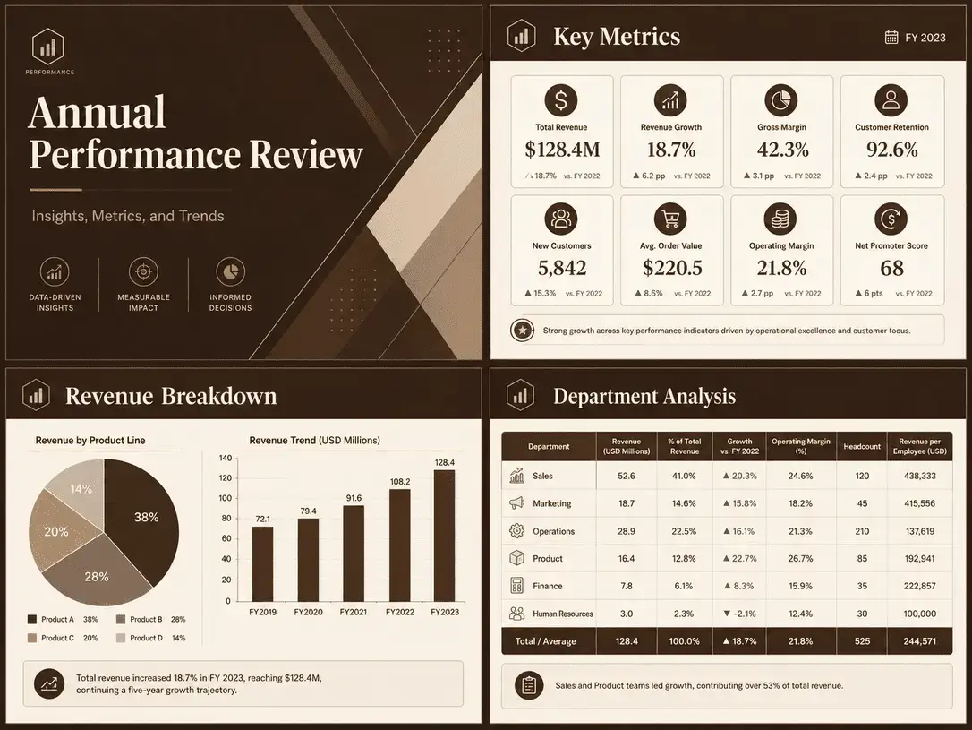
Some PowerPoint templates are particularly well-suited to data visualisation. This chocolate brown template is one of them.
The dark yet not overpowering coffee tones provide a solid backdrop for charts and tables. It looks particularly striking in layouts that evoke a dashboard feel.
It’s not just about aesthetics; there’s also a strong approach to information architecture.
Although data is presented in different ways on each slide, the design language remains consistent.
This creates a sense of cohesion that inspires the user whilst also making them think, “I can actually use this.”
Caramel Marketing Slides
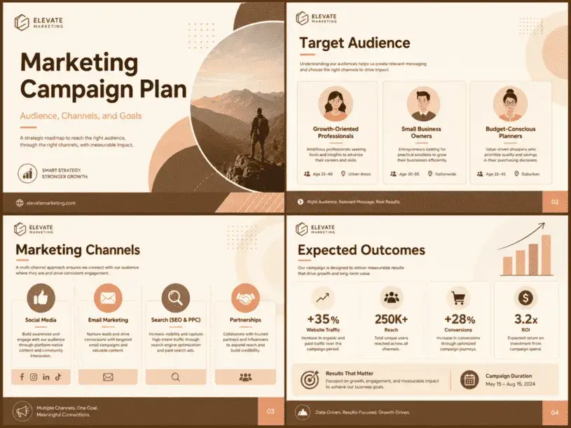
Caramel tones lend the presentation a warmer and more dynamic look. This template can serve as a great source of inspiration, particularly for marketing teams, content agencies and brand strategists. The brown here isn’t dated or heavy; rather, it transforms into a soft yet energetic backdrop.
The narrative style complements this perfectly. Different pages—such as the campaign summary, target audience, channel plan and results slides—are brought together under a single system. In other words, the template offers a structure that is not only aesthetically pleasing but also practical for building a presentation narrative.
Rustic Brand Story Deck
Rustic brown tones look striking in presentations that are more textured, more natural and more story-driven.
This type of aesthetic can be particularly meaningful for handmade brands, coffee brands, boutique businesses or sustainability-focused projects.
Here, the design creates a bit more of an atmosphere.
Yet it does more than simply produce a ‘pretty look’; it establishes a strong connection between the brand story, values, product categories and the landing page.
This is precisely why it is so inspiring.
Taupe Academic Presentation
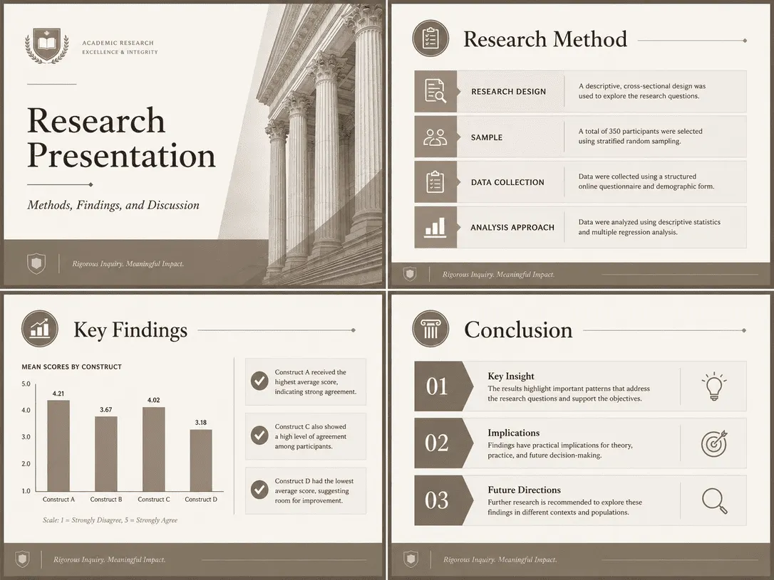
Shades ranging from taupe to grey-brown work particularly well in more academic and structured presentations.
This template offers a useful framework, particularly for university presentations, research reports, conference abstracts or educational content.
The structured heading system and restrained use of colour help to highlight the information.
Each slide serves a different purpose: to introduce, explain, illustrate and conclude. Nevertheless, the design’s cohesion is maintained. It is precisely here that the true success of such templates lies.
Cocoa Elegant Proposal
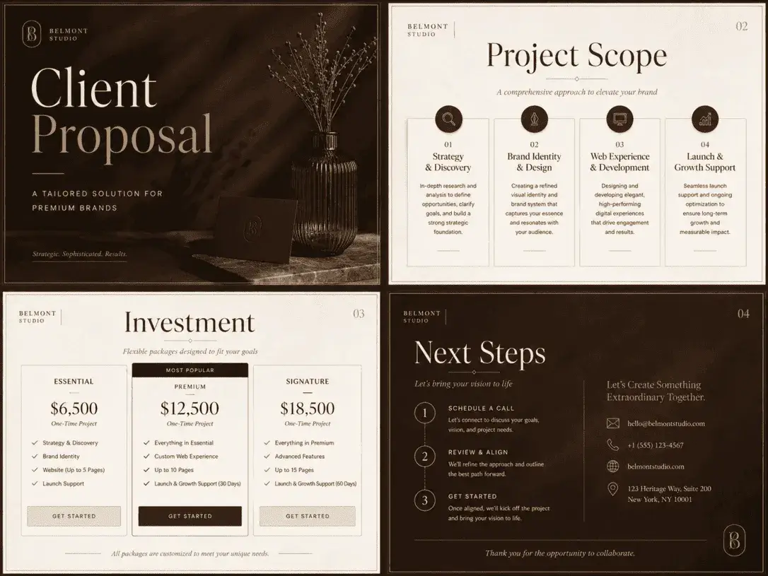
This template is a fine example for those seeking a slightly more luxurious, slightly more refined presentation style.
The combination of cocoa tones with gold-beige details creates a striking look, particularly for proposal documents, premium service presentations and high-end brand narratives.
-1.webp)
When different page types are brought together, it becomes clear that the template offers a truly ‘premium’ system.
The same elegance is maintained not only on the cover but also throughout the content and closing pages. This provides the user with a more cohesive and inspiring experience.