But there’s a question behind every palette we share: how do our eyes tell those colors apart?
We can give a shade a name and a HEX code, but that only tells part of the story.
To understand color more fully, we need to look at what happens between light reaching our eyes and the colors we actually see.
How light becomes a visual signal
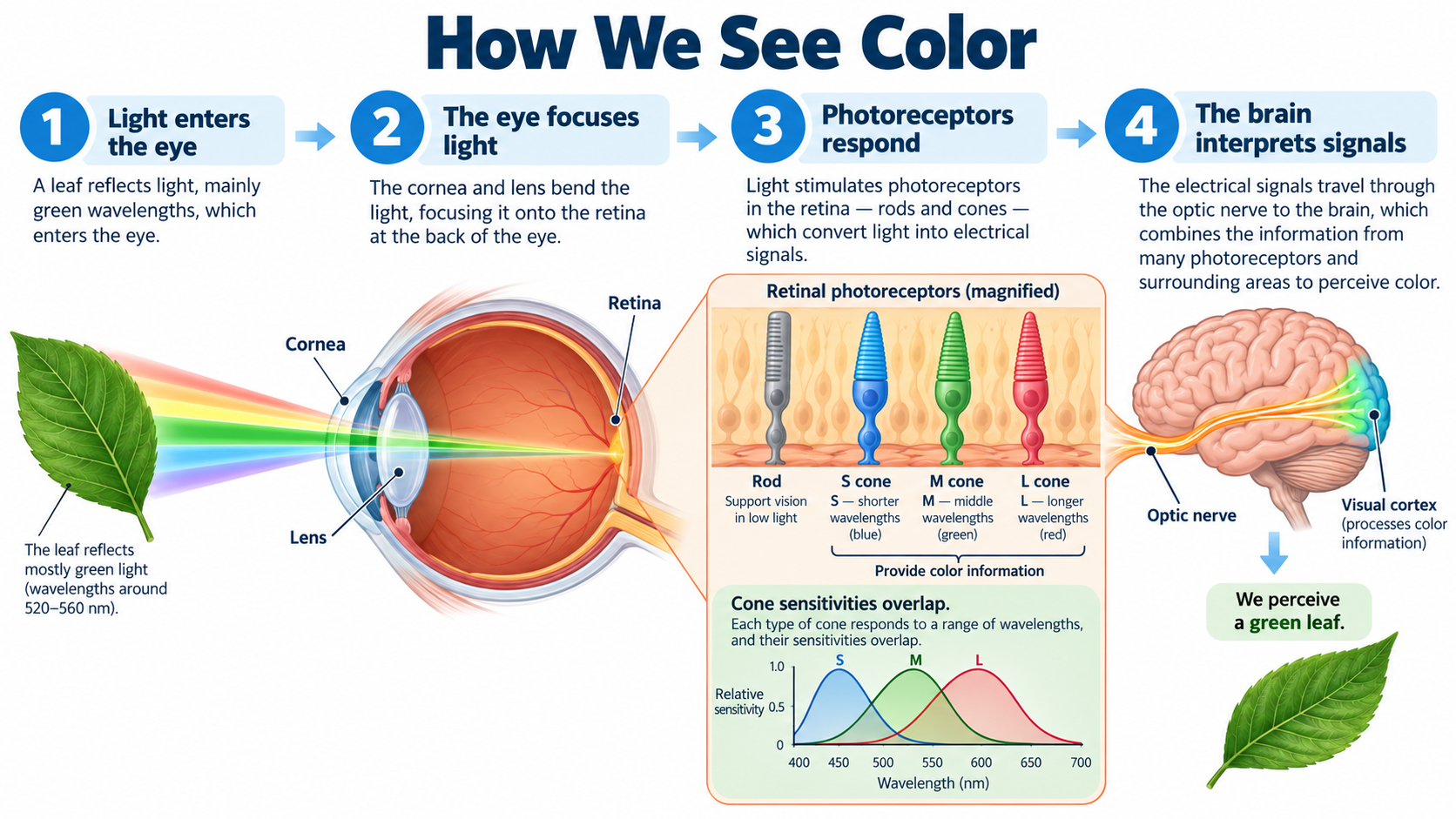
Before you recognize a blue button or a yellow flower, light has to reach your retina.
The cornea and lens focus incoming light onto this tissue at the back of the eye. Photoreceptors then convert light into electrical signals that travel toward the brain through the optic nerve.
The National Eye Institute’s explanation of how eyes work describes this route.
Two kinds of photoreceptors have different jobs. Rods support vision in low light, while cones provide color information.
Typical human color vision involves three cone types with different sensitivities to light. The NEI’s overview of cone circuitry explains how these cells feed signals into the visual system.
Calling cones red, green, and blue receptors is convenient shorthand, but the experience of color depends on how their signals are processed together.
A digital swatch and the color someone perceives are related, yet they describe different parts of the process.
Why neighboring colors change the result
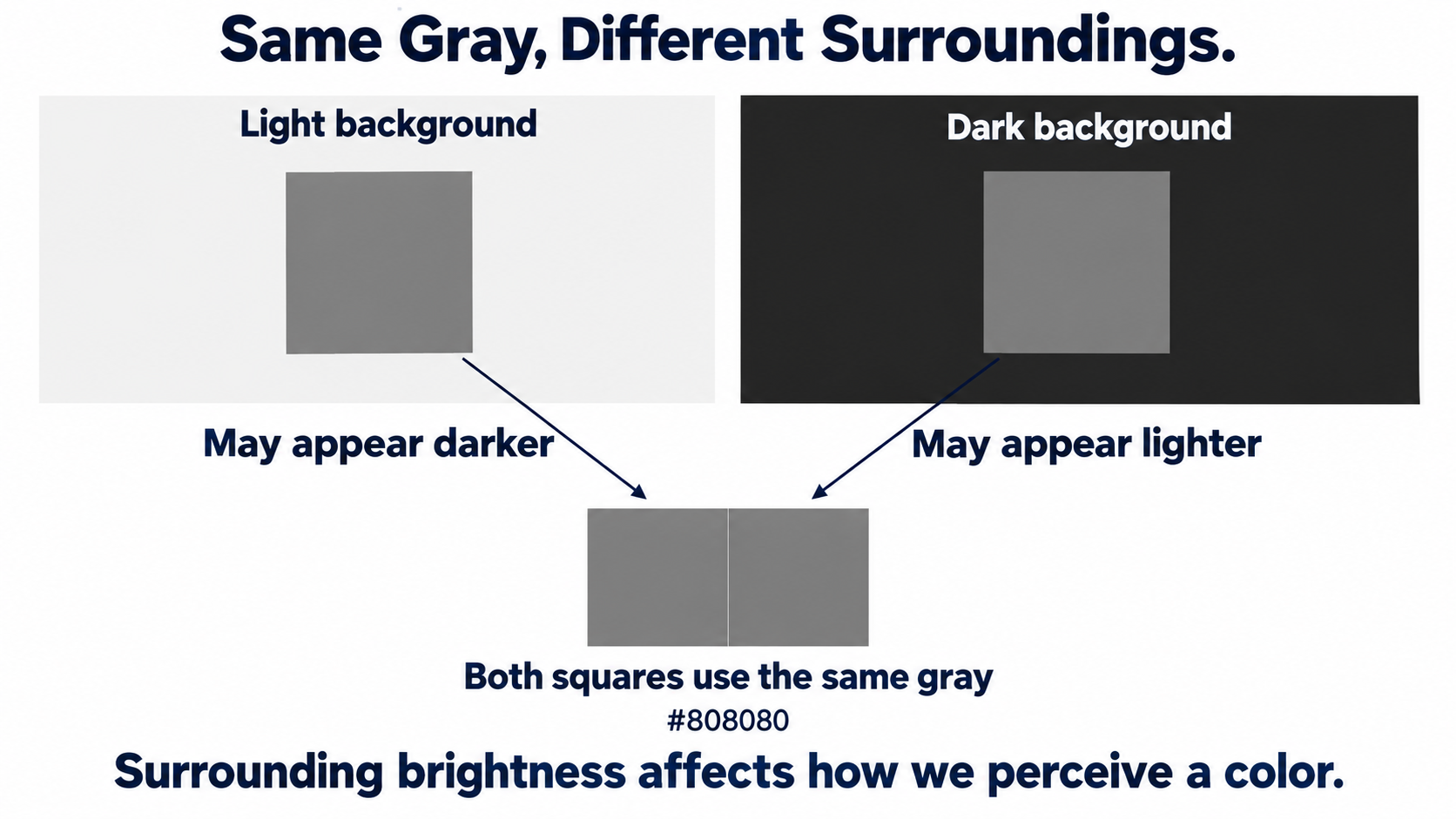
Your visual system pays attention to differences across an image.
A pale border may be obvious against a dark panel and difficult to notice against a light one. Looking at the border alone won't tell you whether it will separate two sections clearly.
The Exploratorium’s Gray Step demonstration makes this sensitivity to boundaries visible.
Covering the boundary between two matching gray gradients changes how their shading appears. The underlying image stays the same; the available visual context changes.
Try a related design exercise with a small gray label. Place copies on white and charcoal gray backgrounds, keeping the label’s color and size identical.
Compare how easily you can read each version. Then repeat with a thin border. This is a suggested comparison, not a measured accessibility test, but it gives you a reason to evaluate colors inside a layout.
Clear vision and color discrimination
Seeing a sharp edge and distinguishing its color are different aspects of vision. Someone can read a label clearly yet struggle to separate particular hues.
The NEI’s guide to color vision deficiency explains that difficulty telling certain colors apart is much more common than seeing no color at all.
That distinction also helps when researching vision correction. A reader looking for EVO ICL in Dallas can review Tylock Nasser’s information about the procedure and discuss suitability with an eye care professional.
Questions about focusing vision and questions about color discrimination deserve separate answers; a vision correction page shouldn't be read as a promise to change how someone perceives a palette.
For designers, the practical lesson is to avoid treating your own view as universal. If two categories differ only in hue, some readers may struggle to tell them apart even when the labels look crisp.
Turn a palette into readable information
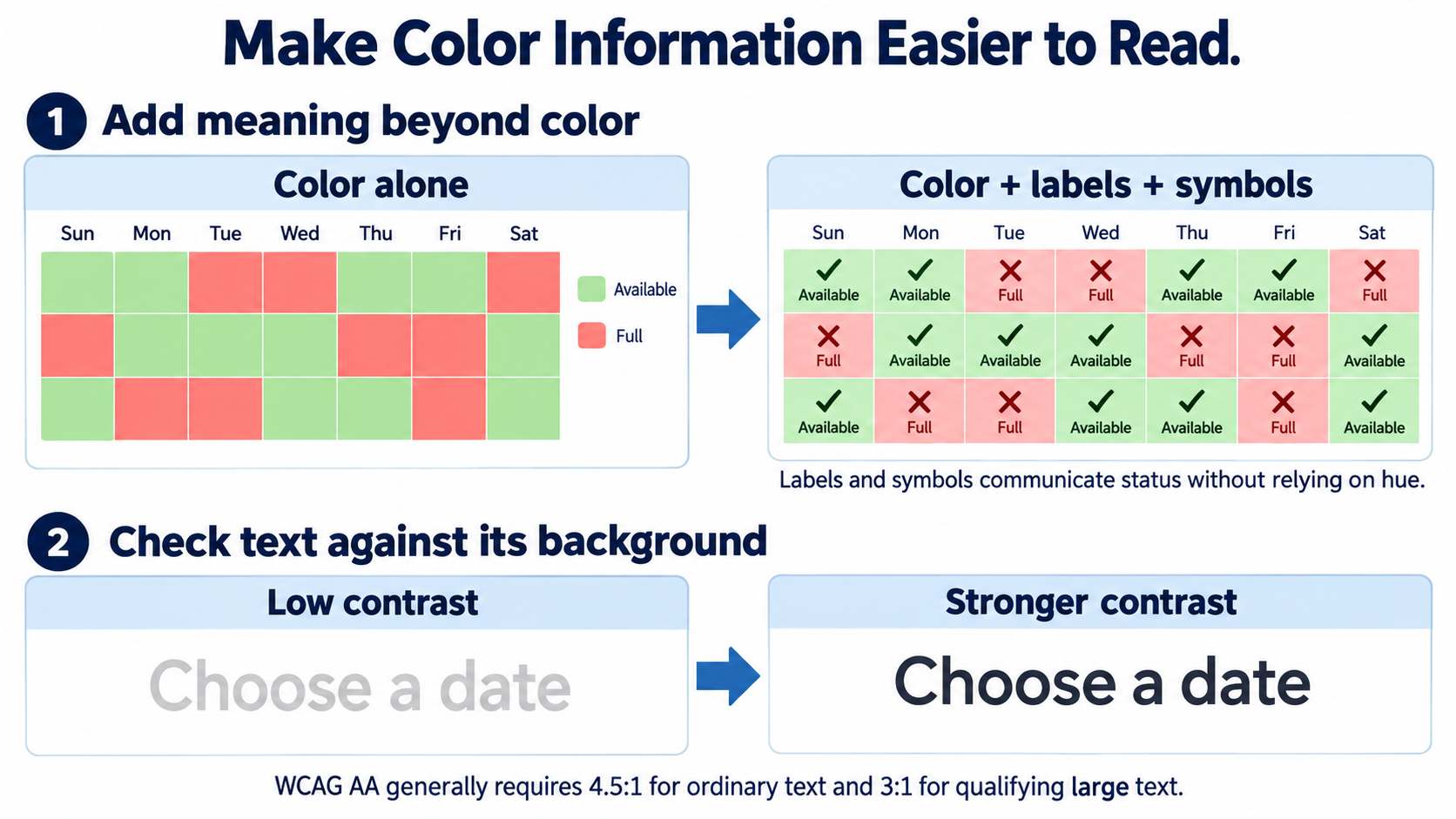
Start with the content people need to understand. A chart should identify its series with labels or distinguishable line styles as well as color.
A selected option can include a check mark. These choices follow W3C’s guidance on using color, which requires another visual means of communicating information when color alone carries the meaning.
Text needs a separate contrast check. Under WCAG’s minimum contrast criterion, ordinary text generally needs a contrast ratio of at least 4.5:1 against its background; qualifying large text needs 3:1. Exceptions apply, including logos and inactive controls. An attractive pairing doesn't establish that it meets those thresholds.
With gradients, check the background beneath the letters across the whole text area. One end may provide enough contrast while another doesn't.
If the result is inconsistent, try moving the text or placing it on a solid background before changing the entire palette.
For a simple comparison, imagine a booking calendar with available dates in green and unavailable dates in red.
Adding the words Available and Full gives each state an explicit meaning. You can still keep both colors, but the visitor no longer has to identify the hue correctly before deciding which date can actually be booked.
Choose colors in the context of a page
Eggradients’ image color palette generator can give you starting colors from a photograph.
Assign those colors jobs before committing to them.
Use one candidate for a background, another for text, and an accent for a selected state. Then inspect those combinations in an actual component.
If you need other ways to assemble a starting set, the guide to color palette generators offers options.
Keep the final decision tied to the page: a color that works across a large decorative area may be unsuitable for small instructional text.
Before saving a palette, build one compact example containing a heading, a paragraph, a link, and a selected control.
Check the text contrast and make sure the selected state remains understandable without its hue. Save those working combinations alongside the individual swatches.
They tell the next designer how to use the colors, rather than leaving them to rediscover the same constraints.