Building an app used to be a daunting task. A good idea alone wasn’t enough. You had to find a developer, set aside a budget, and wait for months.
The worst part was that a creative idea could easily get lost in the technical complexities of the project.
Today, the picture is quite different. Those with ideas can now make faster progress without being overwhelmed by the technical burden.
Especially when using a good AI app builder, the process doesn’t feel like building a wall from scratch. Rather, it’s more like building your own style on top of a solid foundation.
This difference is not insignificant.
After all, most people don’t give up halfway because they don’t want to write code, but because they can’t find a platform that allows them to bring their ideas to life in a clean, organised way. With the right tool, however, the design process becomes much smoother.
The initial setup is taken care of, leaving you free to focus your energy on the essence of the project.
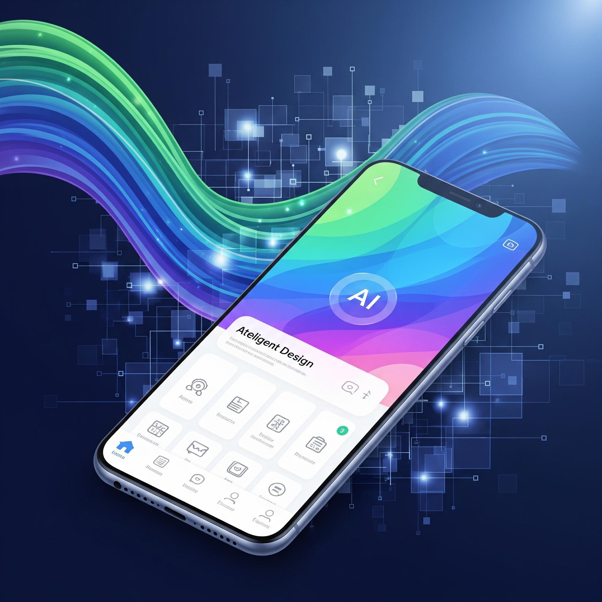
One of the clearest examples of this is using ready-made app templates. Instead of being left with a blank screen, you start with a structure tailored to your needs.
Whether you’re setting up an online shop, a community app, a personal content platform or a booking system, having a suitable starting layout for each makes the process significantly easier.
But here’s the key point: just because you’re starting from scratch doesn’t mean it has to look ordinary.
The template should merely serve as a framework.
The true character emerges through colour choices, use of white space, typography, visual language and the tone of the content.
Well-designed apps are generally not the overly ornate ones, but those whose purpose is immediately apparent. When you look at the screen, you see clarity rather than clutter. The user senses this straight away.
That’s why design decisions remain at the heart of the matter. Which colours inspire trust, which ones appear more energetic, which layout is easier to read, which screen feels more inviting… All of these make a difference.
This is precisely where the brand identity is established. The app’s appearance should not be random, but deliberate. Especially when it comes to building a strong brand identity, colour and visual consistency play a far greater role than you might think.
Colour is not a detail to be taken lightly. Whilst shades of blue convey a calmer and more trustworthy feel, yellow and orange can create a livelier and more vibrant atmosphere. Black can establish a strong and clear presence.
Pastel shades, on the other hand, appear softer and more approachable. Of course, every brand has its own distinct palette.
But when an app opens, the user senses the atmosphere first, not the text.
This is where artificial intelligence really comes into its own. Rather than having to come up with every design decision from scratch, it can offer you sensible suggestions.
It can suggest layouts based on your content structure, curate visuals, and help you achieve a more consistent look across screens.
Creating harmonious colour palettes, in particular, is a more challenging task than many people realise. AI support really speeds things up at this stage.
Still, the best results don’t come from leaving everything to the system. The best results emerge where the human eye meets machine speed.
Because artificial intelligence is fast, but it has no sense of taste. At least not on its own. That’s why the right approach is to treat its suggestions as raw material. Let it present the structure to you, but you make the final decision.
Let it start the text, but you refine the tone. Let it prepare the visuals, but you check whether they truly fit your brand.
This is precisely what’s most often overlooked in app design: the easy way isn’t always the right way.
Another critical issue is device compatibility. A design that looks good but appears distorted on a phone, overflows on a tablet, or has buttons that are difficult to press cannot be considered good. People no longer live on a single screen.
Small screens, large screens, portrait view, landscape view… each requires separate testing. That’s why avoiding common website design mistakes is important not just for websites, but for app logic too.
Poor navigation, cramped spaces, unbalanced hierarchy and screens that are slow to grasp will drive users away very quickly.
Good design is partly about the work that goes unseen. The user may not notice certain things, but they feel at ease.
They find what they’re looking for easily. They don’t have to think about where to tap. They have no trouble reading the text. It feels as though the screen isn’t working against them, but alongside them.
This is often the quiet result of the right decisions.
Today, building an app is no longer as distant a goal as it once was. Large teams, massive budgets and production processes lasting months still exist.
But they are no longer the only way. Smaller teams, and even individuals working alone, can produce powerful work.
What makes the difference is often not technical prowess, but the right choice of tools and a clear design vision.
In short, it’s not just about launching an app. It’s about creating an experience that people will want to use, feel comfortable with, and connect with visually.
And you don’t have to do everything the hard way. Smart automation lightens the load. Visual creativity, however, is what truly makes the app your own.
The good news is: you no longer have to choose between the two.