Blue says, “You can trust me with your money,” green glows, “You're doing great, well done,” and red warns, “You made a mistake, but don't panic.”
That's why large product teams start their design system by focusing on critical colors like the primary button color, link color, background gray, and success/danger tones.
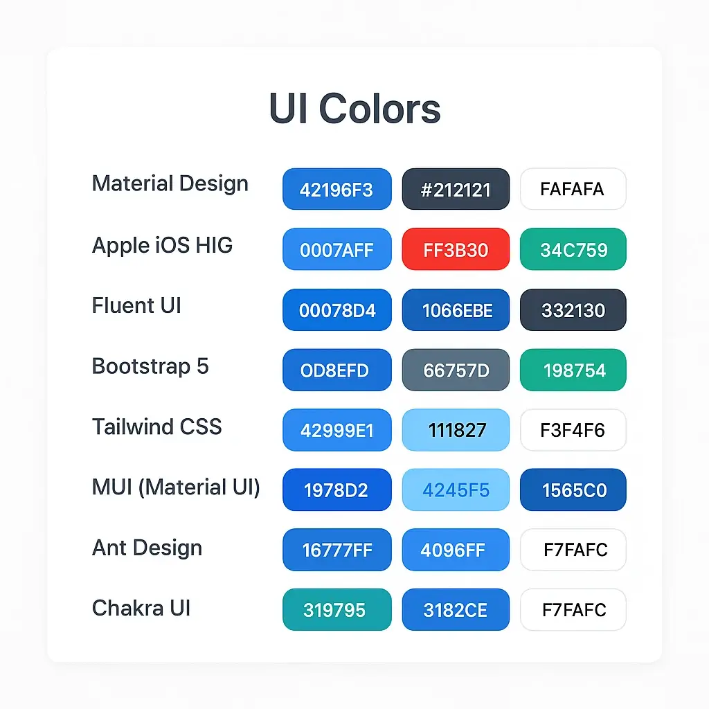
In this article, we'll compile the most commonly seen UI color sets, from the design systems of giants like Google and Apple to famous UI libraries like Bootstrap, Tailwind, and Ant Design.
For each one, we'll briefly explain what it's used for, which primary colors it uses, and provide small palettes and visual ideas that you can copy and paste into your own interface.
The right UI colors approach is not something to be implemented after your software or product has become very successful.
It is important to establish your UI mechanism and develop your app on the right foundation even during the MVP Development process.
Because when you look at the general characteristics of very professional-looking applications, color consistency and color continuity are clearly visible, making your app feel much more professional and reliable.
Material Design Colors (Google)

In the Material world, the star of the show is usually Material Blue 500 (#2196F3); it screams “I'm Google” on both buttons and links.
On the text side, dark gray #212121 provides a safe contrast, ensuring readability without straining the eyes.
Since very light backgrounds like #FAFAFA and #FFFFFF are used, this blue always stands out.
Apple System Colors (iOS HIG)

On the Apple front, System Blue (#007AFF) is a true “I am iOS” color; it appears everywhere, from links to primary buttons.
System Red (#FF3B30) kicks in for error messages, while System Green (#34C759) appears for success messages, all shining brightly against a pure white background.
The palette is actually very broad, but these three colors are enough to convey the feel of the iOS interface in seconds. Minimal but emotional: few colors, clear message.
Fluent UI Colors (Microsoft)
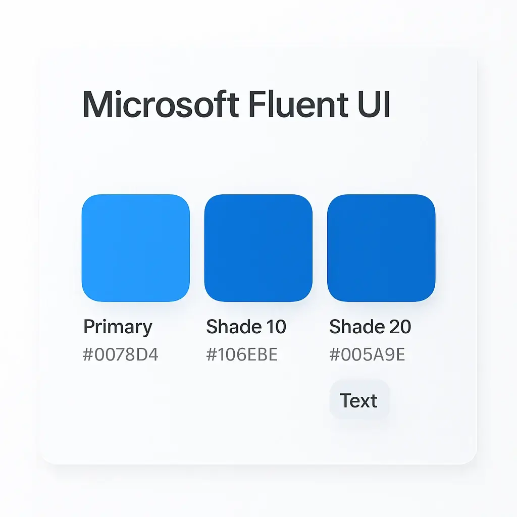
The heart of Fluent UI beats with a corporate blue, #0078D4; you see this color everywhere, from toolbars to CTA buttons.
Darker shades, #106EBE and #005A9E, come into play in hover/active states, adding a sense of depth. For text and icons, a dark gray around #323130 creates a more serious, “Office feel.” The result: combined with subtle glass effects, it's both modern and truly “Microsoft corporate blue.”
Bootstrap 5 Theme Colors

In the Bootstrap palette, colors are named after roles, not people: Primary (#0D6EFD), Success (#198754), Danger (#DC3545), Warning (#FFC107), Info (#0DCAF0)…
They all have different hex values, but they all come to life in a single line with classes like .btn-primary and .text-danger.
Primary Blue #0D6EFD is now known as “Bootstrap Blue” because it is never overridden in many projects.
Thanks to this semantic approach, designers think about the situation rather than the color: “Is this a success, a warning, or an error?”
Tailwind CSS Colors

There is no single “brand color” in Tailwind CSS; instead, there is a large scale ranging from blue-50 to blue-900 and gray-50 to gray-900.
For example, blue-500 (#4299E1) is often chosen as the primary color in modern SaaS interfaces, while gray-900 is the preferred dark gray for bold text.
Since color names are embedded in utility classes like bg-blue-500 and text-gray-900, both the design and code sides speak the same language.
Tailwind isn't actually a UI framework, but its default palette gives many projects a “familiar modern web” feel.
MUI Primary Colors (Material UI)
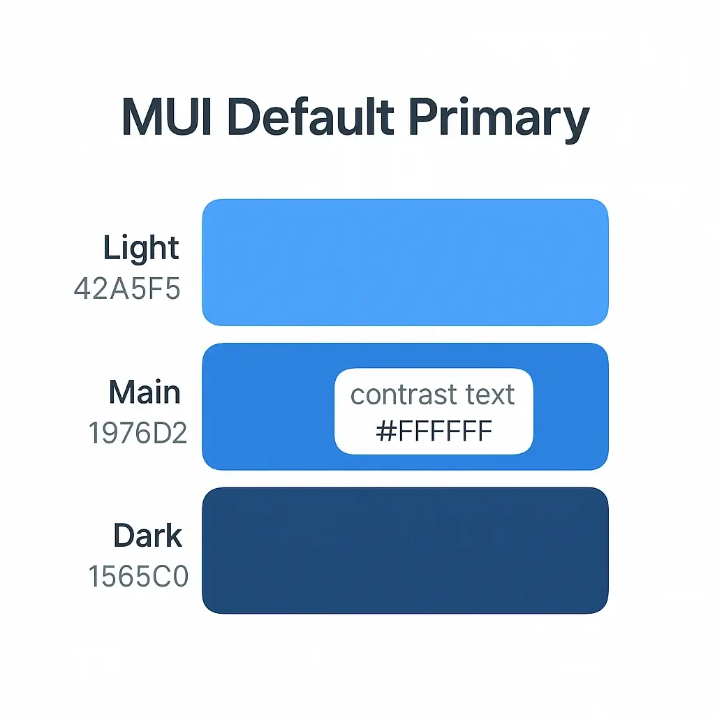
MUI is the representative of Material Design in the React world and its default primary color is blue (#1976D2).
The accompanying Light (#42A5F5) and Dark (#1565C0) colors come into play during hover, focus, and disabled states.
Since #FFFFFF is generally used as the contrast text color, buttons remain very clear and legible on the screen.
If you leave the MUI project with the “default theme,” you are presenting the user with a look that directly evokes the Google ecosystem.
Ant Design Brand Blue

In Ant Design, the star of the show is Primary Blue #1677FF; a bright blue that appears everywhere from dashboard buttons to form elements.
Surrounding this primary tone are lighter shades like #4096FF and darker ones like #0958D9 and #001D66, creating smooth transitions between states.
The rest of the palette is supported by neutral grays, maintaining an enterprise feel. In short, if you use this blue in Ant Design, your brand will inevitably start to look like “B2B SaaS.”
Chakra UI Theme Colors
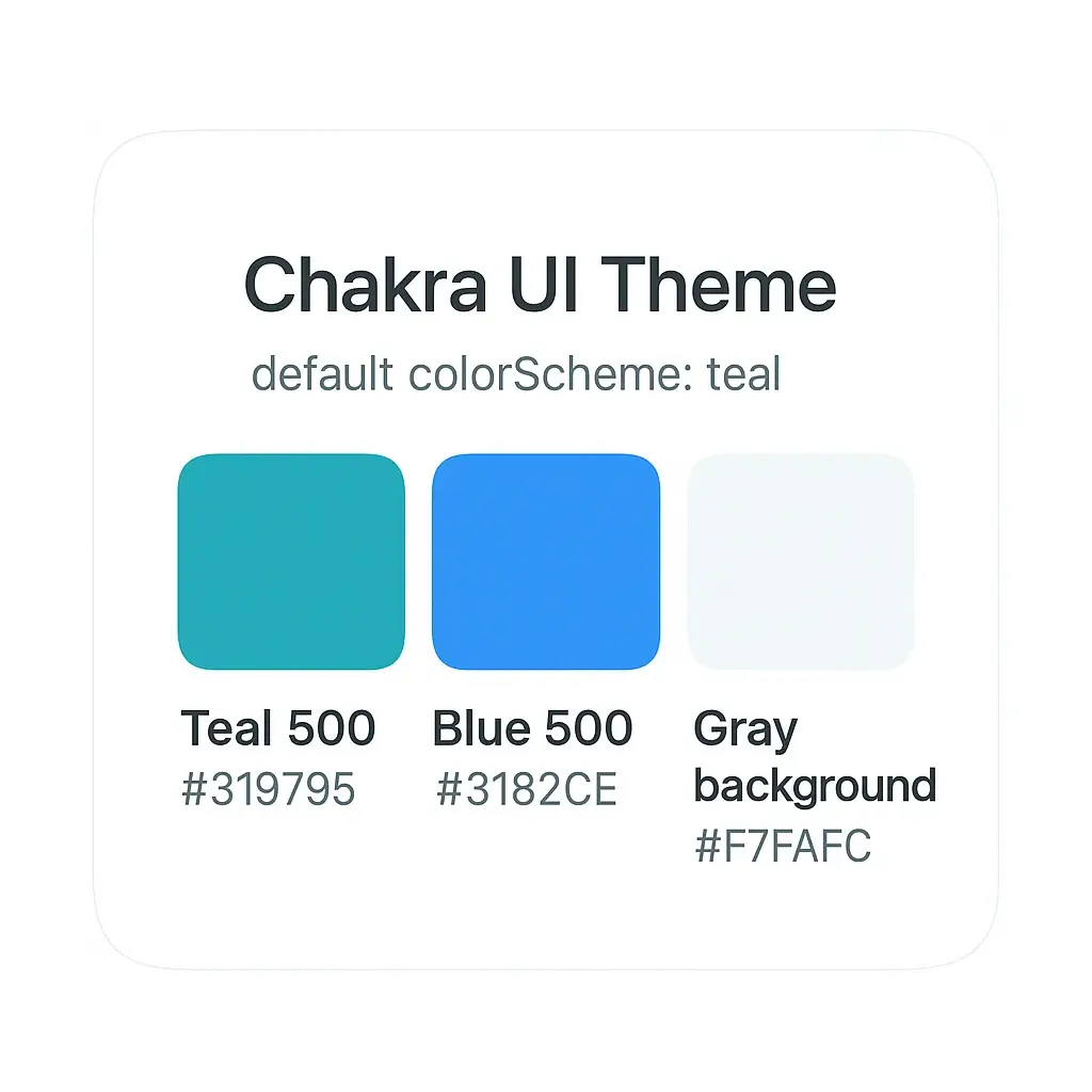
Chakra UI has a slightly more emotional connection to teal tones than others; teal.500 (#319795) is practically the library's mascot.
blue.500 (#3182CE) is used as a secondary accent, while gray.50 (#F7FAFC) is preferred for backgrounds and card surfaces, and gray.800 (#2D3748) for text.
By simply writing colorScheme="teal" as a single prop, you can paint all components from buttons to badges in the same family, making this palette practical.
The result: a “friendly dashboard” vibe, a default theme that comes without any hassle.
Final Worlds
At Eggradients, we provide services in many areas, from color palettes to images that can be created with the right color palettes. At the same time, we find the above structures useful with their scientific approach to UI Colors.