Calm tones associated with Zen philosophy—especially soft blues, greens, and neutral colors that refer to nature—help us establish spiritual balance, calm the mind, and open the doors to inner peace.
Zen color palettes embrace the power of a simple and minimalist approach. They are typically based on pastel tones, the serenity of blue and green, and the balance of warm neutrals such as beige and gray.
However, the digital world often pulls us the other way, pulling attention with adrenaline-fueled content online—sharp contrasts, rapid cuts, vibrant colors—that overstimulate our senses and contrast sharply with Zen’s calm simplicity.
These palettes create a calm atmosphere by lightening the mental load while also offering a visually elegant balance.
Used particularly in interior decoration or digital content, these colors invite the viewer on a peaceful journey, leaving them feeling at ease.
Calm Stone
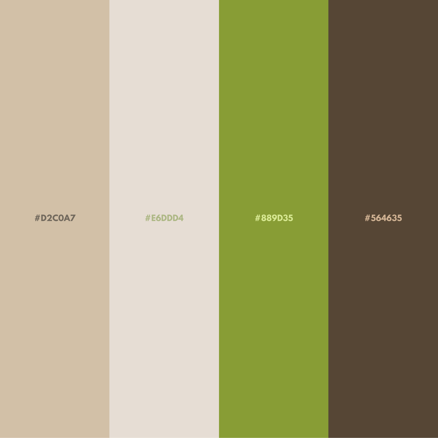
This palette brings freshness with the soft beige tones of Sand Beige, while the warmth of White Coffee (“Modest White”) offers a peaceful invitation to the interior.
Deep Palm Leaf green creates a balance reminiscent of nature, while the rich chestnut brown accent of King Chestnut creates an atmosphere that is both calm and community-oriented.
Lotus Garden
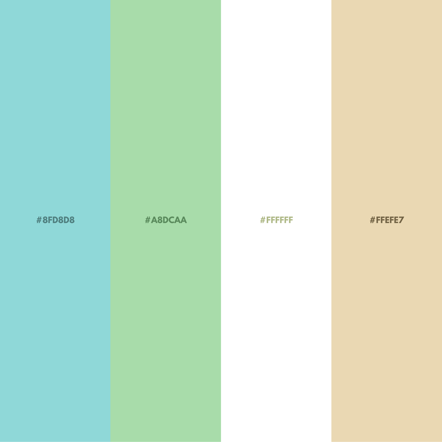
Like the serenity of a lotus, this palette combines light blue and green tones to bring mental clarity and peace. The balance of pure white and beige adds a calm yet warm texture to the space.
Silent Land
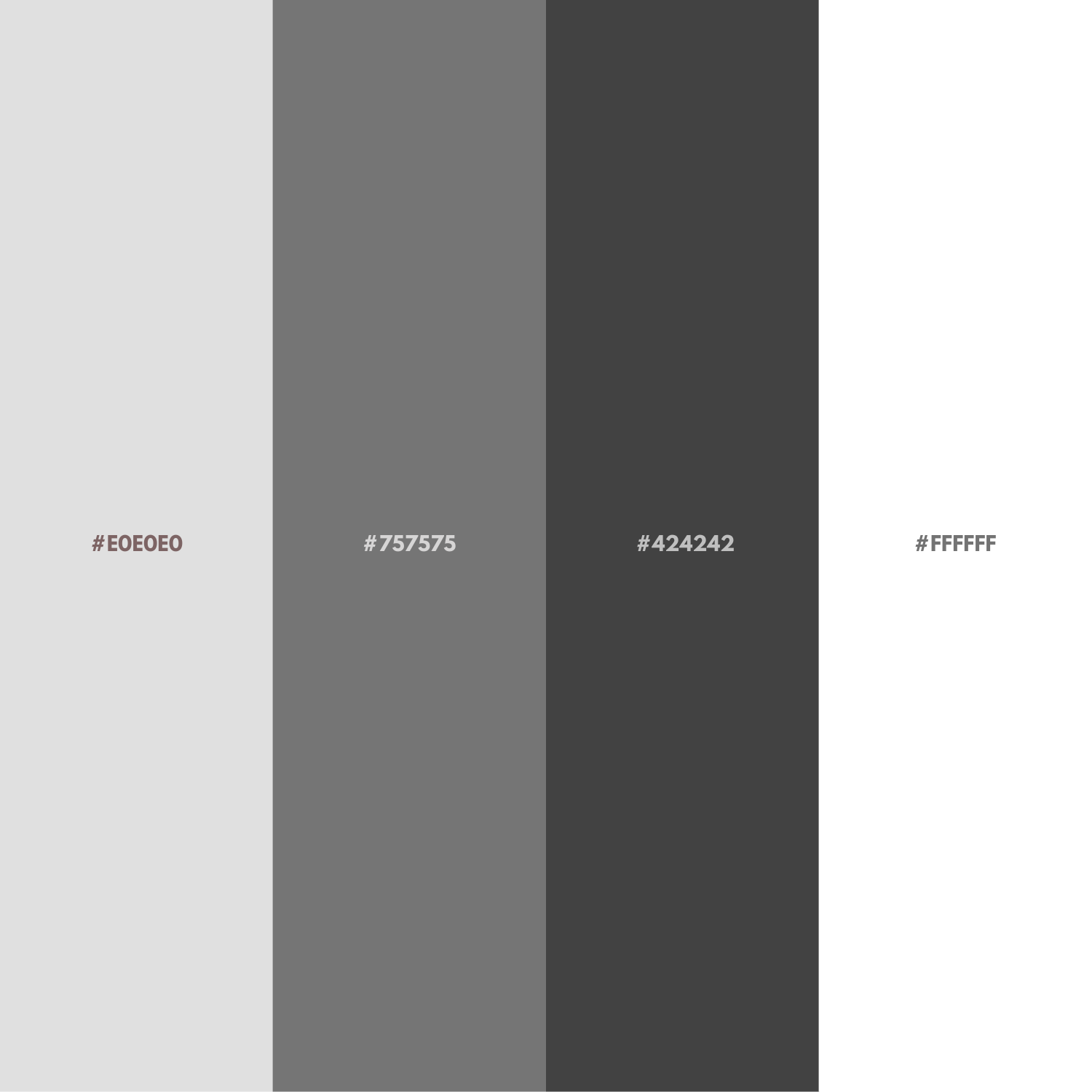
This palette brings a sense of freshness to the mind with the simple and soft neutral texture of Quiet Earth – Light Gray; Medium Gray offers a balanced transition, while Deep Gray adds a confident and grounded tranquility.
The lightest tone, White, creates a clean freshness and minimal elegance throughout the palette.
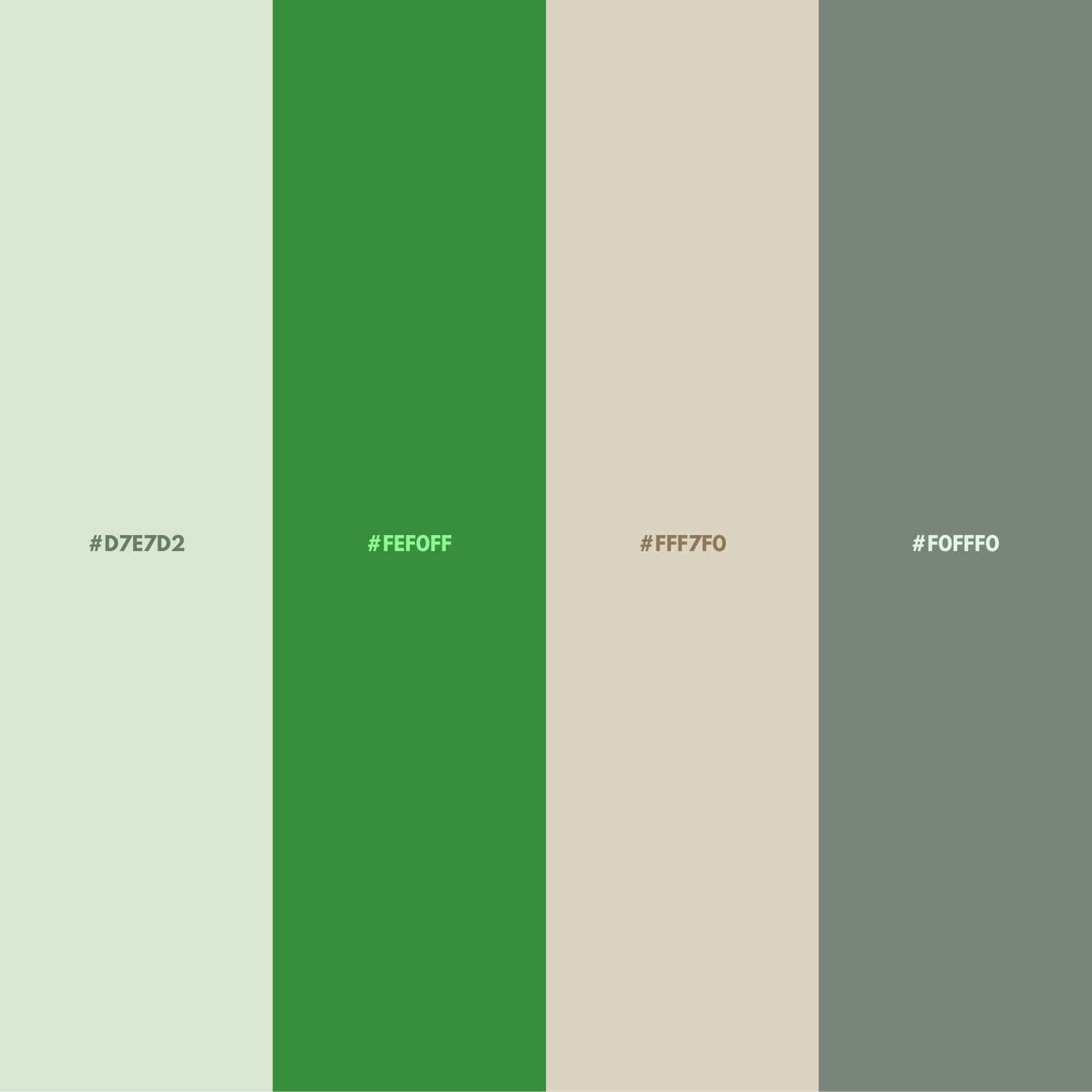
Forest Breath
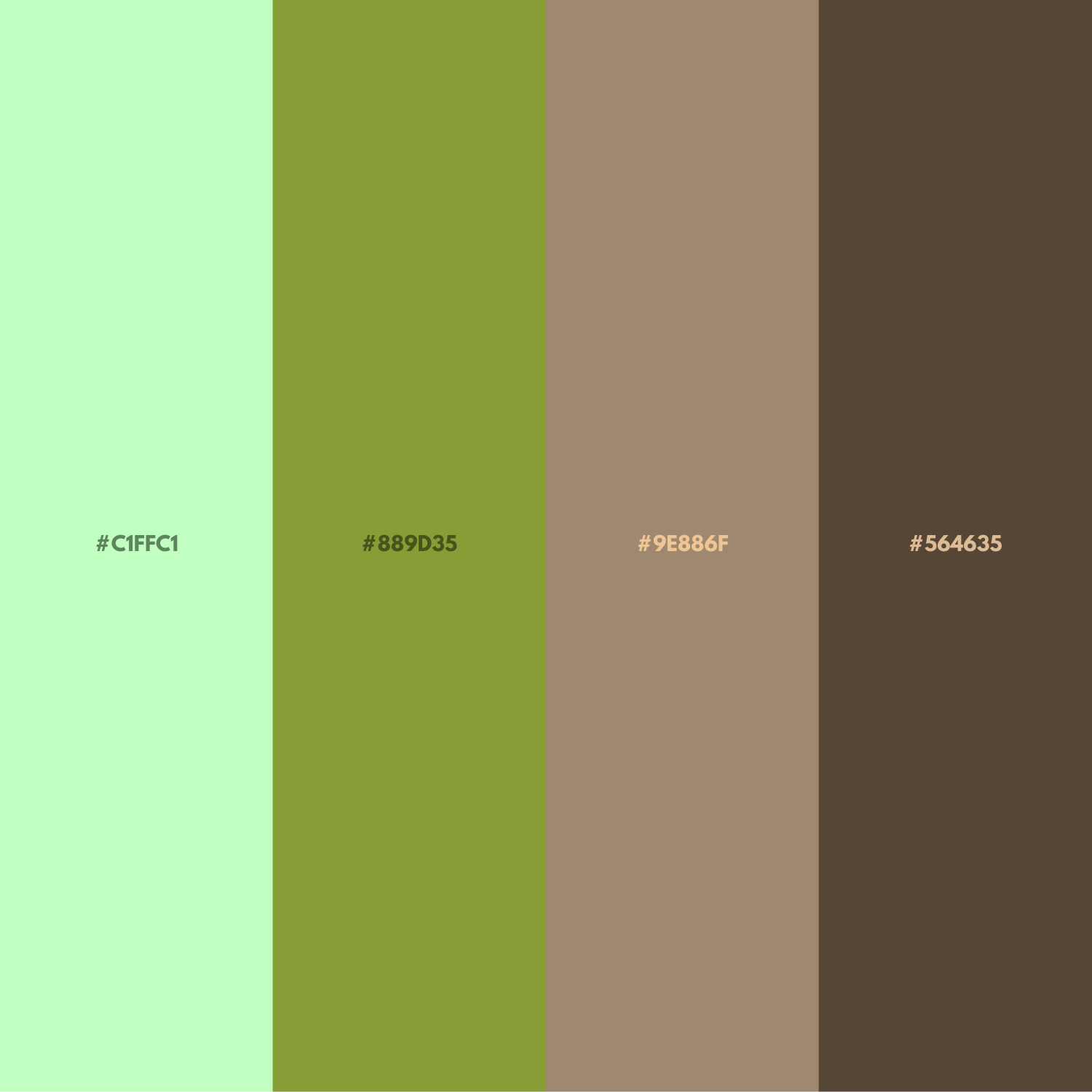
This palette, inspired by nature, provides relaxation with its fresh green tones while ensuring stability with the grounded presence of brown.
Sky Serenity
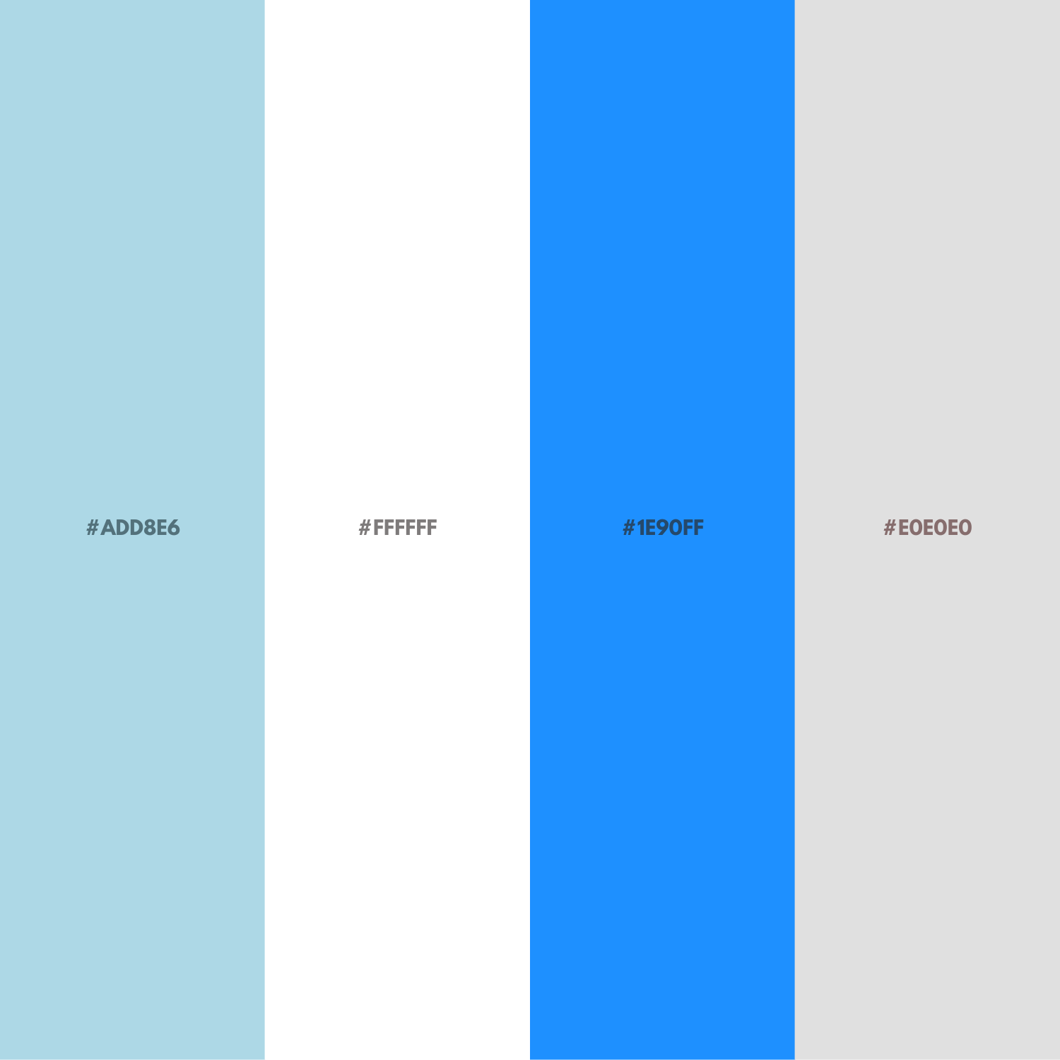
This palette offers inner tranquility with its light blue tone reflecting the natural serenity of the sky; White creates a fresh and bright surrounding peace.
Dodger Blue's vibrant blue brings movement and energy to the palette, while Light Gray, supporting the overall calmness.
Whispering Bamboo
This palette, which evokes the tranquility of bamboo forests and a connection with nature, brings peace with its soft and vibrant shades of green.
Dawn Shelter

This palette brings an inner calm with the delicate and soothing texture of Rose Blush (very light rose-pink).
The following Light Pink tone evokes a warm, gentle, and intimate feeling.
The salmon color's soft red-pink shimmer adds vibrancy to the palette, offering an energetic yet understated liveliness.
Finally, Thistle's pastel lavender effect adds emotional depth with a sophisticated calmness.
Stone Serenity

This palette, reminiscent of the reflection on a windless lake surface, conveys a sense of tranquility. It enhances the calming effect when paired with minimalist designs.
Silent Purple
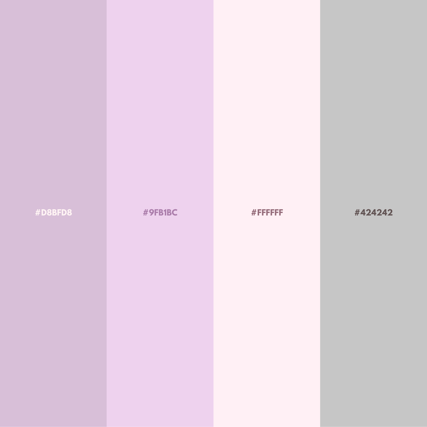
The emotional tranquility of soft purple and lavender tones combines with cream and gray to create a pastel ambience.
Seaside

This palette creates a quiet atmosphere with the deep and minimal look of Midnight Blue. Navy follows, providing a sense of trust and continuity with its classic navy blue tone.
Steel Blue provides a transition with its calming blue tone with gray undertones and radiates a balanced sense of tranquility.
Last Words
Each palette carries an inner peace and aesthetic harmony; I hope you too find a rhythm in these colors within your own harmony.