Capital One Colors
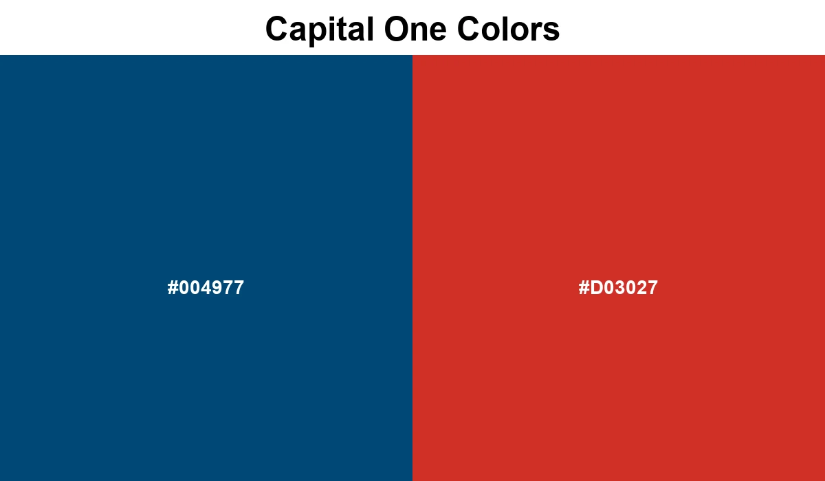
The Capital One brand uses a simple but striking combination of blue and red. The navy blue represents trust and depth, while the vibrant red adds a layer of action and energy to the brand's visual system.
#004977
#D03027
No items found.
Capital One's visual identity relies on a classic two-tone strategy that signals reliability and boldness. The deep blue acts as a sturdy foundation, common in the banking sector, while the sharp red provides a 'spark' of energy used to highlight calls to action and important alerts.
This combination ensures the interface remains professional yet modern enough for a younger demographic of users.