iOS Colors
The iOS brand color system uses flat, highly saturated hues tailored for digital displays. These colors provide essential visual hierarchy and interface consistency.
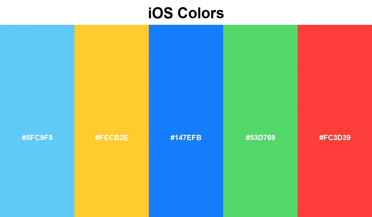
#5FC9F8
#FECB2E
#147EFB
#53D769
#FC3D39
No items found.
The iOS color palette relies on a vibrant spectrum of flat, high-contrast system colors.
This dynamic range includes Malibu Blue (#5FC9F8), Emerald Green, and Red Orange, all designed to stand out crisply on digital displays. By standardizing these core hues, developers can ensure their applications feel native to the operating system environment. The bright, optimistic tones enhance user interaction and provide necessary visual hierarchy across countless apps.