A physical product requires accounting for many variables. Proper palette use is crucial. But even if colors are chosen correctly, the actual colors may not have the same effect.
In this article, we'll share pin color palettes that will cause you the least disappointment in actual production.
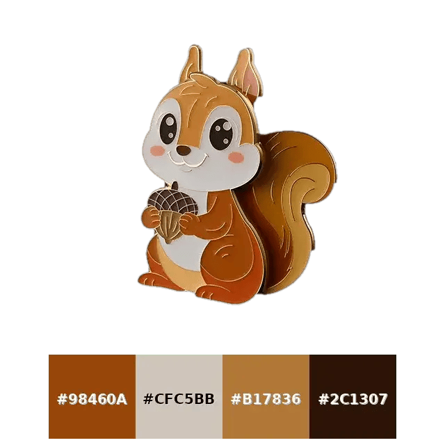
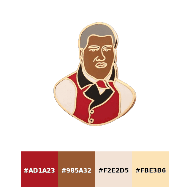
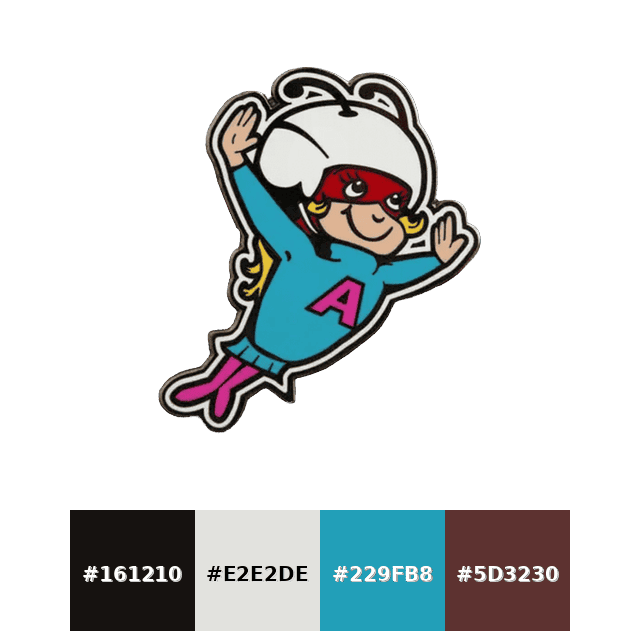
If you want to make custom pins from a picture or a logo, you can create a palette based on the image. Maybe you don't need palettes. Your palettes hide in your branding.
Classic Combinations
No matter how advanced the technology is, choosing palettes that won't clash with the metal's color is the safest approach to achieving the right pin colors.
All the palettes in this article are safe, but we can call the ones in this section +A plus easy palettes.
Don't get me wrong. It's not that difficult. We are just emphasizing this topic to remind you how important the distinction between screen color and real color can be.
Black Tie Badge
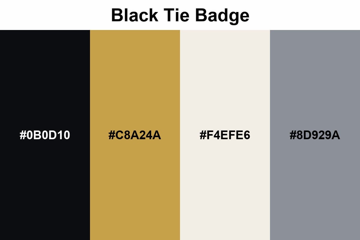
When you combine Rich Gold with Jet Black, you already have a palette that really stands out. If you add a little Ivory accent (5% max), you'll have a pin you can proudly use.
Gallery Label
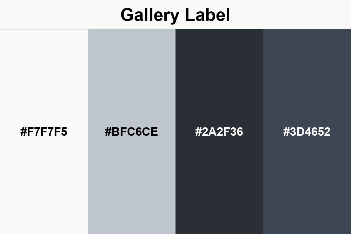
Porcelain White and Silver Mist blend seamlessly with metal surfaces as they belong to the same cool color family; Charcoal, on the other hand, provides contrast and ensures readability.
Heritage Navy
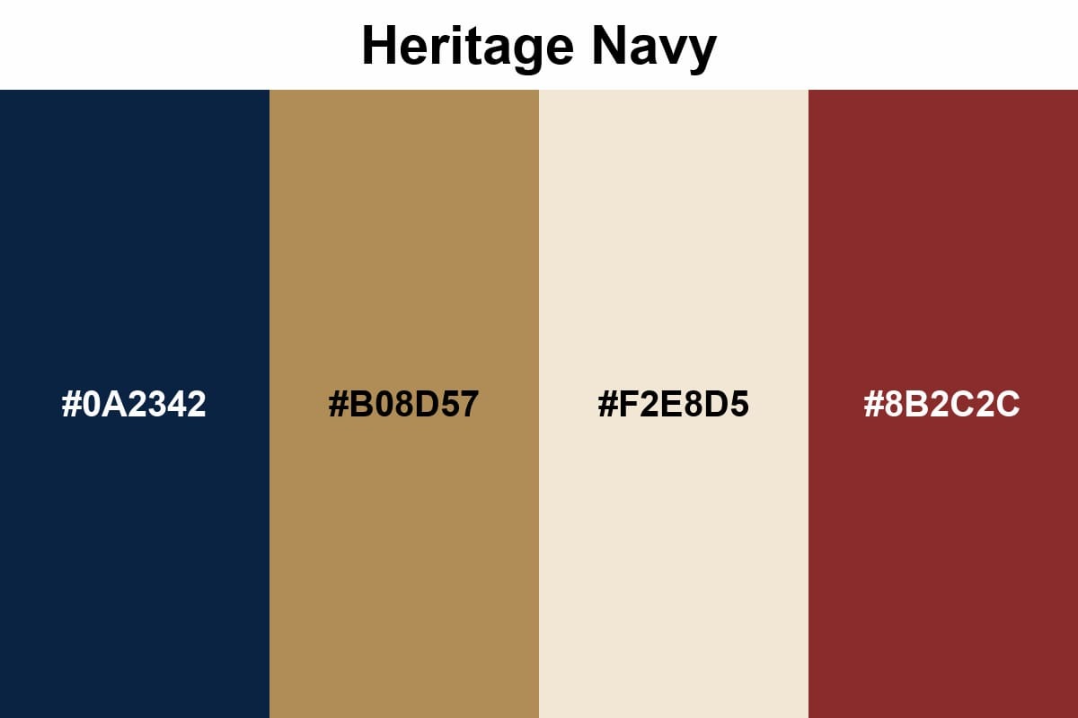
This palette balances the seriousness of navy blue with the sparkle of antique gold; paper cream softens the harshness and creates a more inviting balance. Using brick red as a small accent adds character to the design.
Gradient-Inspired Ideas
While flat colors create cheerful results by creating contrast, don't say you've found the palette in your mind without seeing the options that can be created with Gradient!
It may take a little more effort in production, but when you see the results, you'll see that it's worth the effort. I'm leaving the technical parts aside.
Because if you're on this page, you're already a master of real colors.
Sunset Melt
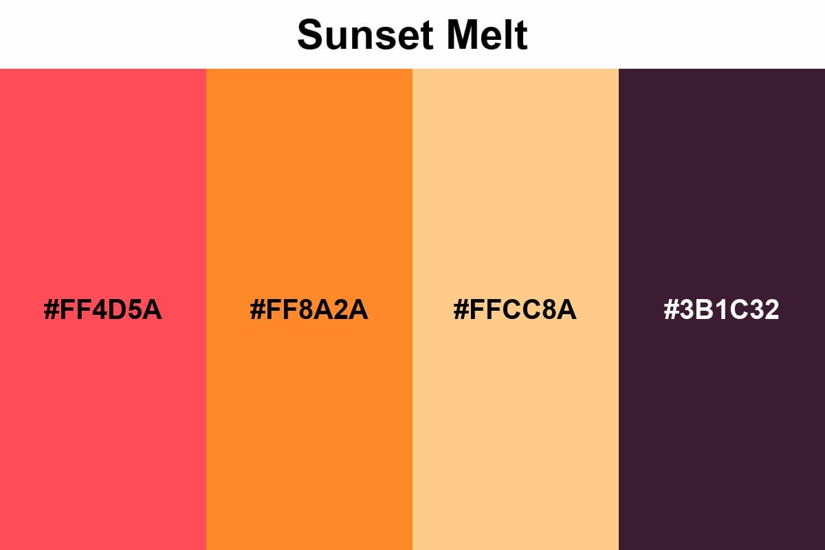
The coral-orange-peach gradient instantly makes the design feel warm and vibrant; it works very well with summer, vacation, and pop culture themes.
Ocean Fade
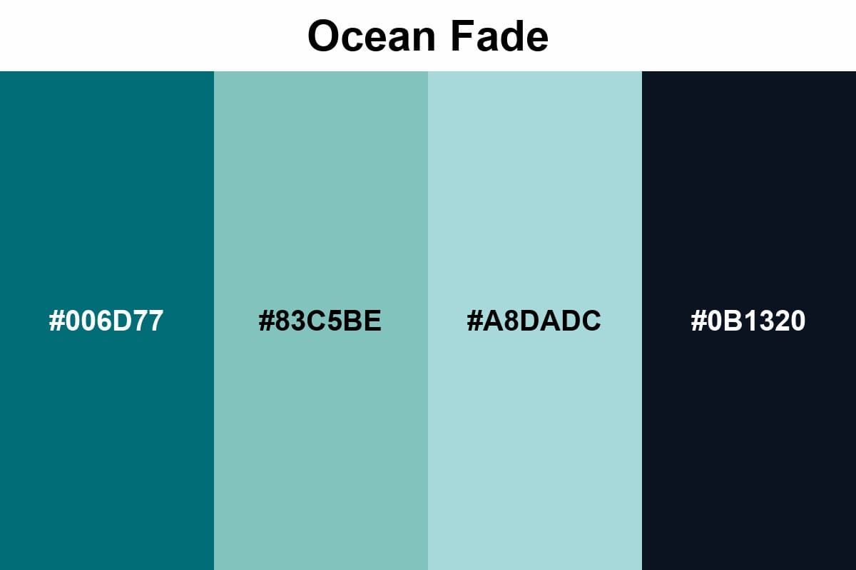
I realize that in the palette example above, we've transitioned from warm colors to cool colors. This is a deliberate choice. I wanted you to see how both ends look side by side.
Aurora Citrus
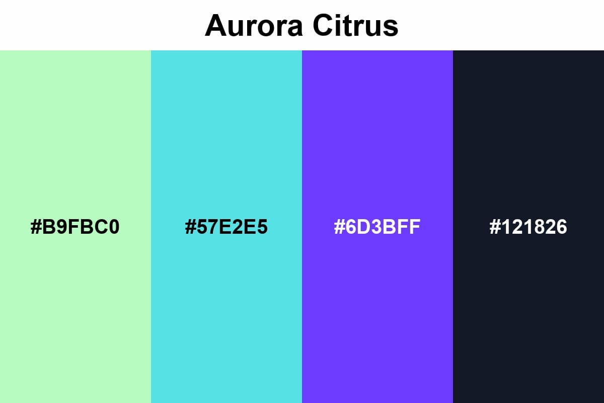
It provides a modern and digital energy, but if you use it block by block, it becomes rigid, so you must soften it with a pattern.
Bold & High-Contrast
A pin is a small object; readability from a distance is half the design. I always use this rule here: look at it from 2 meters away, is it still clear? That's why we're used to seeing high-contrast palettes on pins.
And yes, Enamel Pins production handles high contrast particularly well: the metal outline makes sharp distinctions even cleaner, and the color blocks remain strong.
Pop Poster
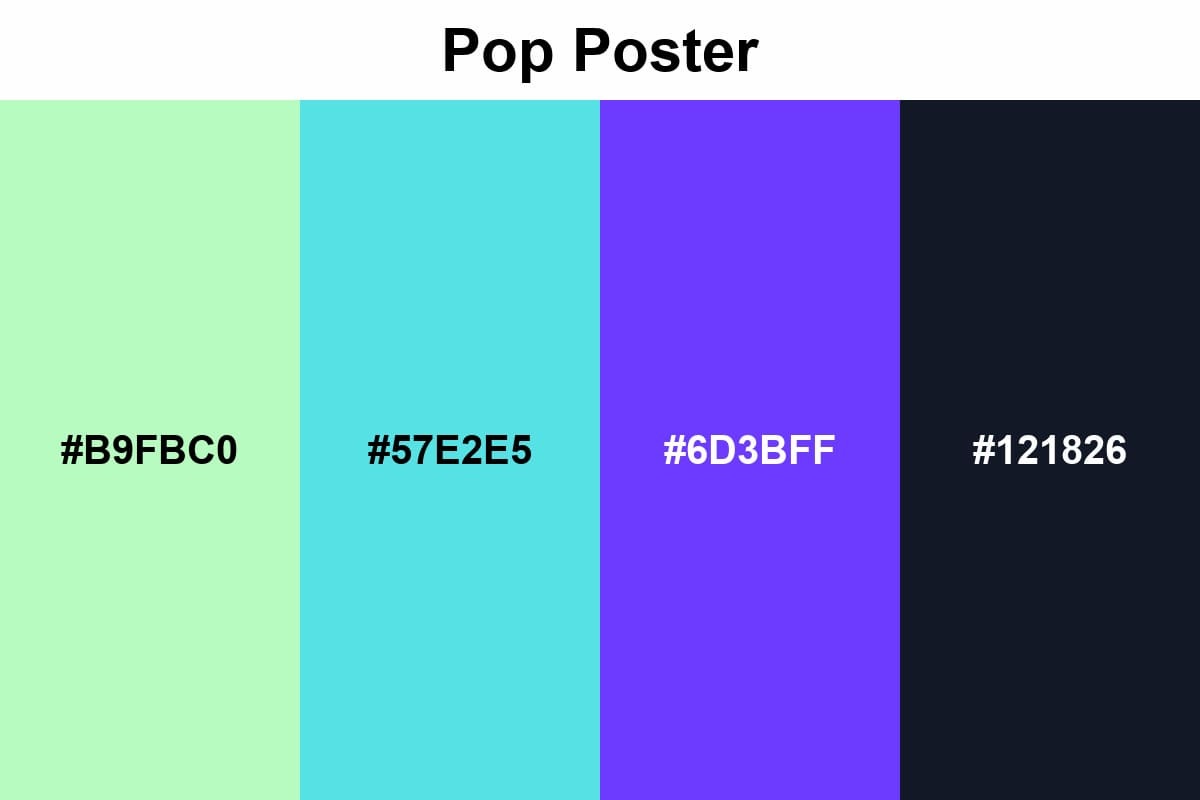
Signal Red + Ultra Yellow gives the street poster energy: bold, vibrant, and direct. Thanks to the black outline and white space, everything looks clean, and the details find their place without straining the eyes.
Cyber Warning
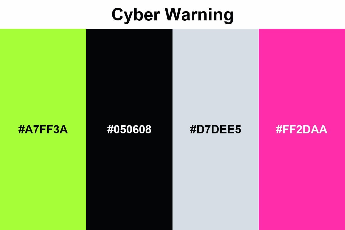
Black + acid green stands out from every distance. And whatever the context, it makes you feel like you're carrying a sports car in your pocket.
Comic Panel
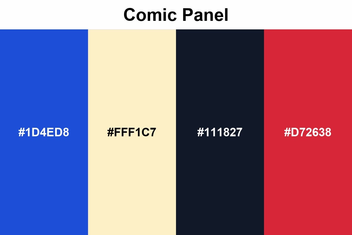
I wanted to dip my toes into the comic world with the last pin colors in the contrasting palettes category.
Because comics are one of the art forms that use contrast best. We wouldn't easily see Royal Blue and Cherry colors in any other medium.
Pro tips: Before moving on to the pallets, let's squeeze in this technical detail: HEX codes may not translate to the exact same color in production.
This is because the production side often works with Pantone (PMS) references.
Therefore, when ordering Custom Pins, define each color as a separate swatch and add the corresponding PMS target next to it.
This speeds up the proofing process and yields results closer to the design.
Minimalist & Professional
The goal of minimalist pins is not to choose fewer colors, but to place the right emphasis in the right place.
In business and high-end use, the pin should not overshadow the outfit, but it should also convey its quality. Therefore, wide spaces, clear contours, and a controlled color combination are the right choices.
This approach is particularly effective for a lapel pin worn with suits, as it creates a more professional look while incorporating the metal's shine into the design.
Boardroom Mono
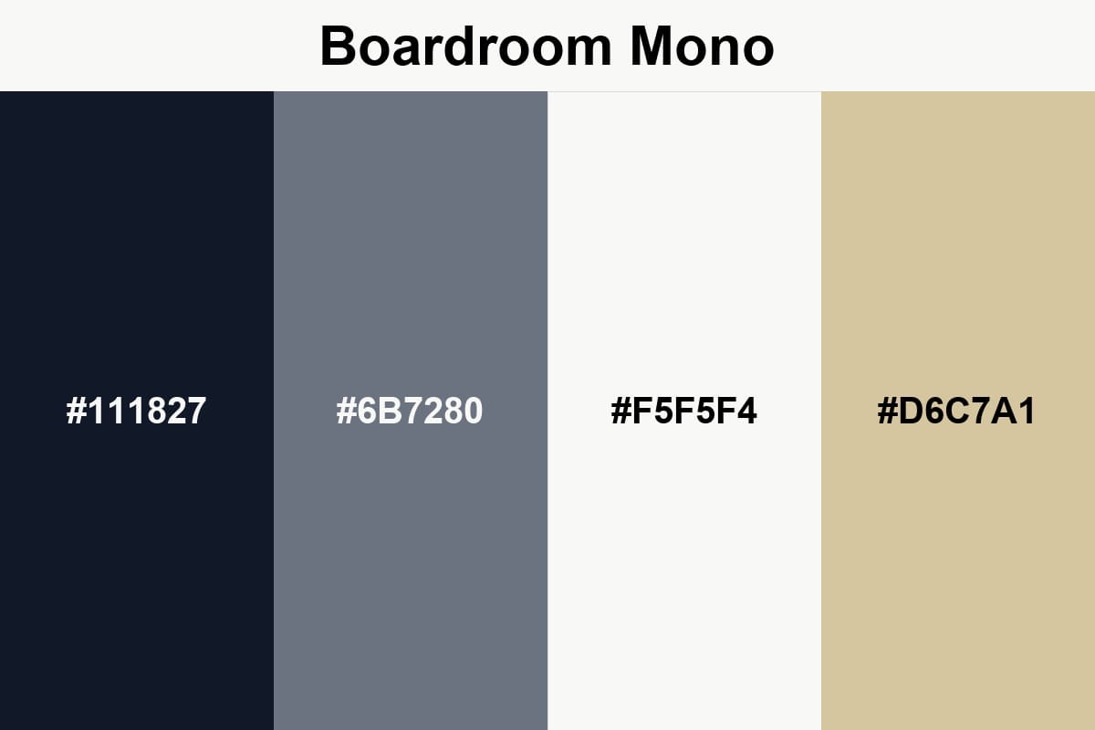
The colors in this palette successfully incorporate the shine of metal into the design. The Steel color, in particular, creates a metallic feel within the metal.
Architect Neutral
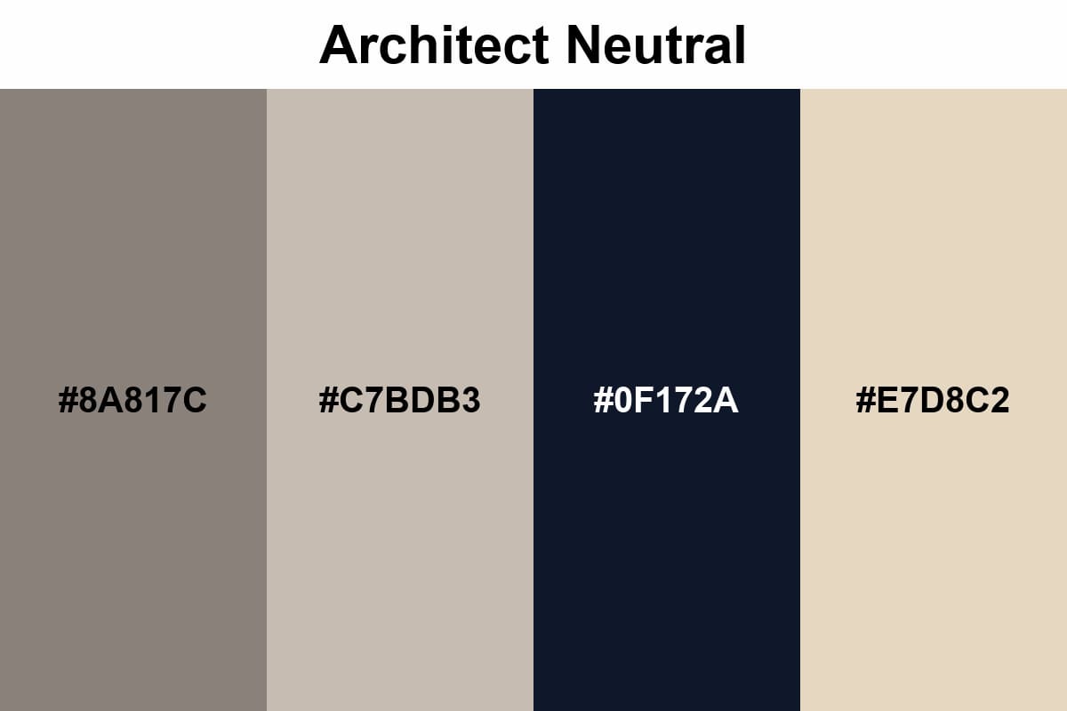
This palette offers a calm, high-quality look with warm gray and stone tones that are easy on the eyes.
The Midnight color adds clarity to the design; it looks particularly stylish on geometric and minimalist pins.
Executive Navy
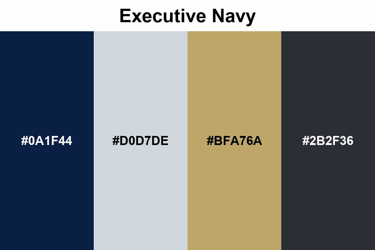
This palette combines the seriousness of navy blue with the elegant sparkle of soft gold; the result is a calm yet prestigious look.
FAQS
Why do enamel pin colors look different from the colors on the screen?
Enamel pin colors often differ from screen colors because digital screens use RGB light, while manufacturers use Pantone (PMS) solid pigments to match the colors.
What colors are best for small enamel pins?
Small enamel pins are best suited for high-contrast color combinations and clearly defined color blocks.
Why do mid-tones in enamel pins sometimes appear blurry?
Because enamel pins rely on metallic outlines to separate colors, mid-tones can sometimes appear blurry.
Last Words
We discussed setting up pin colors to convey the same feeling in production: classic combinations, patterns inspired by gradients, high contrast, and minimalist-professional choices.
Before closing, remember: metal contours and coatings alter perception, and light tones can look particularly different.
Dividing pastels into very small pieces loses detail, and too many colors clutter the design; if you proceed with these basic rules, the design will truly come together when the pin is in your hands.
Whether you make custom pins or mass production, you can use these palettes with peace of mind.
If you have any other beautiful palettes that you use, please share them with us. We would like to add them to our next update.