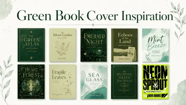
When creating a successful green book cover, simply choosing the background colour is not enough.
Typography, illustration, the use of white space and complementary colours also determine the tone of the design.
Colours such as cream, off-white, gold, black and soft beige can highlight different aspects of green.
In the examples below, you can explore different book cover approaches using ten distinct shades of green.
Preparing the first draft of a book is now much easier than it used to be.
Seeking support from solutions such as essay writing services during the research, text planning and writing process can help transform ideas into a more structured text.
However, the book’s first point of contact with the reader does not depend solely on the content. The cover design is also an important visual element that conveys the book’s character. Particularly when using a colour like green, which can evoke entirely different emotions depending on its shade, the right graphic approach can completely transform the book’s appearance on the shelf.
In the examples below, you can explore how different options—from sage green to emerald tones, and from lime green to dark jade—can be used on book covers.
The Silent Garden
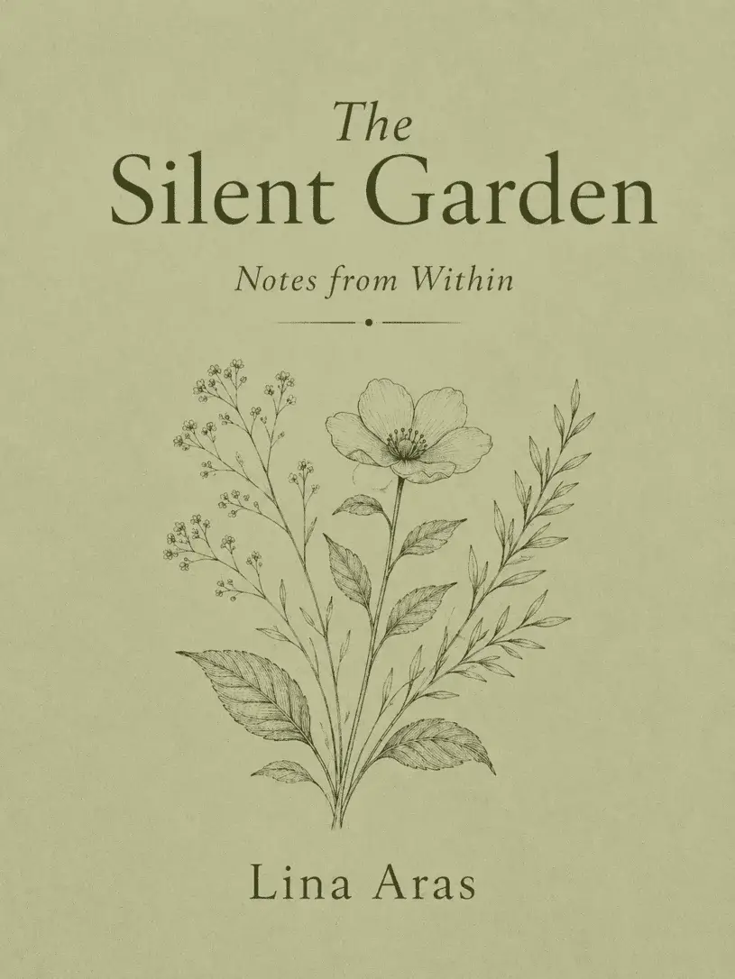
This cover, featuring sage green, creates a calm and refined impression at first glance. The delicate botanical illustrations in the centre add character to the cover without overwhelming the design.
The generous white space and elegant serif typeface, meanwhile, give the impression that the book contains more contemplative content.
Emerald Night
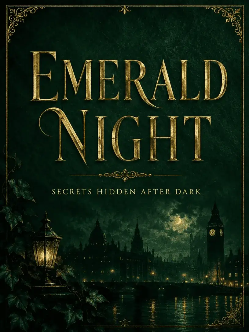
Emerald green is one of those powerful shades that can convey luxury and mystery at the same time.
On this cover, the dark background, the night-time city skyline and the gold accents are used together to create a cinematic atmosphere.
The cover manages to convey the book’s genre through just a few visual details.
In crime, thriller or dark-atmospheric novels, this kind of approach can quickly capture the reader’s attention. The gold details, meanwhile, lend the design a more prestigious feel.
Echoes of the Land

Olive green lends the cover a mature and timeless look.
The slightly weathered paper textures and botanical details that evoke an archival feel set the design apart from the typical history book cover.
Nostalgia is used in a controlled manner in this design.
It evokes an old document yet does not appear outdated. It could serve as a strong reference for books on history, culture, urban memory or place.
Mint Breeze
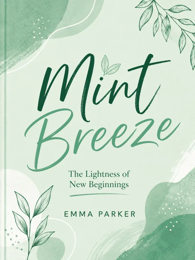
Mint green creates a younger, more energetic visual language.
The use of organic shapes and relaxed typography on this cover lends the design a more approachable feel. Whilst the colour palette looks fresh, the cover doesn’t feel too plain or empty.
This style of design is particularly well-suited to books on themes such as new beginnings, creative living or personal development.
It offers a visual identity that is approachable and does not feel distant from the reader.
Heart of the Forest

The forest green on this cover is not merely used as a background colour; it becomes an integral part of the narrative.
Layered leaves, shadowy trees and the luminous symbol at the centre create a small story universe.
In fantasy fiction covers, it is important for the reader to be able to immerse themselves in the world quickly.
This design powerfully conveys a sense of adventure and discovery without needing to explain too much.
Fragile Leaves
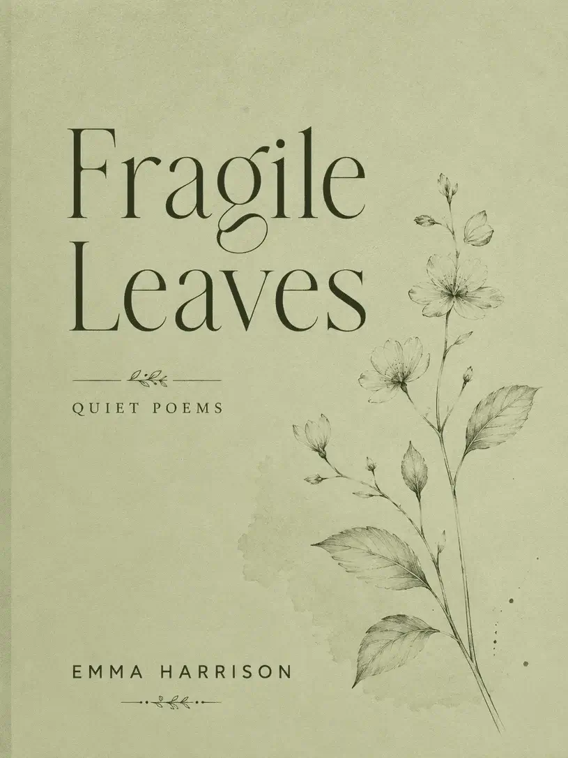
Pistachio green can create a soft and intimate atmosphere in poetry collections.
The fine lines and subtle paper texture used on this cover reinforce the book’s delicate and emotional tone.
The design’s greatest strength lies in its lack of overt explanation. Rather than telling the reader a story directly, the cover presents a mood.
This approach can yield more compelling results in collections of poetry and short prose.
Sea Glass

Sea foam green is a highly versatile shade for modern and artistic book covers. The semi-transparent forms used here create a subtle, glass-like effect.
The clean typography, meanwhile, prevents the design from looking overly decorative.
This example is a good option for genres such as contemporary essays, creative writing or travel notes.
Although it has a calm appearance, the cover possesses a distinctive personality.
The Hunter Green Journal

Hunter green is a dignified shade often found on classic book bindings.
The fabric-like texture and gold-leaf details give this cover the look of an old library edition.
The design is quite simple yet far from ordinary.
In diaries, memoirs or anthologies, a cover of this style can transform the book from something merely to be read into an object to be treasured.
Neon Sprout
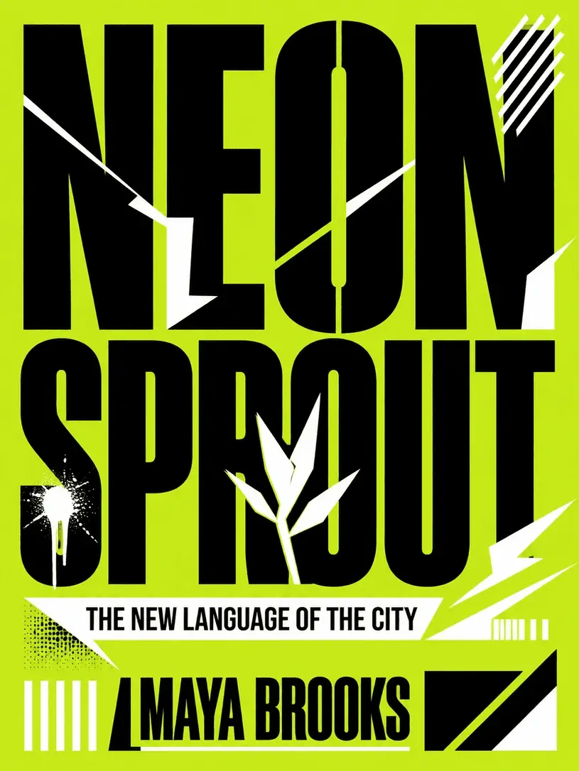
Lime green creates a bolder, more contemporary look than a classic book cover.
The large typeface and stark black-and-white contrasts make the design stand out easily from other books on the shelf.
This cover isn’t trying to look understated.
On the contrary, it directly reflects the energy of a book written about youth culture, city life or the creative industries.
When paired with the right content, it can be quite memorable.
The Green Atlas

This cover, featuring jade green, has a more premium look thanks to its orderly layout and delicate gold lines.
The linear elements, reminiscent of map details, add meaning to the design that goes beyond mere decoration.
In books on travel, culture, geography or general knowledge, a cover of this style creates a sense of reliability.
The design is striking yet understated; it manages to look serious without being overly academic.
What should you bear in mind when designing a green book cover?
When designing a green book cover, the first step is to determine the mood the book aims to convey.
Sage and mint green offer a calmer, softer and more approachable look. Darker shades, such as emerald, forest and hunter green, create a more powerful, literary and prestigious atmosphere. Bright tones like lime green are suitable for a more experimental and youthful design language.
The choice of typography is just as important as the colour.
Serif typefaces lend the cover a classic and literary character, whilst sans-serif fonts provide a more contemporary look. Gold details can create a luxurious effect when paired with dark greens.
Cream and off-white tones, on the other hand, help the cover appear softer.
A well-designed green cover does not necessarily have to directly explain the book’s content. Sometimes the right colour, the right use of white space, and a few careful details are enough to convey the book’s atmosphere.