This hardware is the most fundamental part that allows us to communicate seamlessly with screens.
For some users, a simple, single-color keyboard enhances concentration, while for others, bold, contrasting color palettes spark creativity.
On this page, we bring together keyboard designs created with 10+ different color palettes.
For each palette, we address not only aesthetic concerns but also factors such as daily use, long-term typing experience, gaming, coding, and ergonomics.
Because how a keyboard feels when used for extended periods is just as important as how it looks.
Keyboard Colors
Time spent at the keyboard isn't limited to just typing; studying, taking notes, and completing assignments are also important parts of this time.
Especially for students, spending long hours at the keyboard is inevitable.
At this point, you don't have to do everything on your own; it's possible to manage some time-consuming keyboard tasks more intelligently.
For tasks that require focus and time, such as writing articles, using the EduBirdie assignment writing service can be a way to lighten the load.
The goal is to use the keyboard more efficiently and save energy for tasks that really matter.
In the remaining part, we turn to the enjoyable side of the task: colors.
Although the effect of colors on the keyboard has not been proven by clear experiments that directly measure typing speed, studies on visual perception and attention point to certain trends.
Colors can affect the distinguishability of keys and the direction of visual focus.
In practice, this is associated with certain tones creating a calmer feeling during long writing sessions, while contrasting combinations can keep attention more alert.
In short, keyboard colors alone do not guarantee efficiency; but they can play an indirect role in the feel of use and personal comfort.
Let's dive into the real life palette examples on keyboards.
Muted Notes
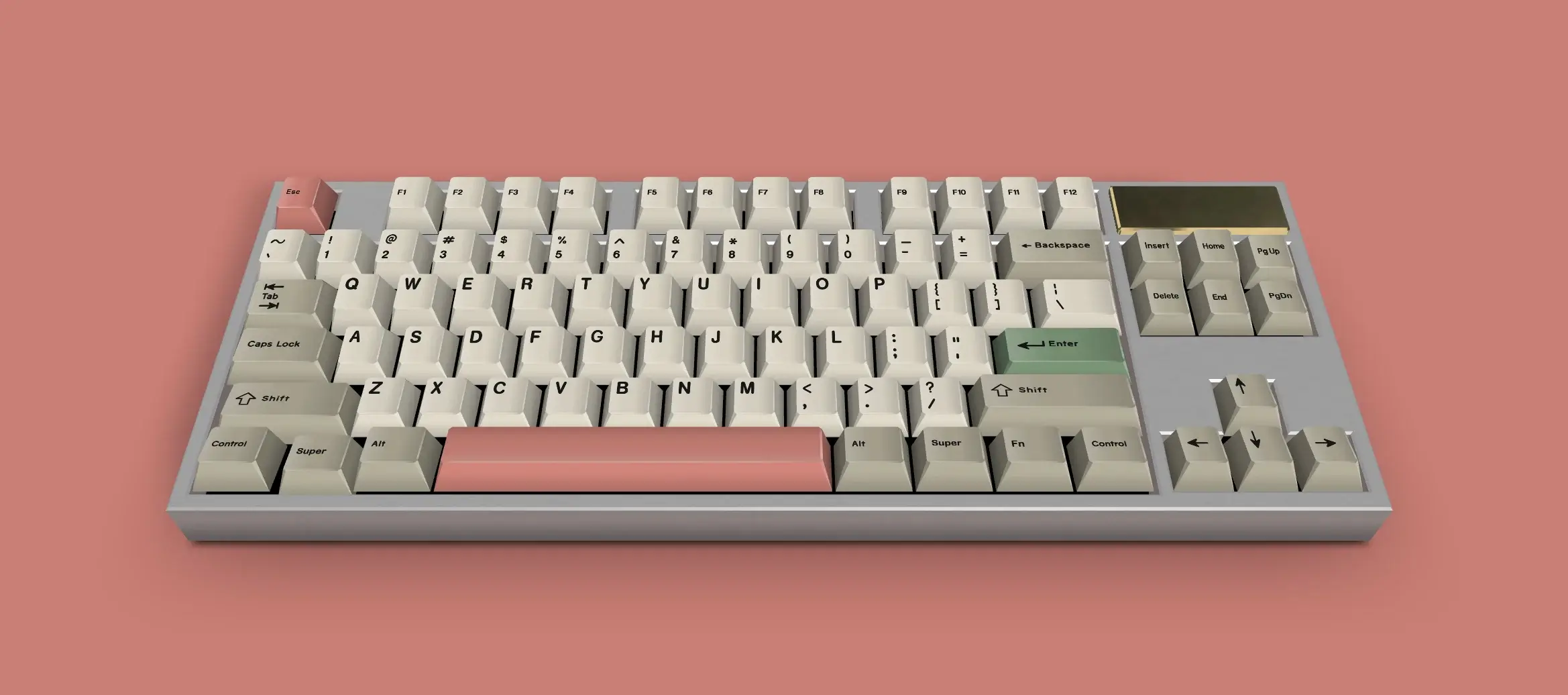
This palette offers a calm and low-contrast feel. Soft Ivory is easy on the eyes, while Warm Taupe provides a balanced base for the keyboard; Dusty Coral adds a subtle accent without disrupting the palette.
During long typing sessions, the keyboard eventually becomes unnoticeable — which is generally a good sign.
Muted Notes is for those who prefer “let the color fade into the background, let the text take center stage.”
Daily Bread
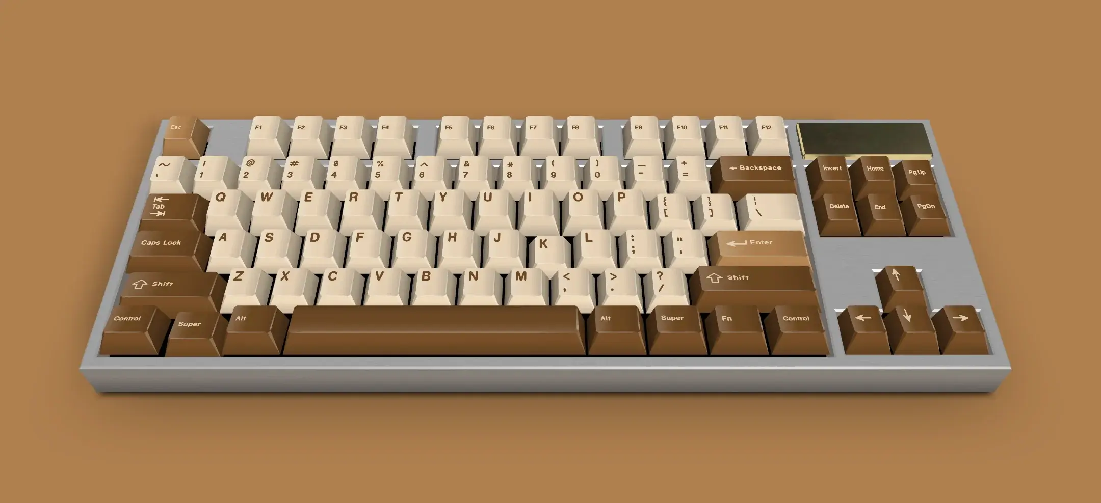
Fresh Flour creates a clean and comfortable base on the main keys, while Warm Wheat adds a soft transition feel to the keyboard. Toasted Crust emphasizes the function and edge keys, giving the keyboard a visually “settled” feel.
It doesn't try to be flashy; it inspires confidence.
Launch Mode

This keyboard doesn't just work quietly, it takes center stage. Rocket Red instantly grabs attention, Dark Violet adds a sense of hidden power and technology to the keyboard, while Signal Yellow constantly says “be ready.”
It's a combination that boosts energy just by sitting on the desk, making people turn and look again.
With this keyboard, no one will think you're just writing an email; it gives the impression that you're launching, compiling, or firing something.
Launch Mode is for those who don't just want to be cool but also want to show off a bit. I know not every move we make is virtuous; sometimes we like to show off, and that's okay. Even if it's a waste of time, it feels good.
Crimson Command
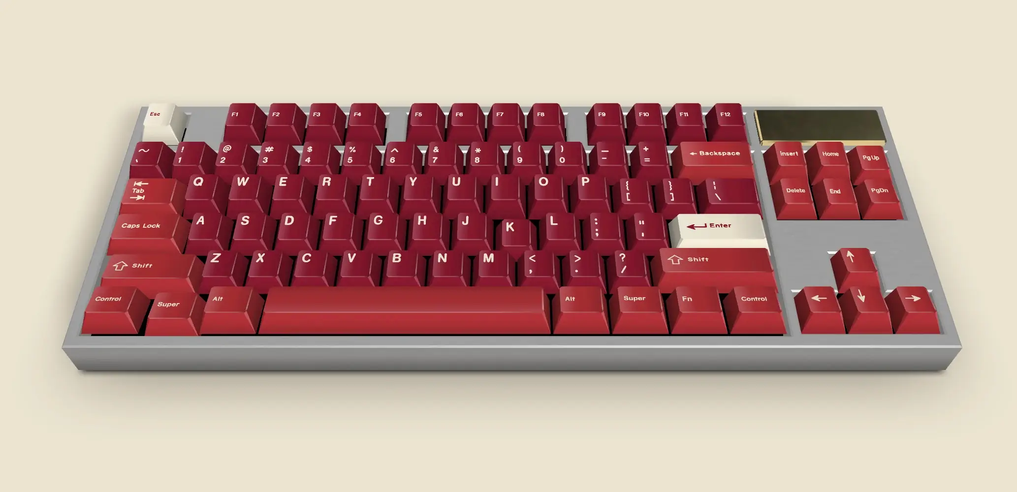
Crimson Command is bold, to say the least. When Deep Crimson, Royal Red, and Ivory Accent come together, the keyboard doesn't stay quiet; it commands authority on the desk and gives you that “I'm in control” feeling.
Deep Current
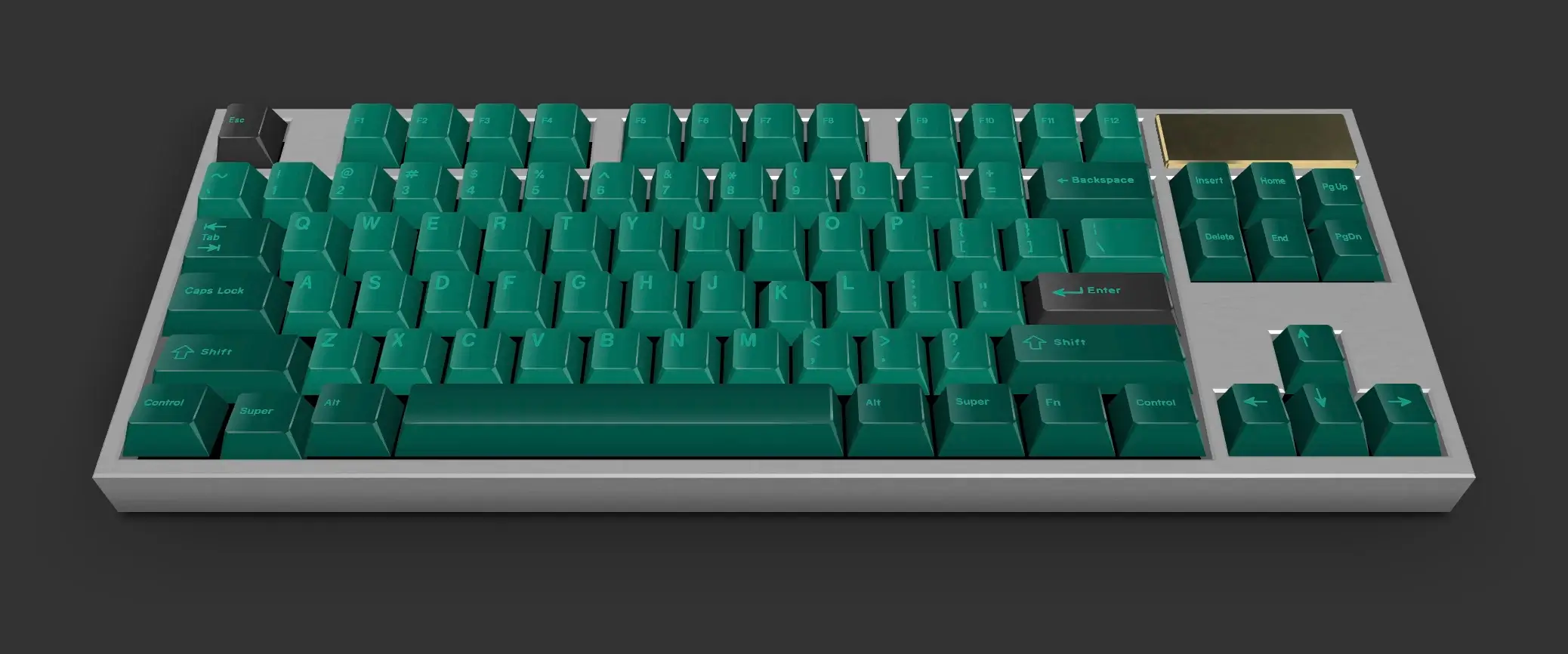
Emerald Teal, Dark Pine, and Carbon Gray come together to create a quiet yet powerful keyboard.
No showiness, no shouting; just a quiet confidence that sits on the desk without saying “I'm here.” A cool, clean, and controlled vibe.
Last Word
The common thread among the keyboard palettes in this article is that they don't claim to be the only right choice.
Some are calm, some bold, some completely on stage; each represents a different desk vibe. Color selection is partly a matter of taste, partly a matter of mood.
The best palette is the one that feels most natural to you.
You can discover these and similar keyboard color combinations on Eggradients.com and continue developing your own style from there.