A handful of M&M’S brings saturated colors into one small space. Looking at the shells is a familiar way to compare a bright red, a warm yellow and a cooler green. For a dessert table or a candy-inspired graphic, the proportions can matter as much as the individual hues.
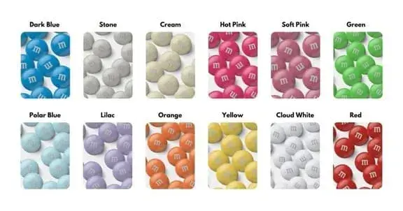
The 12 shades below offer different starting points for a palette. Names such as Stone, Polar Blue and Cloud White describe the shades discussed here; they are not a universal list of official product names. The brand’s single-color selection varies by product and market.
Does the shell color tell you the flavor?
Choose the product variety separately from the color. A pale shell alone does not establish a cream filling, and orange coloring is not enough to identify an orange-flavored product. The brand sells single-color milk chocolate and peanut varieties. Check the product name and label for the filling and ingredients.
Dark Blue
In 1995, a public vote brought blue into the M&M’S assortment, according to the brand’s history.
Dark blue gives a mixed-color display a deeper area beside the brighter shells. On a white table, it can carry the darker half of a blue-and-white combination. Add yellow for a sharper warm accent, or keep the surrounding paper and ribbons pale if you want the blue to remain prominent.
Stone
Beside pink or yellow, a stone gray gives the arrangement a neutral area. It could be the paper behind the candy shapes or the cloth beneath a bowl. Matching those grays closely is optional. A warmer cloth and cooler gray candy can remain visibly separate, even when neither is especially dark.
Cream
Cream leans warmer than a clean white. Beside chocolate brown, that slight yellow cast can make the two colors feel closer together. An ivory swatch is a useful screen reference when choosing labels or a background for this direction.
Hot Pink
A few vivid pink pieces among mostly white ones can be enough for a small bowl. More pink produces a denser block of color. Dark blue paper sharpens the separation around the pink; pale pink paper brings the colors closer together.
Soft Pink
Soft pink leaves more room for nearby colors than a saturated pink does. Three combinations worth trying are:
- Pink and white: a small difference in hue, with plenty of light areas.
- Pink and brown: a pale color beside a much darker one.
- Pink and lilac: neighboring pastel directions that need a little space between them.
Use the packaging, a plate or a paper label to introduce the second color if you do not want to mix candy varieties.
Green
The green in the reference image leans toward yellow. Give it most of the space in a pink-and-green illustration, with pink confined to a few small shapes. A darker, bluer green would change this into a different pairing even if the pink stayed exactly the same.
Polar Blue
Placed between white and dark blue, the pale blue shade creates a step in lightness. On a white invitation, its outline may need a slightly darker edge. On dark blue paper, the pale shape already has a clear boundary, so that extra edge may be unnecessary.
Lilac
Cream and cool white give pale lavender two different backgrounds. The cream introduces a warmer tint beside the purple. White keeps the combination cooler. Put both backgrounds beside the same lavender swatch to judge that small difference.
Orange
Against blue, a small orange area can become a focal point. Group it with yellow and red and the whole arrangement shifts warmer. A side-by-side sketch with the same orange shapes makes the effect of those neighboring colors easier to see.
Yellow
Yellow can connect the warm reds and oranges in a mixed display. A golden yellow reference offers one direction for matching paper or ribbon to a warm palette. For text on a yellow label, check the actual foreground and background colors together; a bright-looking swatch alone does not establish readable contrast.
Cloud White
On a white shell, the printed letter has a different background from the lettering on a dark piece. That detail can be useful in a candy-inspired graphic: a pale shape might need a gray outline, while a dark shape can carry a light letter without one. White and cream decorations also deserve a side-by-side check under the room’s lighting.
Red
Concentrating red in one bowl gives a dessert table a different layout from spreading it across every dish. The same choice applies to a graphic: one red cluster, or small red marks repeated across the page. Blue and white leave the red more isolated; yellow and orange draw it into a warm group.
Three palettes to try on screen
These HEX values are our illustrative design choices, not official M&M’S color codes or measurements taken from candy shells. They are starting points for a graphic, invitation or background.
| Direction | Light area | Supporting color | Accent |
|---|---|---|---|
| Dark blue and warm yellow | #FFF8E7 | #243A73 | #E6B638 |
| Pink and lilac | #FFFDF8 | #D8C4E8 | #E79AB9 |
| Orange on a cool background | #F4F7FA | #25477A | #F28B35 |
Open the palette visualizer and change how much space each color covers. For a controlled comparison:
- Keep the background color fixed.
- Try one large accent area, then several smaller areas of the same color.
- Compare the layouts at the size you intend to use.
A short note on the name
The two initials refer to Mars and Murrie: Forrest Mars and Bruce Murrie. The brand’s official history explains the name and the 1995 blue vote. Color availability has changed over time, so use the current product selection rather than a fixed worldwide color count when planning an order.