While we often associate pastels with spring and Easter, they can be applied throughout the year to give your site a boost anytime.
Pastel Color Palettes
Do you love the look of pastel color palettes? Do you often struggle with the best combination colors in order to communicate your message? Whether it is creating an infographic, flyer or website design, using pastel colors will give your design a fresh and soft feeling.
Pastel colors are best described as pale, soft toned and close to white with little or no tints of another color. Because it is made from the hue of any other color, it can be easily distinguished using its base color. Most commonly we see this type of color in the protagonists of various anime series.
They serve as a sharp contrast to the more dominant and somewhat intense color palette found in the background.
Pastel Color Names
Pastel Green - #77dd77
Pastel green is a color made by mixing blue and yellow. It is not the strongest of colors but when used in a right combination it can be very effective. It is a color which makes people feel calm, relaxed and happy. Pastel colors are for both indoor and outdoor spaces where they add a touch to your decor.
Pastel Brown - #836953
Brown is one of the most beautiful colors and it makes a whole lot of difference to interior decorating. Brown can be soft or used as a strong background; it can add warmth or cool mood.
In fact, brown has so many shades that you could technically paint your whole room in this color only and still not get bored.
Baby Blue - #89cfff0

Baby Blue is one of the nice colors and that is why it is mostly chosen by the people for giving the nice look to their walls.
It gives a nice feeling in your room and in your heart. Only a few people know about this color, that's why it is not used by everyone; only those who are aware of its use are using this color.
Pastel Turquoise - #99c5c4
One of the most dramatic colors that you can use for design is turquoise. If used correctly, it offers a great chance to draw people’s attention and to create a positive and pleasant impression on them.
In my opinion, turquoise has two “colors” – light and dark. The color between both ranges creates the unique tone which could be described as Pastel Turquoise Color. It is softer than the color of plain turquoise and because of this attracts attention to itself in a more refined way.
Blue Green Pastel - #9ADEDB
There are numerous color combinations to create the perfect aesthetic for a website. Some colors, however, are more ideal than others.
And no, I’m not talking about red and green. Blue green pastel color is one of the best colors to create a specific atmosphere that focuses your audience’s attention on the call-to-action.
Persian Pastel - #aa9499
Before you hit on the idea of decorating your house with Persian Pastel color, one should consider certain things. One of these is the importance of color combinations of the Iranian pastel color before applying it to your present home.
For no two homes are alike in terms of exterior or interior architecture; each home has its own kind of individuality and style.
Magic Mint - #aaf0d1
“Mint” is a tricky color to wear. It looks very different on different skin tones. For example, a fair-skinned person can pull off mint with just mascara, while a black-skinned person might look ridiculous if they try to replicate that look.
Light Pastel Green - #b2fba5
Light pastel green has a lighter shade when compared to regular pastels. It has bluish and yellowish touch in it which gives it a light tone of green.
The different shades exhibited by this color along with its calming tone help to keep your home or office space calm and peaceful.
Pastel Purple - #b39eb5
What does the color Pastel Purple mean to you? It’s a delightful mix of violet and pink coral. It is the color that causes a lot of people to get headaches when they stare at it for too long.
That’s because it is such a beautiful, distinctive shade that really causes the human eye to strain as the brain tries to figure out just how distracting that particular shade of purple really is.
Pastel Lilac - #bdb0d0
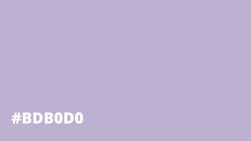
The color of the year 2016 in the fashion industry is pastel lilac. Lilac provides a refreshing and calm mood, because it’s lavender hue little by little replaces the coldness of the winter palette. Above all shade pleasantly cool purple shades, lilac can be combined with almost any color, making the room more spacious and airy.
Pastel Pea - #bee7a5
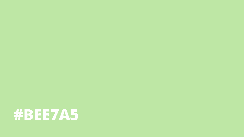
Pastel is the color of calm and relaxation. It can be used in almost any room of your house, as it’s one of those colors that goes with anything. And because of its relaxing quality, it will help you stay focused and productive during a study session.
Light Lime - #befd73
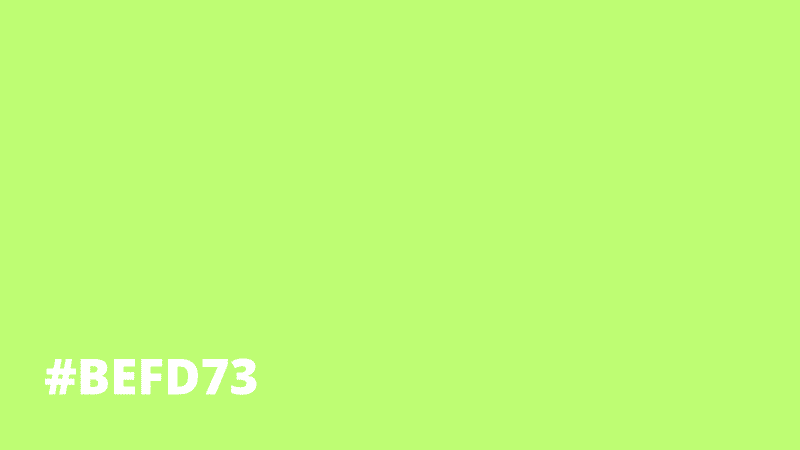
Lime green is a color that can be seen in many different places. It can be described as fluorescent green or aqua green, and is also referred to as Light Green or Apple Green. Lime green is utilized by many people because of the fact that it is appealing to the eye and a great color to brighten up any room.
Light Periwinkle - #c1c6fc
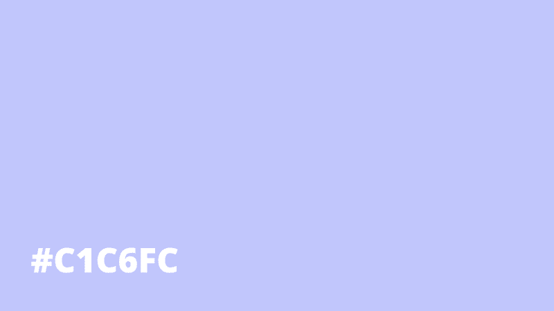
Light purple is part of the lavender family and it appears similar to blue. It may look like a light sherbet shade or a soft, cloud purple color. If you're looking for a color scheme for baby items or just want something soft, you are in the right place.
Pale Mauve - #c6a4a4
Pale Mauve was a color that I rediscovered a couple of years ago. It is a shade that has a pinkish tone to it but can be very versatile. It can be used on your birthday cake or you may use it for your room's interior design.
It is also common for women to use this color when applying their nail polish, especially for special occasions like weddings. Even though this color is not very popular in interior design lately, it is still chosen by many people as the main color of the room they are designing.
Pastel Violet - #cb99c9
Pastel violet color is a light shade of purple that can be combined with dark blue or pink to create a beautiful palette. It is one of my favorite colors because it inspires thoughts of the ocean, which is a particularly beautiful scene in the morning when the sun begins to rise against the sea.
Pastel Yellow - #fdfd96
Pastel Yellow is a color that has a warm but slightly dull yellow hue. It displays the qualities of yellow and a tint of orange all at once. On color scales, this color falls under 0% to 50% saturation with a hue of 30 degrees.
The saturation percentage indicates the presence of black in the color while the hue denotes its source.
Pastel Red - #ff6961
Pastel Red is a dark red color but it also has a tint of pink to it. Red is the color of love and passion, which makes it the perfect choice for romantic occasions. Red is also the most dominant colour one could possibly have in a bedroom, kitchen or even bathroom.
It’s sultry appearance is sure to turn heads anywhere it’s used and its bold features are sure to impress and attract many people.
Pastel Orange - #ff964f
Pastel Orange is a supplementary color scheme derived from the standard complementary colors of lavender, green, and red. When placed next to each other, these three colors combine to form a peaceful orange tone that helps one relax after a long and hectic day.
While addition of yellow tones naturally gives off an air of cheerfulness.
Related: Pastel Gradients
American Pink - #ff9899
The color we are going to talk about today is something I have been seeing around me a lot these days.
For all those men and women who love to color their hair pink, this article is for you all. Just to make it clear that this article is all about the American Pink, not a kind of a pink that comes from somewhere else even if I do call it an international color.
Baby Pink - #ffb7ce
Baby Pink color is a very soft shade of pink, it can be considered as a baby pink shade, because it’s color of light and soft pink.
Pink lovers have been using this color in girl’s nursery furniture or bedroom decor, selecting this shade will create calming and softer ambience to a room. It is also an easy on the eyes color since it can be soothing to the eyes without being overly flashy.
Baby Purple - #ca9bf7
Baby purples are what I'd like to name these little bundles of joy, more commonly known as baby girls. Yes, we’re talking about the soft and gentle background coloring that makes for beautiful shades of purple.
You know exactly what I’m talking about when you think of baby girl pink. These ranges of light purples and blushing pinks pop with vibrant energy in such a cute and comical way; you can’t help but smile every time you see them.
Pastel Color Names
.webp)