When used well, it does not turn the cover into something that screams; on the contrary, it can convey emotion, era, character and rhythm through a single colour.
It’s interesting to see that, in these examples too, red doesn’t serve the same purpose on every cover.
In one instance it evokes a sense of nostalgia; in another, it conveys a sense of danger; and in yet another, it becomes the central element that highlights the typography or the surface.
When looking at cover design, one must consider not just the colour itself, but also how much space it occupies, which shades it pairs with, and how it relates to the text.
For those wishing to grasp a long book quickly, a cover can sometimes provide a first impression, and at other times accelerate the decision to read; at this point, using a tool such as a PDF Book Summariser to access the book’s content more quickly can add an extra layer.
Ulysses by James Joyce
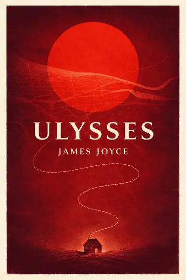
The red on the cover of Ulysses does not look like a colour chosen merely for decoration; rather, it carries a certain mental weight.
The large red circle in the centre could be a sun, an eye, or even the novel’s own inward-turning consciousness.
The small house below and the narrow path leading to it, meanwhile, evoke a sense of humanity—small yet stubborn—in the face of this vast inner world.
The dark texture and lines in the background are also significant.
Whilst each element appears very simple on its own, together they create a sense of slight chaos, disorientation and confusion.
This approach is quite fitting for a text as layered and challenging as James Joyce’s.
In Search of Lost Time by Marcel Proust

Here, the red feels softer, more like a memory. When the clock, the profile of a face, the coffee cup and the winding road come together, the cover does not directly narrate an event; rather, it layers fragments from within the memory.
As Proust’s world is built upon time, emotion and association, this warm red-orange palette works well. Its balance with cream tones also prevents the cover from feeling heavy.
The result is not dramatic, but rather a surface that evokes the feeling of looking back at the past.
The Great Gatsby by F. Scott Fitzgerald

The visual style chosen for The Great Gatsby is somewhat more fragmented and cinematic.
When the face glimpses through the torn layers, the city skyline and the distant lights come together, the novel’s glittering yet fractured world is brought to life on the cover.
The Catcher in the Rye by J. D. Salinger
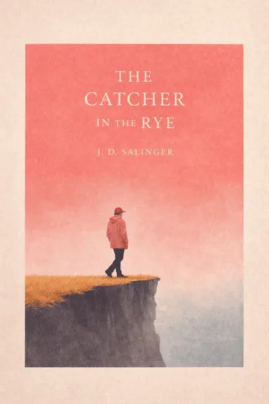
Here, the red is far more subdued than in other examples.
When the pastel pink-red sky, the tiny figure and the cliff’s edge come together, a sense of loneliness and alienation takes centre stage rather than a loud, striking effect.
The beauty of the cover lies in its refusal to try to prove anything. By diminishing the character and expanding the void, it brings the mood to the fore.
This simplicity fits well with the novel’s introverted, restless and somewhat fragile tone.
A Bright Ray of Darkness by Ethan Hawke
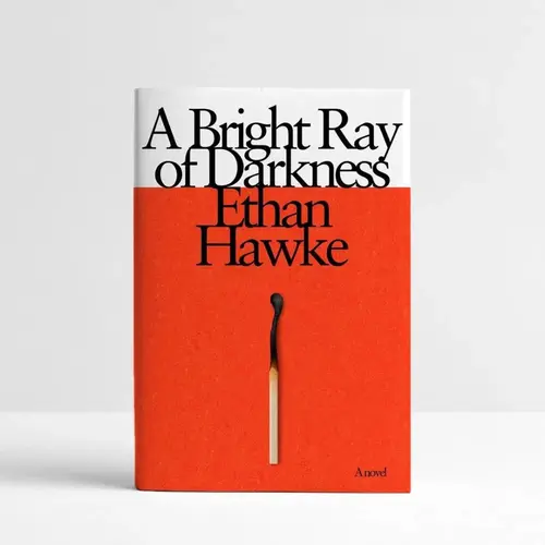
Sometimes a single idea is enough to carry a cover.
Here, too, the plain red area at the bottom and the single match in the centre achieve this.
The image is very simple, but that is precisely why it is not easily forgotten.
Whilst the black typography at the top creates a more intellectual and controlled atmosphere, the red block at the bottom evokes a sense of tension, burning, and energy building up from within.
There’s no excessive explanation, yet the cover still gives the impression that something is about to ignite.
The Need for Roots by Simone Weil

The idea of extending the root form onto the cover is actually quite straightforward, but it doesn’t look clunky here. The way the red branches out across the purple-pink background lends the cover both an organic and an intellectual quality.
For a text with the philosophical weight of Simone Weil, this abstraction is a good choice.
Rather than attempting to explain the book, the design opens up an emotional space for it.
The red, within this space, oscillates between vitality, connection and a slight fragility.
Moonglow by Michael Chabon

The best thing about the Moonglow cover is how the object itself translates into the design language.
The matchstick form is not merely visual; the title, author’s name and layout are all structured around it. Thus, the red transforms into both the object and the typography.
The use of texture further enhances the design. The subtle tactile quality of the surface lifts the cover out of sterility, giving it a warmer, more handcrafted feel.
There are designs that are clever without being pretentious; this is one of them.
The Internal Colony by Sam Klug

Here, the orange tones verging on red and the stark black figures create a more political energy.
The fact that the typography has been deliberately left slightly unbalanced and rough also lends the cover a controlled sense of unease.
Nineteen Eighty-Four (1984)

The small black detail in the centre and the minimalist layout further enhance the cover’s impact.
I think it’s a particularly powerful choice to convey the novel’s dystopian harshness through colour and proportion alone, without resorting to excessive symbolism.
Cherry by Nico Walker

The Cherry side features a more pop, louder and younger visual language.
With large typography at the top and a repeating star pattern at the bottom, it almost gives the impression of a poster or fanzine aesthetic at first glance.
This sense of repetition makes the cover feel a bit chaotic, but that’s not a bad thing.
On the contrary, it lends the book a slightly disorganised, energetic and unrestrained air.
Because red, white and pale pink are used together, the result doesn’t feel harsh; it remains a bit cheeky, a bit bright, and a bit deliberately exuberant.
Last Words
The red cover design is not fixed to a single meaning; it can evoke a wide range of themes, such as love, danger, memory, anger, loneliness or political tension.
The real issue is not how much red is used, but rather the shade, the negative space, and the visual concept with which it is combined.
This is precisely what makes these examples so striking: the same colour takes on a different mood in every book.