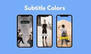
There is no clear formula for what is and what is not watched on the internet. If there was a prescription for this, everyone would follow it!
There really isn't?

Maybe there is.
You can increase your chances of going viral by following some clues, even if they are not obvious!
Let's go back to the relationship between colors and subtitles!
What is the purpose of subtitles? To read it. Nobody puts a subtitle in the middle of a video for a video effect! So how to make it readable?
By choosing the right colors of course!
Wait a minute, I can hear you asking... Well, the colors of the video are constantly changing. It is not always possible to provide contrast with the right color!
Yes, it used to be impossible... but if you add a label to your subtitle(or shadow), it will be much more readable!
By the way, if you are impatient and don't have time to read the whole article, let me tell you at the beginning what I should tell you at the end.
Black on yellow is the simplest and fastest solution!
But to perfect this solution, I suggest you read the rest of the article!
You realize how far artificial intelligence has come! It used to cost a lot of money to edit videos, find content, even localize your video in local markets!
For example, how long would it take to translate french video to english? Depending on the length of the video, at least 3 hours!
Now these things have become much more efficient. But even if you spend less time translating, if you don't choose a readable subtitle color, your views will still be low.
So I say it again! Colors are important in subtitles too!
If we are convinced that they are important, let's see how we can make them more perfect!
Black on Yellow
-1.webp)
Yellow is already shaded, it has even been used in movie subtitles for years! But putting a shadow underneath is a bit old-fashioned.
A nice solution would be to make the background yellow instead of the subtitle!
By the way, in the example above I chose an image in yellow tones, because as you can see, it can be read clearly even in similar tones!
Black on White
-1.webp)
Black and white is one of the safest to use. If the yellow option above clashes with your brand's colors, of course it wouldn't make sense to use it!
It can be applied to any video and is practical.
Green on Black
-1.webp)
Another quick and easy solution is to combine green with black. Yes, it may seem like an ambitious combination, but believe me, it is a healthy solution in terms of creating contrast.
Green is always used by influencers with millions of followers!
Note: Finally, you may have wondered... The most used font in subtitles is Rubik. It's completely free and one of Google's open source Fonts!
I always used Rubik's in the examples I gave!