Orange Red
August 11, 2025
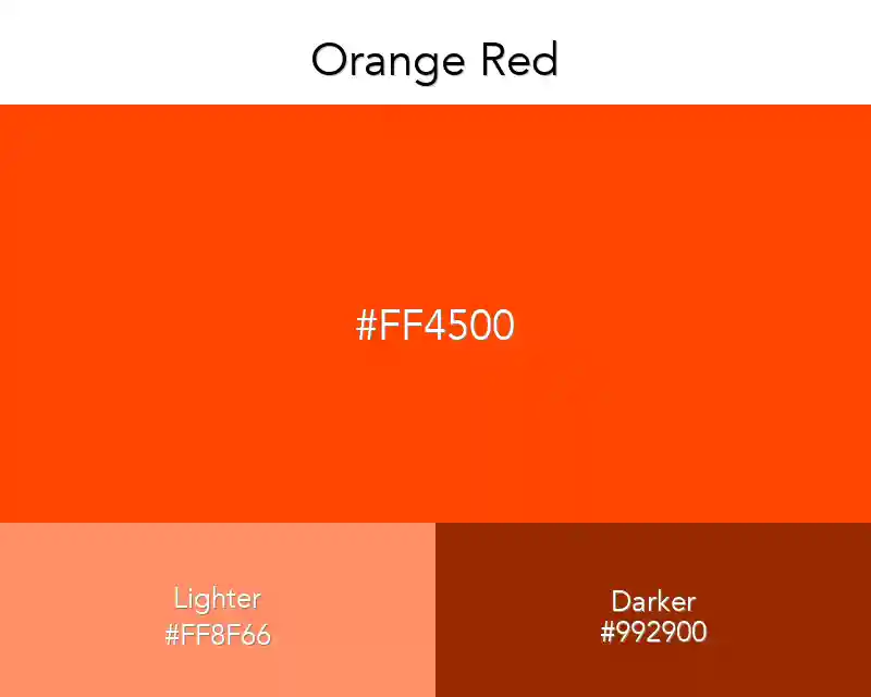
Orange-red is a warm shade of orange. It is also an intense shade of red. It can be obtained from a mixture of two colors. This was the first thing I thought of.
No items found.
#ff4500
rgb(255,69,0)
Color Conversions
Real Design Examples 👇🏽
Color Combination
Palettes
Fashion
No items found.
Interior
No items found.
Wallpapers
No items found.
Patterns
No items found.
Best Match
Tints
Shades
Triadic
Monochromatic
Analogous
Complementary
Orange is a color that I really like, but can’t seem to use that much on my products or branding.
This is because the color orange is really bold and bright, and often times too bold and bright for many clients. So why do I keep talking about orange if it can’t be used as often? Well, it’s simple: orange red is the prettiest version of this color!.
Related: Orange Gradients