A white surround makes the warmth easier to spot: ivory leaves only a faint tint, while cream looks closer to pale yellow. Switch the preview to gray, then dark, to judge each against the background you plan to use.
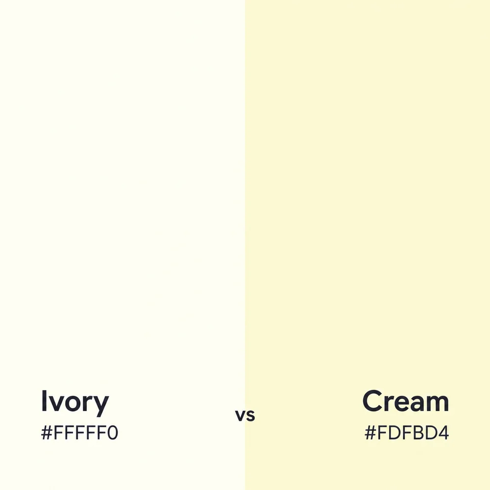
Keep a separate color for the lettering. This pair is too similar in lightness to use one as small text on the other. The comparison uses Eggradients’ two linked HEX references; fabric and paint names can cover other shades.