Auburn Colors
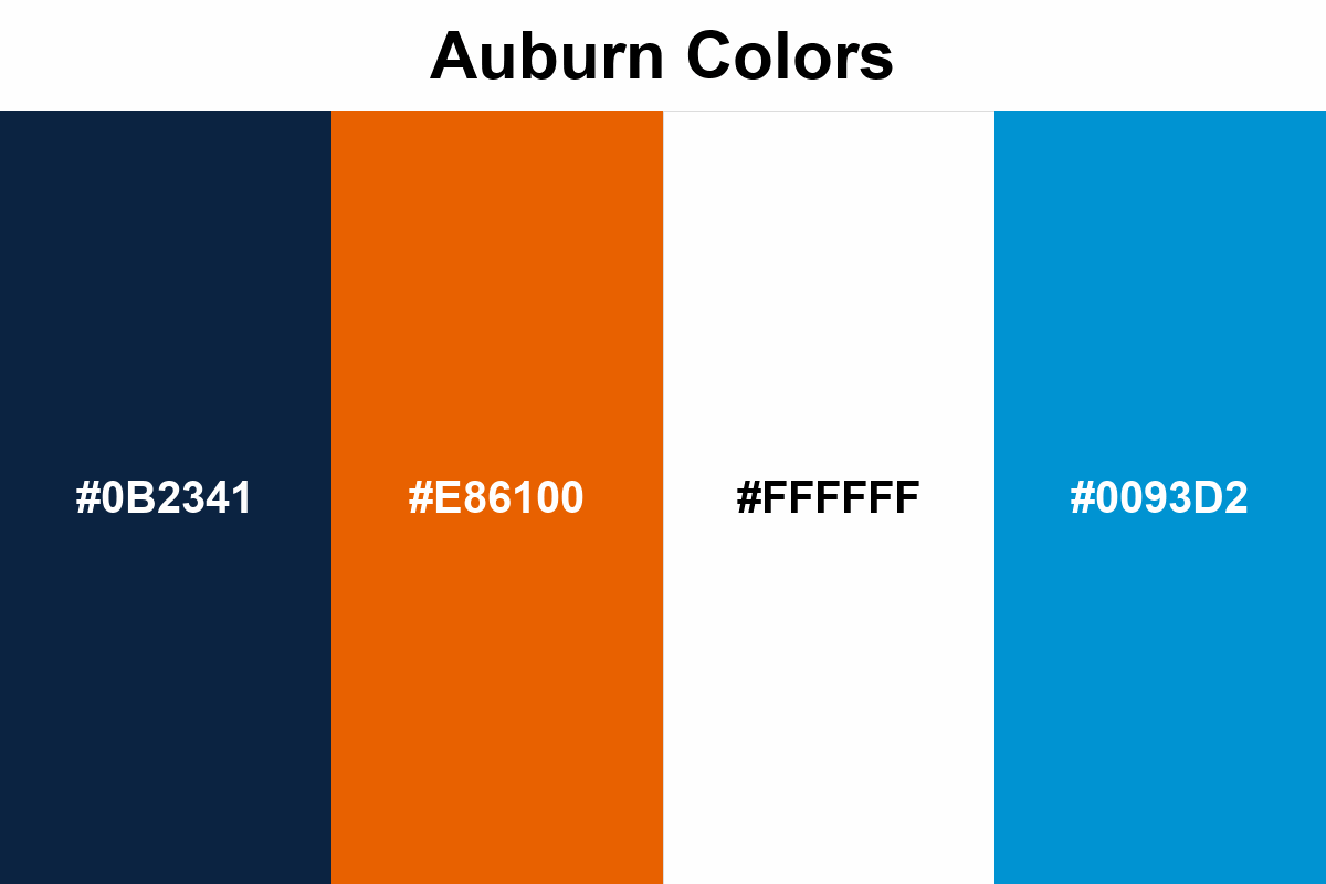
The Auburn color palette establishes a clear contrast scheme, using Auburn Blue as the primary carrier color and Auburn Orange more in accent areas.
#0B2341
#E86100
#FFFFFF
#0093D2
No items found.
Palettes
Auburn Blue carries large areas and headline weight; Auburn Orange steps in for calls, emphasis, and highlighting in small but critical spots.
Auburn makes the design breathe easier, especially since it encourages a white background; orange also looks stronger when used “less but clear” rather than spread across large blocks.