DHL Colors
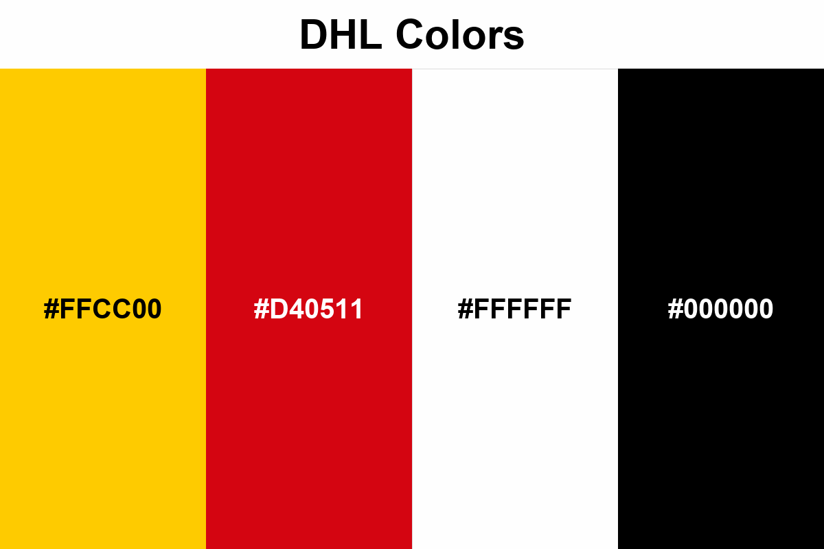
When you think of DHL, that high visibility comes to mind, and it's the combined work of these two colors: #FFCC00 completely illuminates the scene, while #D40511 tells the eye where to look.
#FFCC00
#D40511
#FFFFFF
#000000
No items found.
Palettes
These colors work as if designed to be read from a distance: yellow stands out immediately, even on a crowded screen; red also enhances the sense of speed and action.
In the design, if you save red for points such as lines, icons, small headings, or CTAs rather than large blocks, yellow looks more premium; when you keep white as space and black for text, the result is clearer.