Houston Astros Colors
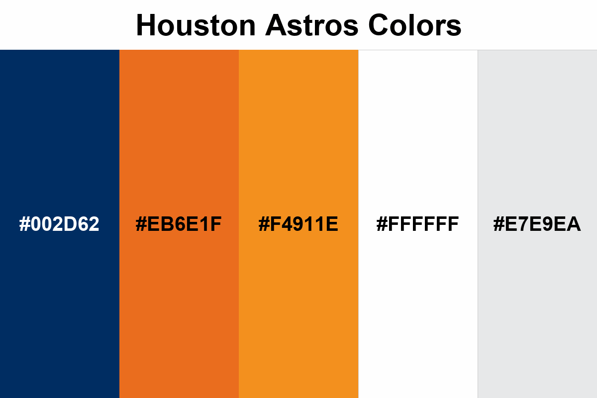
The Houston Astros color palette features a dark navy base, enhanced with two-tiered orange accents and balanced with white/gray neutrals.
#002D62
#EB6E1F
#F4911E
#FFFFFF
#E7E9EA
No items found.
Palettes
We gave you the colors, but we didn't tell you how to use them most effectively.
Maybe you don't need this, but if you do, here's what I can say.
The best results in Astros visuals come from layouts where navy blue acts as the “backbone of the background”; orange is more effective in accent details rather than large blocks.
Using two shades of orange at the same time softens the harshness created by a single orange: dark orange stands out strongly in the main emphasis and logo elements, while light orange provides a more refined transition in lines, shadows, gradients, and small icons.