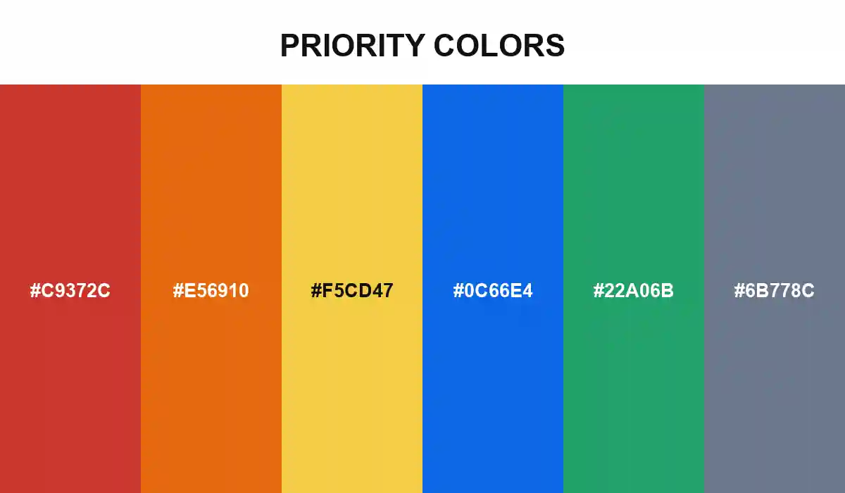
Priority Colors

A six-level system that controls how loudly each task can speak, while keeping status and urgency separate enough for dashboards, queues, and incident views.
#C9372C
#E56910
#F5CD47
#0C66E4
#22A06B
No items found.

Priority Colors is an attention budget disguised as a palette. Critical red spends the most of it, so it belongs only on work that should interrupt the current plan.

High orange shortens the horizon. Medium yellow keeps an item visible without turning every card into an emergency, while low blue lets useful work remain legible and calm. Green is reserved for closure, not importance; gray means the decision has not been made.

A reliable priority system still has to work in grayscale. Pair every swatch with a written level, a distinct icon or shape, and accessible programmatic text so urgency never depends on color vision alone.

Priority Colors
Build with ❤️ Anything