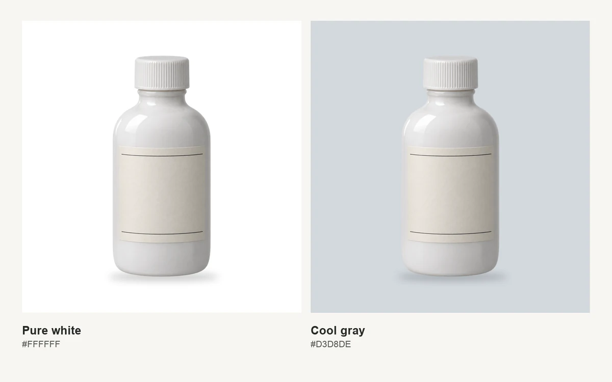
Three backgrounds to try on the same white bottle
Use one photo for the comparison. Keep the crop, exposure, and bottle position fixed. If the bottle gets brighter or the shadow moves between versions, it’s harder to tell how much of the difference comes from the backdrop.
Cool gray (#D3D8DE) is the first one I’d try for a catalog grid. It leaves room for whatever color is already on the packaging. If it reads too blue beside your other photos, pull a more neutral option from these shades of gray and compare the two at the same brightness.
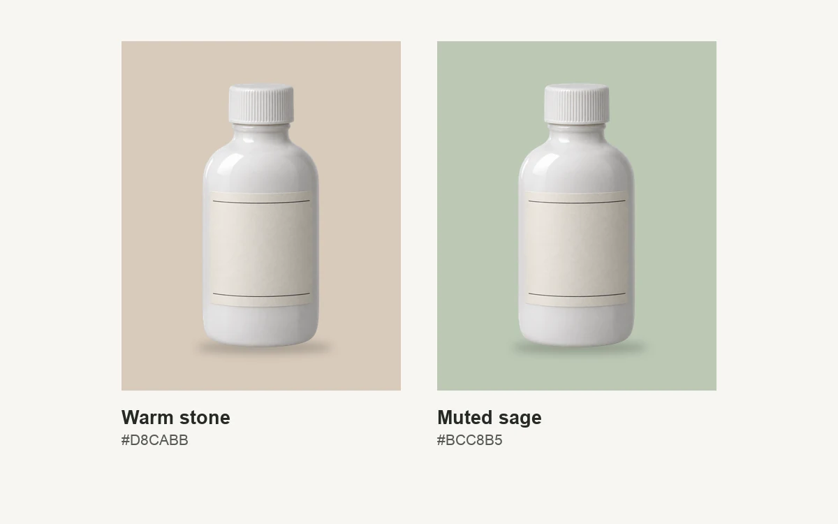
Warm stone (#D8CABB) is a good candidate for an ivory glaze or a cream paper label. In a physical setup, a colored surface can bounce some of its color back onto the bottle. Check the side closest to the backdrop. You want customers to see the glaze they’ll receive.
Muted sage (#BCC8B5) works well as a starting point for a campaign crop where the background is part of the palette. Look at the label before you commit. If it already has pale green lettering or a green border, gray may give those details more room.
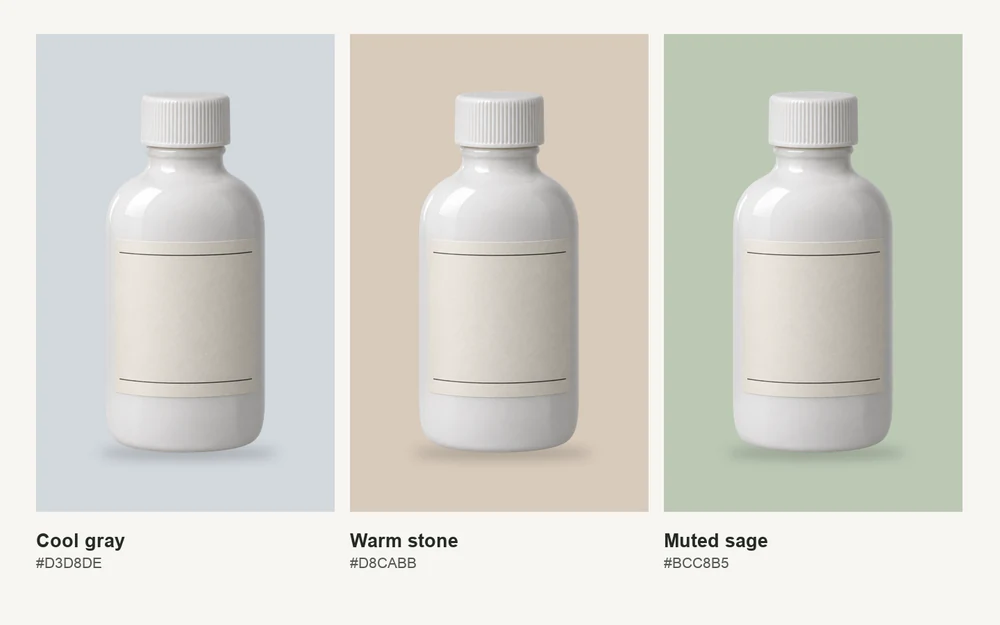
If the gray and the sage both give you a clear edge, put them beside the rest of the product line. A white bottle on sage might be easy to spot on a campaign page, then look like a different product variant when it appears between two bottles on gray. Keep the background consistent across related catalog images and use the colored version where the change is intentional.
Check the edges where the photo will appear
Shrink the image to its actual display size. Put each version into the product card or gallery slot you’re designing for. Look at the cap, the curve where the neck meets the shoulder, and the bottom rim. Those three spots tell you more than the color in the empty corners of the photo.
On a phone, give the thumbnail a quick glance before opening the full image. If you can see the body but miss the cap, check the background beside the cap first. If the bottom rim disappears, look at the contact shadow. A little definition at the base can help the bottle feel like it’s resting on a surface.
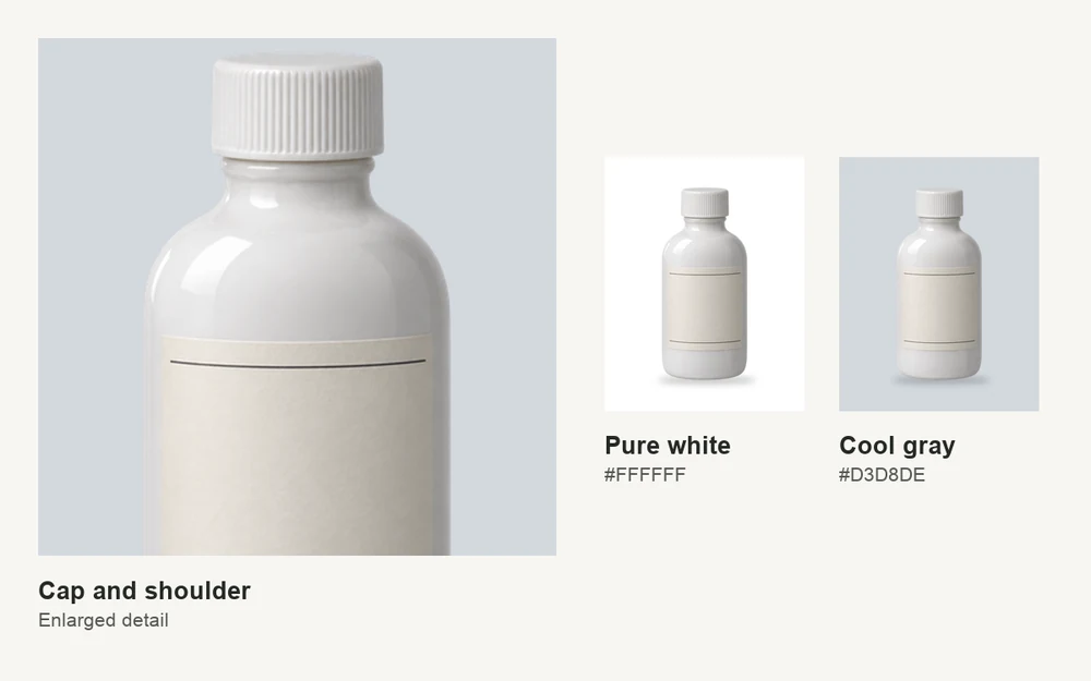
Fix the light if the detail is missing in the original. A darker backdrop can make a silhouette easier to see. If the highlights on the bottle are blown out, lower the exposure or soften the light and reshoot. A new background can’t recover the ribbing on a cap that the camera never captured. If the cap still has detail but blends into the backdrop, try a darker gray before changing the lighting.
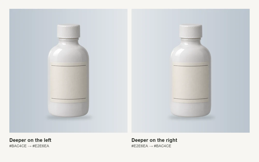
Keep gradients quiet around the outline. If a flat backdrop feels too uniform for a campaign image, use Gradient Maker to try a gentle shift from #E2E6EA to #BAC4CE. Place the deeper end behind the part of the bottle that tends to disappear. Check the label and the base again after moving the gradient.
If you’re shooting on colored paper, keep a neutral reference photo under the same light. Compare the white cap and the center of the bottle between shots. If the sage setup gives the glaze a green tint, move the paper farther back or try a neutral surface under the bottle before you settle on the color.
For a glossy bottle, check the narrow reflections along the sides as well as the color behind them. A bright strip can help trace the shape, but if it runs into a nearly white backdrop, that part of the outline can still disappear. Moving the light or rotating the bottle a few degrees can bring the reflection inward. Check the label after you turn it. Even a small change in angle can move glare across the print, especially if the label has a glossy finish.
Make the final call at thumbnail size
If you’re down to warm stone and muted sage, try both behind the same bottle in Higgsfield’s AI Image Editor. Ask for a background change and compare each result with the source photo. Zoom in to check that the cap shape, label details, and glaze still match, then look at the versions at thumbnail size again.
Pick the backdrop that makes the bottle easiest to recognize in the grid where it will actually sit. Save the HEX value with the crop and lighting reference so the next white product has a sensible starting point.