For a gift, a zodiac palette can be a playful starting point. The recipient’s own favorite color is a better guide than their birth sign alone.
Aries Colors with Meanings

Red: The Power Color of Aries
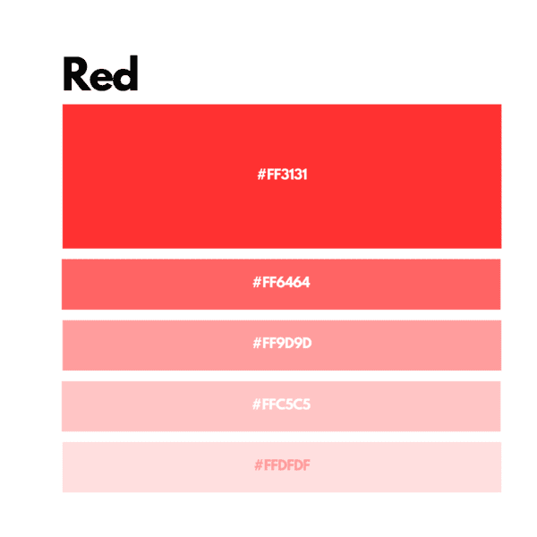
In astrology, red is associated with courage, energy and leadership. That symbolism explains its place at the center of this Aries palette.
Orange: Adventure and Optimism

Orange keeps the warm direction of red while shifting toward yellow. It suits an adventure-themed version of the palette.
Yellow: Source of Joy and Vitality
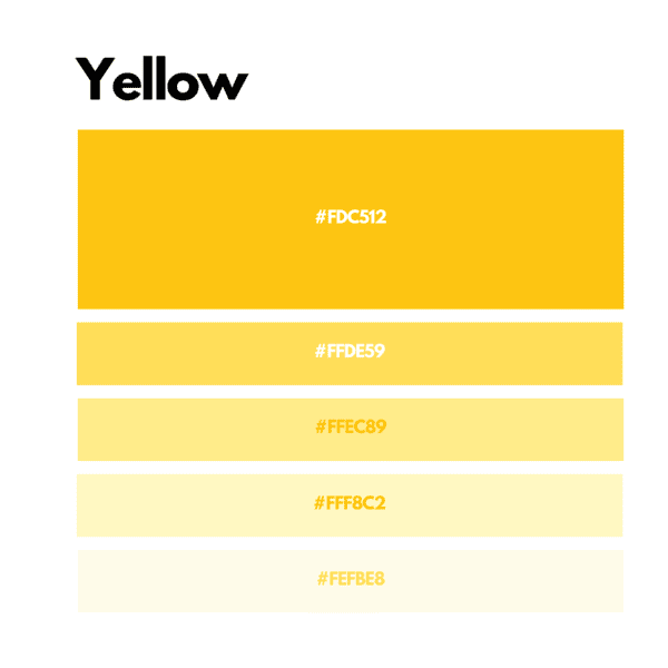
Yellow supplies the lightest bright hue in the warm trio. A small yellow detail can stand apart from a larger red area.
Gold: Success and Splendor
Gold gives the palette a ceremonial or celebratory association. Metallic gold also introduces a surface effect that a flat yellow swatch cannot reproduce.
White: Purity and Focus
White leaves open space around the stronger colors. Use it as a background when red and orange need room to stand apart.
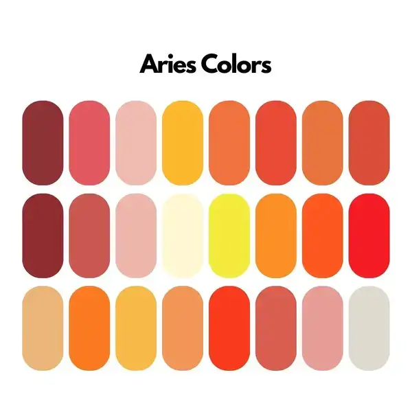
Aries Color Palettes
Fiery Passion Palette: Red, Orange, Yellow
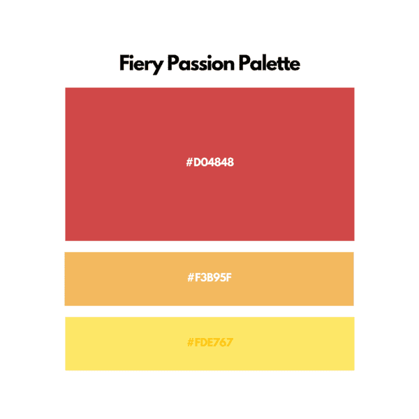
Red, orange and yellow form the warmest combination here. Keep one dominant and use the other two for smaller areas if you want a less crowded composition.
Dynamic Energy Palette: Red, Golden Yellow, White
Red and golden yellow share the warm emphasis; white separates them. This combination has a lighter background option than the all-warm palette above.
Bold and Vibrant Palette: Red, Orange, Light Blue
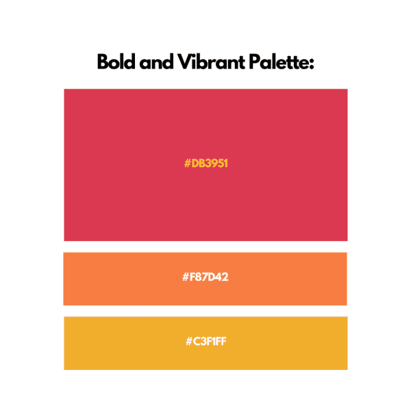
Light blue introduces a cooler area beside red and orange. It changes the balance without removing the warm pair.
Creative Power Palette: Red, Purple, Gold
Purple deepens this combination, while gold gives it a brighter accent. It is the richest of the five suggested palettes.
Optimist Palette Yellow, White, Orange
Yellow and orange sit close in hue. White can divide them in a pattern or provide the main background.
Quieter Alternatives to the Bold Palette
No birth sign makes a color unsuitable. The shades below simply produce a quieter alternative to the bold direction used above.
Pastel Shades
Pastels reduce the saturation of a palette. Use them when you want a softer version of the Aries theme.
Dark Brown
Dark brown adds weight and an earthy base. A little red can stand out against it.
Pale Gray
Pale gray can act as a neutral background. Pair it with a stronger red if you want to keep a clear focal point.
Extra digital swatches: pink and maroon below extend the palette beyond the five main colors. These HEX values are examples for design use.
| Name | Color | Hex |
|---|---|---|
| Fiery Red | #FF2400 | |
| Passionate Pink | #FF69B4 | |
| Dynamic Orange | #FF4500 | |
| Bright Yellow | #FFFF00 | |
| Energetic Gold | #FFD700 | |
| Assertive Maroon | #800000 |
Related: Zodiac Colors