However, when used correctly, blue can lend a menu a much cleaner, fresher, more modern and reassuring character.
Blue menu design can be a particularly powerful option for seafood restaurants, coffee shops, modern bistros, hotel restaurants, cocktail bars and fine dining establishments.
There is no single mood associated with the colour blue. Whilst navy blue appears more premium and serious, sky blue creates a lighter and more relaxed feel.
Petrol blue looks sophisticated, whilst cobalt blue appears more energetic and contemporary. Turquoise and seafoam shades, on the other hand, convey a sense of the seaside, summer and freshness very well.
Combining these shades with complementary colours such as cream, white, gold, grey, coral, sand beige or black in menu design creates different atmospheres.
Nowadays, many restaurants offer their menus not only in printed form but also as digital PDFs accessible via QR codes.
In this case, it becomes just as important for the file to be clean, quick to open and easy to read as it is for the menu’s design.
Businesses that prepare or edit QR menus as PDFs can use tools such as PDFFly to manage their files more efficiently.
After all, a good menu should not only look attractive; it must also be easy to read when opened on a mobile phone, with sections that can be scanned quickly and prices displayed clearly.
Navy Seafood Menu
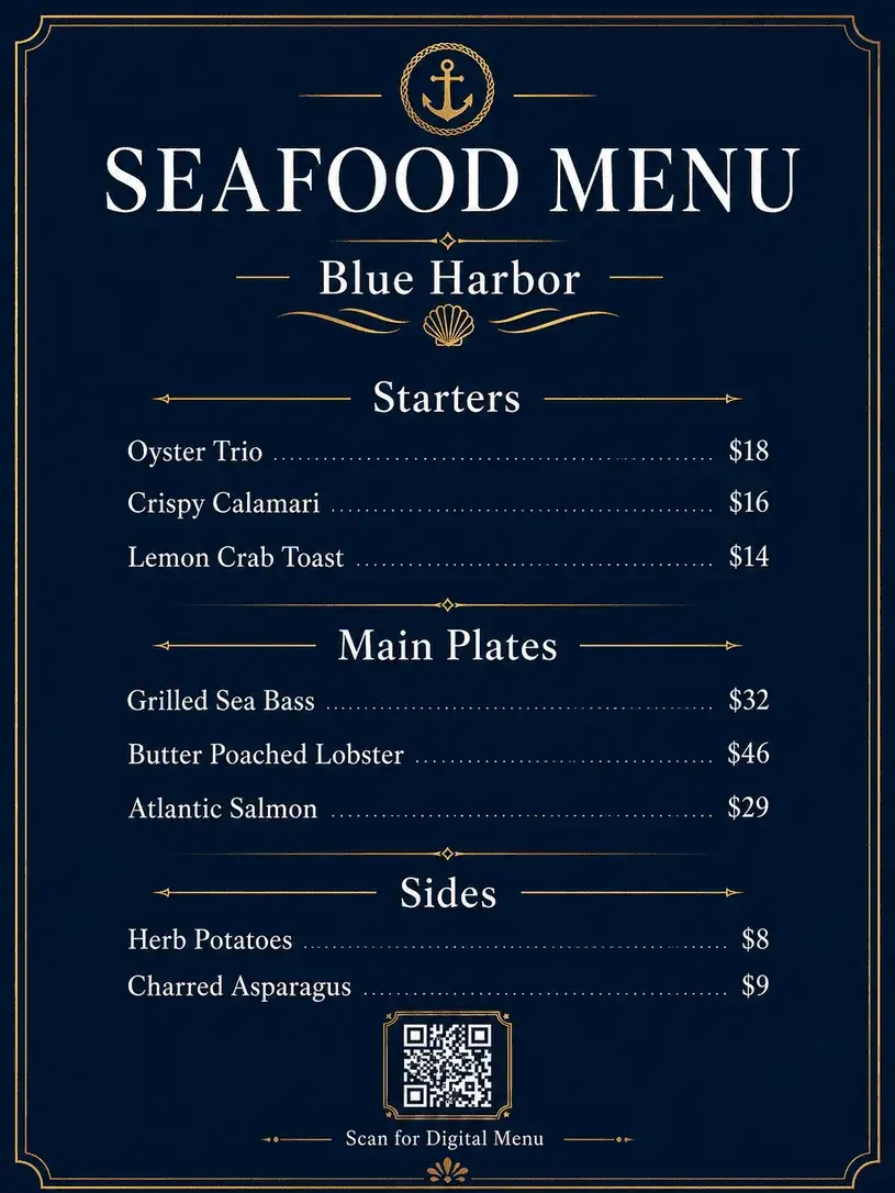
In this menu, the navy blue creates a more sophisticated atmosphere that is perfectly suited to a seafood restaurant.
The white text and subtle gold details lend the menu a premium feel without making it look too cluttered.
This style can be particularly effective in seafood restaurants that serve dinner.
The strength of the design lies in the fact that it does not over-emphasise the maritime theme. Instead of large fish illustrations or clichéd wave patterns, it employs a more restrained graphic language.
As a result, the menu remains true to the theme whilst appearing more sophisticated.
Sky Blue Brunch Menu
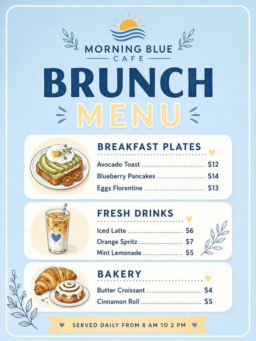
Here, the blue has a much lighter, more casual feel. The sky-blue background adds a touch of morning freshness to the brunch menu.
Thanks to the soft white areas and rounded boxes, the design looks warmer and more approachable.
It’s important that the menu doesn’t look too heavy for breakfast, brunch and daytime service.
In this example, the prices are clearly legible, the product categories are easily distinguishable, and the overall look conveys the feel of a social media-friendly café.
Cobalt Bistro Menu
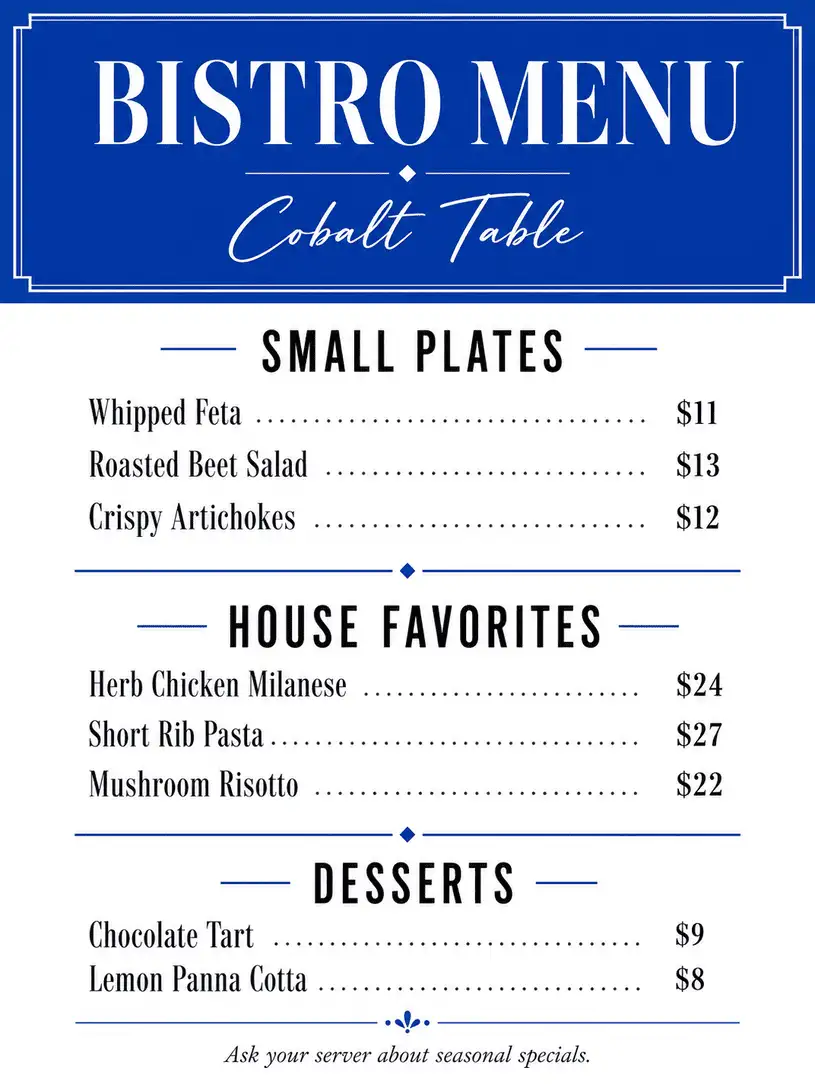
Cobalt blue lends this design a more vibrant and urban character.
The menu moves away slightly from the classic restaurant vibe to establish a more contemporary bistro identity.
Large headings and clear section divisions keep the design energetic yet organised.
This style of menu is particularly well-suited to young, lively venues in central locations.
Here, blue is not a calming colour; on the contrary, it acts as an active colour that reflects the venue’s pace.
Turquoise Beach Bar Menu
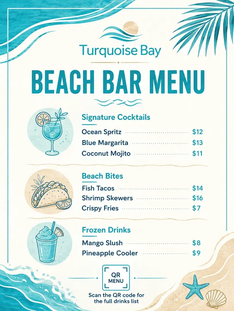
The energy of this menu comes from the seaside.
When turquoise, white and sandy beige are used together, they create a summery, relaxed and holiday-like feel in the design. This colour scheme works particularly well for cocktail and snack menus.
The key here is to ensure the menu doesn’t look too childish.
Tropical colours can easily result in a cluttered design; however, in this example, whilst the colours remain vibrant, the typography is kept simple.
This ensures the menu looks fun yet still professional.
Powder Blue Dessert Menu
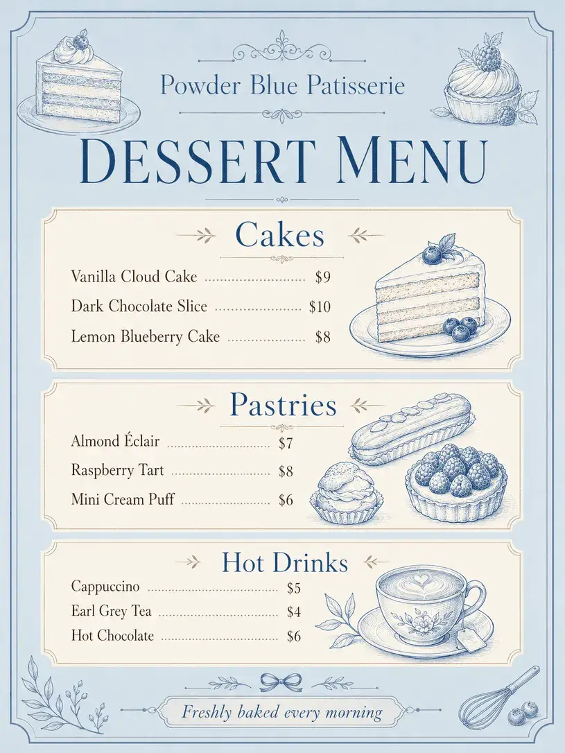
Using blue on dessert menus might seem a bit risky; however, when powder blue is combined with the right textures, it creates a soft and elegant effect.
In this design, pastel shades, a cream background and small illustrative details transport the desserts into a more boutique-style world.
This style works beautifully for menus in patisseries, boutique cafés or hotel lounges.
The menu feels sweet and light without veering into an overly sugary visual style. The balance is struck precisely here.
Midnight Cocktail Menu
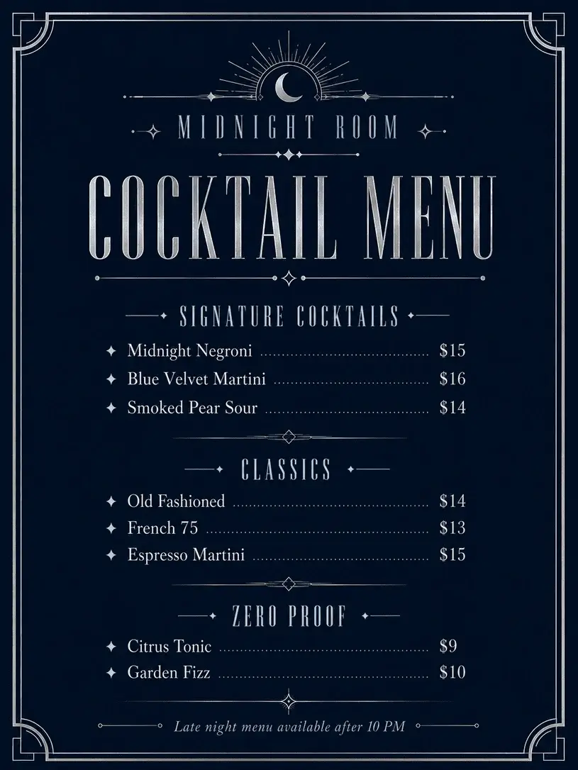
This design appears to have been conceived with late-night service in mind.
The midnight blue background and metallic-looking details lend the menu a bar-like atmosphere. The larger font used for the cocktail names elevates the drinks beyond a mere list.
In cocktail menu design, mood is just as important as legibility. People don’t just choose a drink; they become part of the venue’s ambience.
In this example, the blue colour effectively conveys the dim lighting and night-time atmosphere.
Blue Minimal Fine Dining Menu
In fine dining menus, the best design is sometimes the one that is almost invisible.
In this example, light blue details are used very sparingly; the main impact comes from the white space, typography and alignment.
The menu conveys a subtle yet serious sense of quality.
In a template of this kind, short and concise product names work better than long descriptions. Allowing each line to ‘breathe’ helps the menu to be perceived as more upmarket and meticulously crafted.
The blue here functions merely as a subtle signature.
Denim Blue Coffee Menu
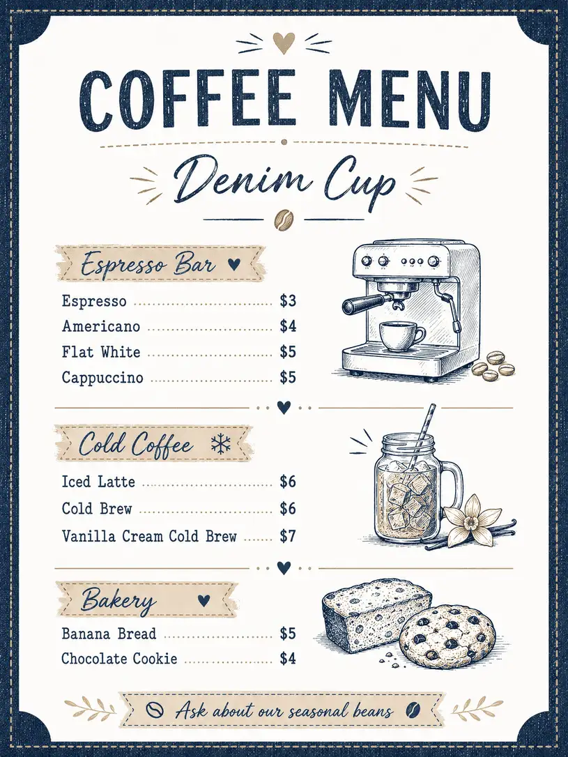
Denim blue can lend a warmer, more casual feel to coffee menus. In this example, the colour offers a fresh take on the classic brown world of coffee.
The white background and small, hand-drawn icons give the menu a friendly feel.
It could be a good option for small coffee shops, co-working cafés or neighbourhood coffee shops. The menu needs to look organised without being too corporate.
This design strikes a good balance.
Blue Botanical Menu
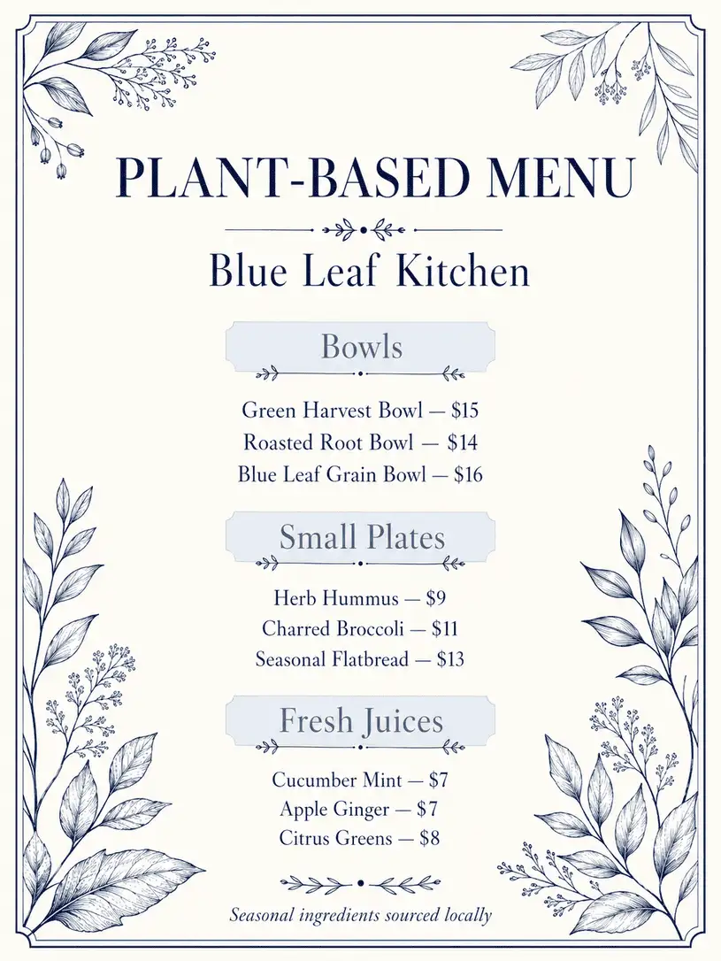
Botanical menus are usually thought of as green; this example challenges that expectation.
The blue leaf illustrations give the menu a more sophisticated and unexpected look. It could be a lovely way for a plant-based restaurant to stand out.
The design feels natural without relying directly on ‘organic’ clichés.
Blue botanical details can make a brand appear more modern, particularly in vegan, vegetarian or farm-to-table restaurants.
Royal Blue Hotel Menu
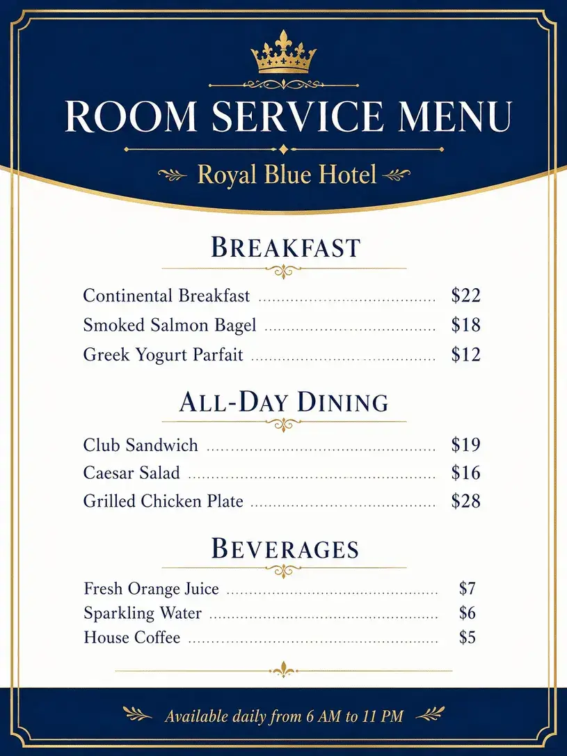
Royal blue creates a strong sense of luxury on hotel restaurant or room service menus. In this design, the colour blocks create a more formal, orderly and corporate structure.
The menu does not simply look like a list of dishes, but rather feels like an integral part of the hotel experience.
The layout of information is crucial in hotel menus. Breakfast, main courses, drinks and serving times must be clearly separated.
This example ensures that users can quickly find the information they are looking for, whilst remaining visually elegant.