A dark navy blue screen may look serious and technical.
Light greens convey a calmer feel. Shades of pink, orange and purple, on the other hand, can make the chat seem more social.
The same screen layout can be transformed into a completely different product simply by changing the colours.
When selecting a chat UI colour palette, it is not enough to consider just the main background. Message bubbles, text fields, buttons, side menus, online indicators and error messages are also part of the same system.
The examples below feature 12 different chat UI colour palettes.
Each has been designed for a distinct product type and user experience.
Midnight Indigo Chat UI

Midnight Indigo is well-suited to AI chat tools that use dark mode. As it uses a background closer to indigo rather than pure black, the screen appears softer.
Indigo-coloured user messages stand out immediately in the conversation stream.
The purple accent can be used in small areas such as the send button, active chat and the ‘typing’ indicator.
This colour palette is a good choice for code assistants, research tools and chat products that remain open on the desktop for long periods.
Soft Mint Chat UI
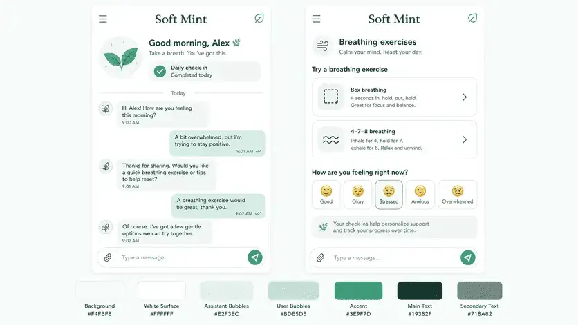
The strength of this colour scheme lies in its calm appearance.
The light mint shade helps to separate message areas without creating harsh blocks on the screen.
It is suitable for use in meditation, therapy, sleep and journaling apps. Even long messages are easy to read against this light background.
A darker shade of green should be used for the ‘Send’ button. Otherwise, the entire screen will be the same shade and clickable elements will be lost.
Coral Video Chat UI

Colours on video chat screens aren’t just used to look nice.
It’s essential to be able to tell within seconds whether the microphone is on, whether the camera has been turned off, whether a connection has been established, and when the call has ended.
Coral tones lend a warm and sociable atmosphere to video call screens.
This approach works better in products centred on meeting new people or brief video chats, rather than corporate meetings.
In an interface designed for platforms focused on instant video calls, such as omg video chat, large video areas, prominent camera controls and a clearly visible ‘next call’ button can stand out.
Keeping the background light prevents a heavy frame from forming around the video feed. It is also more appropriate to choose a distinct shade closer to red for the ‘End Call’ button rather than using the coral colour.
The user must immediately understand which button is merely for emphasis and which is for a critical action.
Sand and Terracotta Chat UI
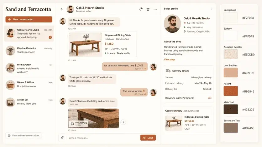
This colour scheme is more reminiscent of a warm editorial page than a tech product.
The beige background and terracotta accents give the screen a more human feel.
It could be suitable for boutique shops, second-hand markets, travel communities or consultancy services.
Product cards and booking details can also be easily added to the chat screen.
As earth tones already have a strong character of their own, it is best to keep the icons and typeface simple.
Neon Orbit Chat UI
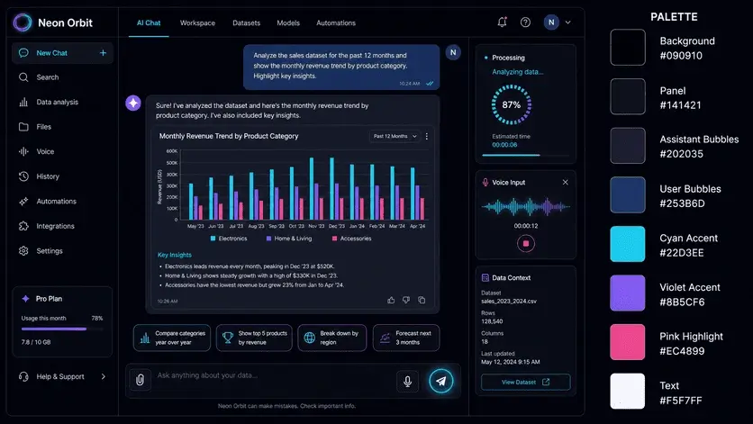
This design doesn’t want to go unnoticed.
Neon Orbit catches the eye at first glance on product landing pages and in futuristic AI tools.
Rather than spreading neon colours across large areas, they should be used in small, interactive elements. Sound waves, interactive tools, loading bars and send icons are suitable areas for this.
Making every section neon could turn the screen into a nightclub.
It’s a bit of fun, but not very practical.
Arctic Blue Support Chat UI
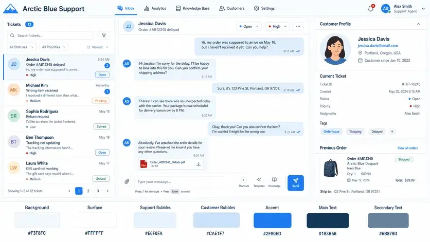
Blue remains one of the most reliable colours for support interfaces. It offers users a clean, organised and familiar environment.
With this colour scheme, customer details, support categories and chat history can be displayed on the same page without looking cluttered. Blue labels can indicate open cases, whilst shades of grey can indicate closed conversations.
It is suitable for SaaS support dashboards, training platforms and customer service.