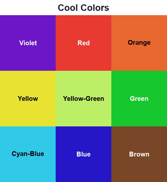
12 color references at a glance
The HEX values identify these screen samples. Names such as orange or violet describe a family, not one universal shade.
| Color | HEX | Swatch |
|---|---|---|
| Violet | #6C16C7 | |
| Red | #E83A30 | |
| Orange | #E86830 | |
| Yellow | #E8E230 | |
| Yellow-Green | #BCEE66 | |
| Green | #16C72E | |
| Cyan-Blue | #30C9E8 | |
| Blue | #2516C7 | |
| Brown | #794628 | |
| Gray | #B4B4B4 | |
| Teal | #008080 | |
| Steel Blue | #4682B4 |
Violet
Deep violet gives cream lettering a rich background on a poster. The sample here, #6C16C7, leans toward blue rather than pink. It has more depth than a pastel lilac.
Red
A little #E83A30 goes a long way beside gray. A red price label and a red full-page background use the same value, but ask very different things of the reader. Choose the area it occupies before adding a second bright color.
Orange
A sunlit edge or a single orange object can warm up a blue-led illustration. #E86830 has a reddish cast; the orange shades collection also includes paler peach and darker rust alternatives.
Yellow
Dark lettering stands out on this slightly greenish yellow, #E8E230. Small white lettering is much harder to read. Leave the typography plain and the yellow can do the talking.
Yellow-Green
For a fresh-looking three-color arrangement, try:
- Yellow-green #BCEE66 for the main colored shape.
- Brown #794628 for an outline or heading.
- A pale cream background to leave space around both.
This is a light yellow-green reference, not the exact CSS keyword chartreuse.
Green
For a leaf or stem illustration, #16C72E supplies a vivid green. It is much brighter than the teal below. Brown outlines would give it an earthy setting, while white space keeps the green sharper and more graphic.
Cyan-Blue
Beside teal, #30C9E8 looks lighter and bluer. That difference can separate shallow-water shapes from darker areas in an illustration. It is a cyan-blue reference rather than a green-leaning aqua.
Blue
The blue here, #2516C7, has a strong violet cast. It is deeper than the cyan-blue and more saturated than Steel Blue. In a transition, those differences matter as much as the shared word blue. The blue gradient examples show other ways to move between blue shades.
Brown
A cream-and-orange menu does not have to use black lettering. Brown #794628 keeps the text dark while staying within the warmer palette.
Gray
#B4B4B4 has equal red, green and blue channel values: an untinted digital gray. It gives the red sample a quiet background.
For gray lettering on white, the contrast ratio is only 2.07:1. Try a darker gray in the color contrast checker if that is the pair you need.
Teal
A narrow yellow-green stripe on teal gives the two colors very different amounts of space. Teal #008080 stays in charge; the stripe supplies the brighter detail.
Steel Blue
Steel Blue #4682B4 is the quieter blue option here. Its muted appearance can suit a large diagram panel where the violet-blue would dominate. Leave the vivid colors for the parts that need attention.