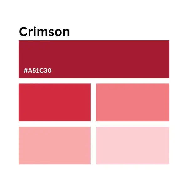
What color is Harvard Crimson?
Harvard Crimson is a deep red. Harvard’s School of Engineering and Applied Sciences lists #A51C30 for digital use in its official color palette. The guide also gives separate print references.
| Reference | Value | Use |
|---|---|---|
| HEX | #A51C30 | Digital color |
| RGB | 165, 28, 48 | Screen artwork |
| Pantone coated | 1807 C | Coated print reference |
| Pantone uncoated | 187 U | Uncoated print reference |
For Harvard-branded work, follow the applicable school or department guide. A screen swatch is useful for choosing a digital fill, but it cannot guarantee how ink or dyed fabric will look.
The rowing handkerchiefs of 1858
At a regatta, a bright headband gave spectators a way to recognize the Harvard crew. The Harvard Gazette’s account of Benjamin W. Crowninshield’s diary describes the purchase of six red handkerchiefs in June 1858. Crowninshield and his sister Alice bought them; Charles W. Eliot also helped choose the scarves.
Eliot later became Harvard’s president. In 1858 he was an instructor who also rowed with the crew. The practical aim was to make the crew visible from the shore. A logo committee was not required.
Why magenta enters the story
Crimson did not move straight from the rowing boat into a fixed brand manual. Magenta became fashionable in the following years and appeared in Harvard sports clothing. The student newspaper began in 1873 as The Magenta.
In 1875, a university meeting favored crimson. The paper then changed its name to The Crimson. Harvard Magazine’s history of the color also describes the next step: the Harvard Corporation approved a physical crimson sample in May 1910.
- 1858: crimson handkerchiefs help identify the rowing crew.
- 1875: crimson is favored over magenta at a university meeting.
- 1910: the Corporation approves a crimson sample.
What gives crimson its Harvard association?
Repeated use ties a color to an institution. A pennant, a team uniform and a university publication can reinforce the same association even though their materials look different.
In a layout, a broad crimson panel makes a strong dark area. White space gives its edges room, while a smaller crimson heading leaves more of the page neutral.
Crimson beside other university colors
The difference is easy to see beside Yale Blue: a deep red and a deep blue take a composition in different directions. Princeton’s orange-and-black combination offers another visual comparison, with a brighter warm color against a dark neutral.
For an informal study, place crimson beside a blue or an orange swatch and keep the surrounding background the same. Keep the swatches the same size to see their differences more clearly. For official university artwork, use the institution’s own specifications.
Related reds and the palette below
Alizarin crimson is another named red to compare with Harvard’s shade. It is not a substitute for Harvard’s specified digital color.
The lighter and darker reds below are an illustrative tonal range around #A51C30, not Harvard’s official extended palette. Use them for a separate color study; keep the designated crimson when the task is to reproduce the university color.
#fef2f2
#fde6e6
#fbd0d2
#f7aaac
#f17b80
#e74c57
#d32b40
#a51c30
#951c31
#801b30
#470a15