How to Make Your Brand Stand Out with Color
Choosing a brand color palette can feel more difficult after you look at the competition. The blue you liked is already on another company's homepage. The purple feels familiar, too. You want your brand to have its own identity, but ruling out every color used in your industry leaves you with fewer and fewer options.
A closer look at those websites gives you more room to work. A color can cover most of one page and appear only in a small button on another. Its neighbors, the lettering, and the balance of light and dark all contribute to the result. Competitor research becomes useful when you start noticing those choices.
Three payment websites with different color priorities
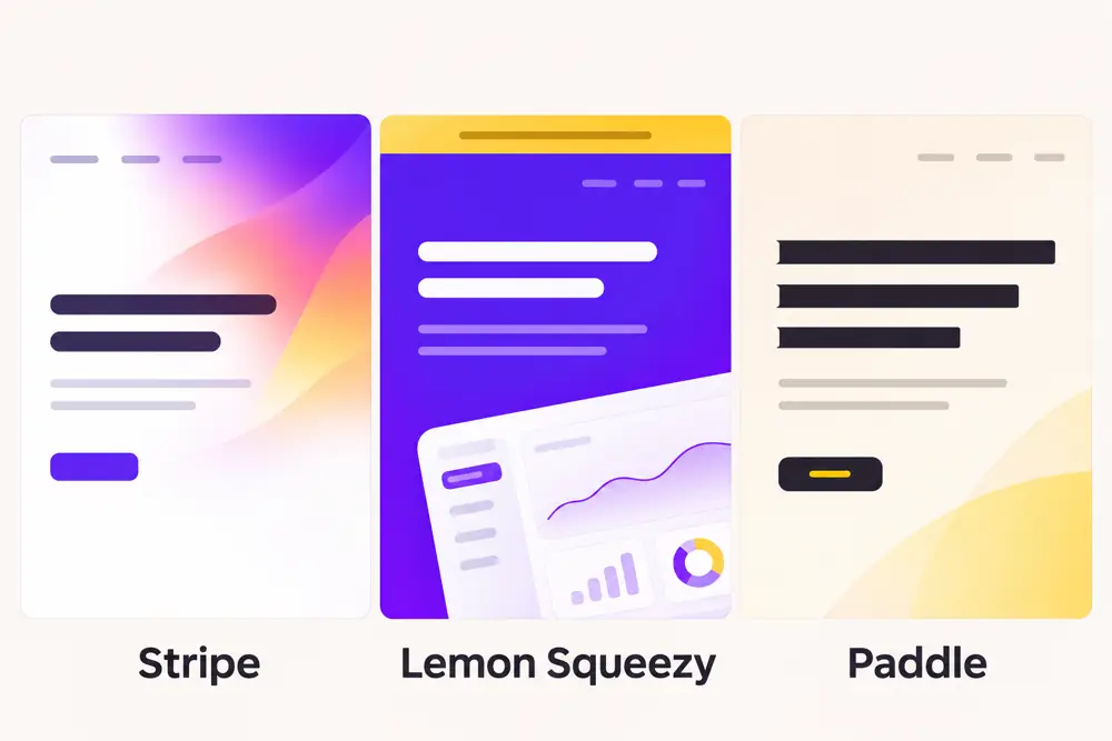
Look at the opening screens of Stripe, Lemon Squeezy, and Paddle. Their services overlap, but their pages use color in noticeably different ways.
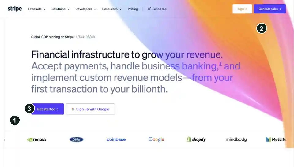
On Stripe’s opening screen, a sweeping, multicolored gradient crosses a largely white background. Violet buttons bring a solid accent from the Stripe color palette into the composition. The gradient supplies the expressive surface; the surrounding white space leaves room for the financial-infrastructure message.
Stripe
- 1: White surrounds the message.
- 2: The gradient occupies the upper-right area.
- 3: A solid violet fill separates the main button from the white canvas.
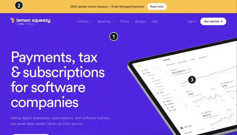
Lemon Squeezy gives saturated violet a much larger role. Its opening screen pairs that broad color field with a large, tilted dashboard image, while a yellow announcement strip sits above it. Purple becomes the environment around the product, rather than one decorative area within it. The name might suggest an entirely yellow website, but the page makes a different choice.
Lemon Squeezy
- 1: Violet fills the hero.
- 2: Yellow belongs to the announcement strip.
- 3: The pale dashboard creates a large light area inside the violet field.
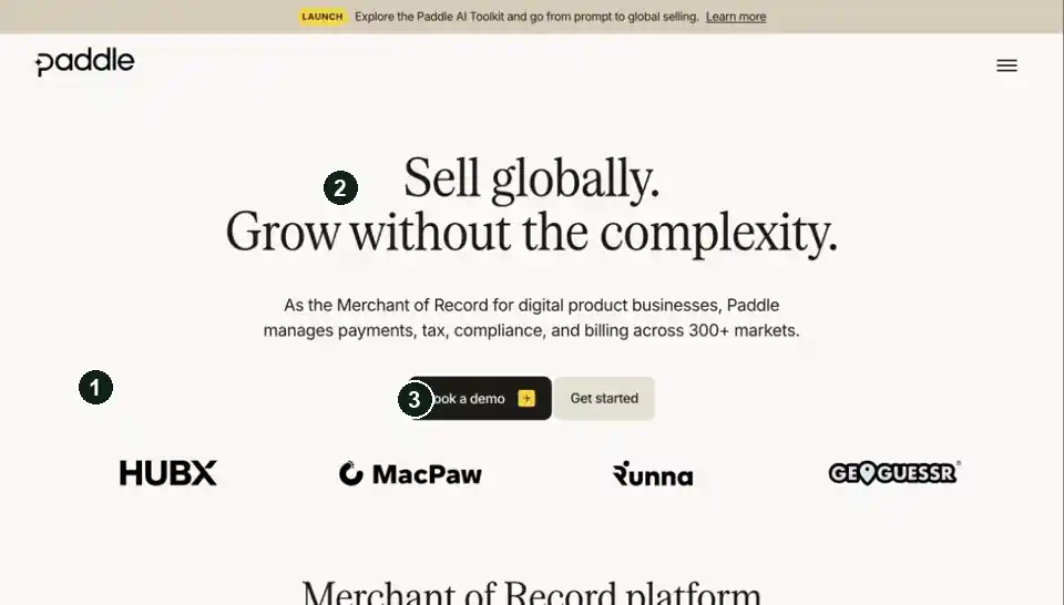
Paddle offers another direction: a warm, pale background, dark serif headline, and dark button with a small yellow detail. There is much less saturated color in that opening composition. The lettering and light-dark contrast carry more of the identity.
Paddle
- 1: A warm light surface covers most of the screen.
- 2: The dark serif headline carries the largest contrast.
- 3: Yellow occupies a small detail within the dark button.
Build a competitor board that explains the layout
Collect the same kinds of screens from each competitor: the homepage opening, a pricing section, and a product or checkout screen. A marketing page may use a dramatic background that never appears inside the product. Looking at both tells you where the identity stays consistent and where it becomes more restrained.
Use the same window width for each capture and let the page finish loading. For regional comparisons, a capture setup might include best proxies by Proxy-Seller. Label those screenshots with the capture location and the page’s language and currency so you can tell a regional variation from a different design.
Under each screenshot, record a few observations:
- Largest surface: white, warm neutral, dark, or saturated color.
- Main action: the button's fill and label colors, plus what surrounds it.
- Supporting colors: whether they distinguish content, illustrate the product, or decorate the page.
- Repeated treatment: a gradient, tinted card, border, or color pairing that appears elsewhere.
Use sampled HEX values to describe the screenshot; use published brand guidelines when you need official specifications.
Build a palette from what the board reveals
For a worked example, imagine a payment tool for small software businesses. The competitor board gives its designer several possible directions: a gradient on white, a broad violet surface, or a mostly neutral page. Start with a violet-and-yellow palette and explore how it could support two of those compositions.
The range of dark purple shades includes red-leaning and blue-leaning options. Here, a deep purple will provide the dark surface, while off-white supplies a warm light canvas. Pale lavender gives the design a supporting surface without introducing another hue.
Lay out candidate color palettes with enough background area to judge their proportions. The violet accent remains small against each surface in this comparison:
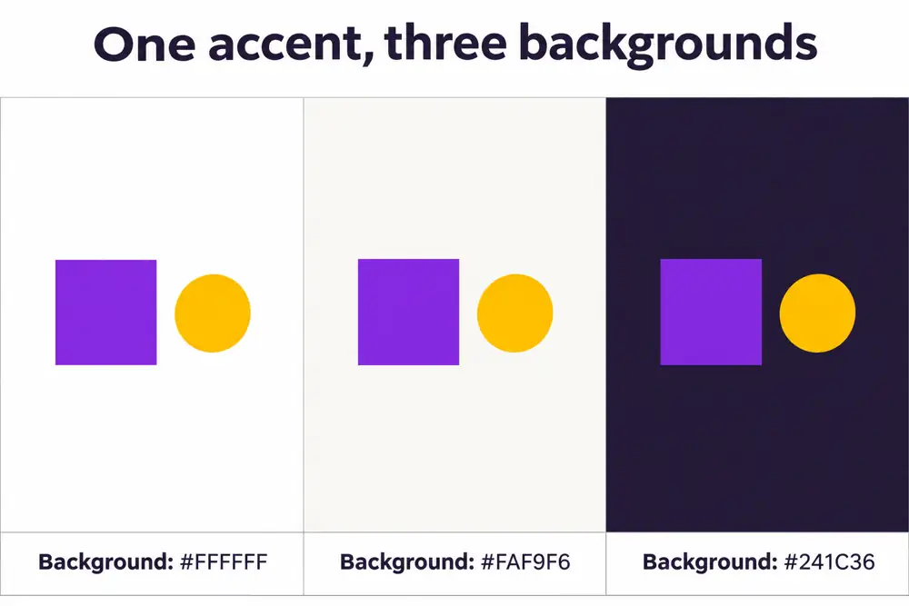
These five illustrative colors can now take different roles in the two layouts:
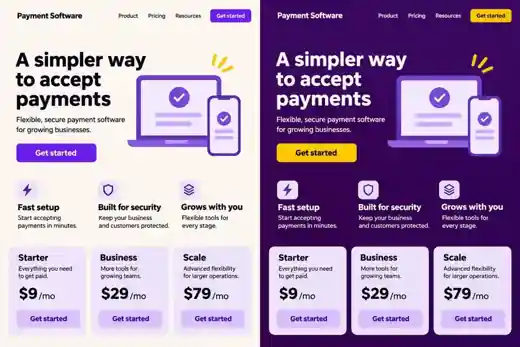
In the light version, the broad off-white canvas leaves violet concentrated on the main button. Yellow can stay in a small illustration detail without competing with the action. This direction suits a layout where the product explanation needs most of the space.
The dark version gives deep purple the largest surface. Yellow moves onto the main button, where it creates a clear light-dark boundary against that purple. Off-white carries the headline, and the pale product illustration breaks up the dark field. The supporting cards keep their lavender fill, so the change in emphasis comes mainly from the hero and its action.
Keep the words, component sizes, and layout identical while comparing these versions. You'll be able to see how redistributing the colors changes the emphasis before bringing different fonts or shapes into the design.
Take the palette beyond the opening screen
Carry the dark version into a pricing page with deep-purple surfaces. The price needs to be prominent, but it doesn't need the button's yellow: a large off-white amount can stand out through size and lightness. Lavender can handle short supporting details.
Reserve yellow for the purchase action. A yellow discount badge beside a yellow button would create two competing points of emphasis; moving the badge to a lavender fill lets the button remain the stronger cue. This gives yellow a repeatable job as visitors move from the opening screen to the pricing page.
Put the finished pricing page beside the competitor board. If it still looks too similar, change one visible decision: the dominant background, the amount of accent color, or the treatment of the product image.