With soft blues, powder pinks, and creamy greens, you can transform your home into a peaceful coffee break in one stroke.
Both Instagram-worthy photos and a relaxing atmosphere; as a bonus, your guests will ask, “Where did you find this color?”—we'll let you in on the secret.
I know, you're not completely free when choosing paint colors... When deciding on a color, you have to consider the color of your furniture... because matching your furniture to the wall color can be a more expensive option.
But is that really the case?
Actually, solutions like sofa covers can give you more freedom when choosing wall colors.
Now that you know this, you can look at the following colors from a different perspective!
Let's explore the colors
The HEX values below are digital colors for the swatches, not paint-mixing formulas. Use the manufacturer’s color name and number when ordering, and compare a physical sample before painting.
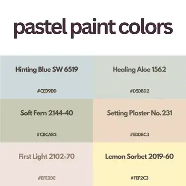
First Light 2102-70 (#EFE2DE)

First Light is a pale pink alternative to white or beige, with off-white trim and pastel grays keeping the room within a light palette.
Sea Salt SW 6204 (#CDD2CA)

Sea Salt is a muted green with blue undertones, rather than a straightforward pale blue.
Natural Linen SW 9109 and Pure White SW 7005 keep the combination light; dark Iron Ore SW 7069 gives trim or furniture a stronger outline.
Lemon Sorbet 2019-60 (#FEF2C3)

Lemon Sorbet brings a light yellow into the selection. Dark furniture stands out against the pale yellow.
Misty SW 6232 (#CDD2D2)
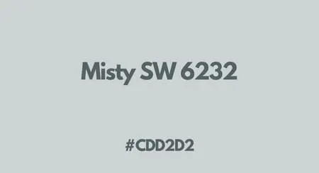
Misty belongs to Sherwin-Williams’ blue family. Navy cushions or curtains give it a darker contrast.
Pale Powder No.204 (#D0D9C8)

Pale Powder is a light aqua. Farrow & Ball notes that it can look closer to gray in north-facing rooms.
Painting an attic ceiling and its sloping walls in the same shade reduces the visual break between them. Wimborne White is the brand’s suggested white for trim.
Soft Fern 2144-40 (#C8CAB2)

Soft Fern is a pale gray-green. In a light palette, it gives the walls more color than white without the strength of a vivid green.
Hinting Blue SW 6519 (#CED9DD)
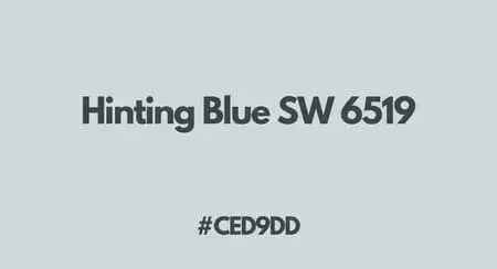
Hinting Blue offers a very pale blue-gray backdrop for a bedroom or home office. Greek Villa, Lively Yellow and Muddled Basil give three different directions for the accompanying colors: neutral white, yellow or earthy green.
Setting Plaster No.231 (#EDD8C3)

Setting Plaster is a dusty pink with yellow pigment, which accounts for its warmer cast. It works with olive greens; School House White is the manufacturer’s recommended white.
Healing Aloe 1562 (#D5DBD2)

Natural oak furniture and linen fabrics add texture beside Healing Aloe’s gray-softened green.
Before You Paint
Hold the sample beside the sofa, flooring and curtains you are keeping. A color that suits the room needs to work with those large surfaces, not just the small swatch on this page.
Related Pages: Sage Green Paint Colors, Brown Paint Colors, Pink Paint Colors