Choose Azure Grey when a blue background feels too colorful but an ordinary gray feels lifeless. The softened blue cast gives tables and side panels a cooler setting without demanding much attention.
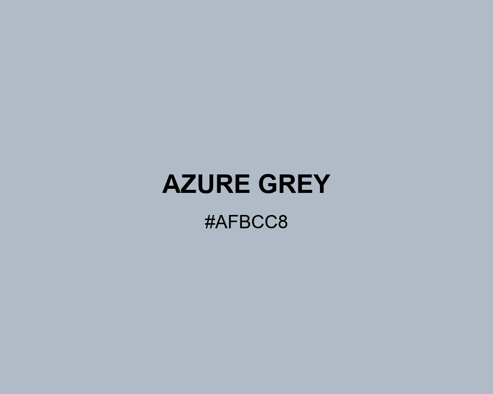
Azure Grey
Tone scale
Tints
Color Conversation
Color harmony
Dark text
8.66:1
White text
1.94:1
At first glance, the swatch belongs among grays. Its cool cast becomes easier to notice beside a warmer neutral.
Choose Azure Grey when a blue background feels too colorful but an ordinary gray feels lifeless. The softened blue cast gives tables and side panels a cooler setting without demanding much attention.