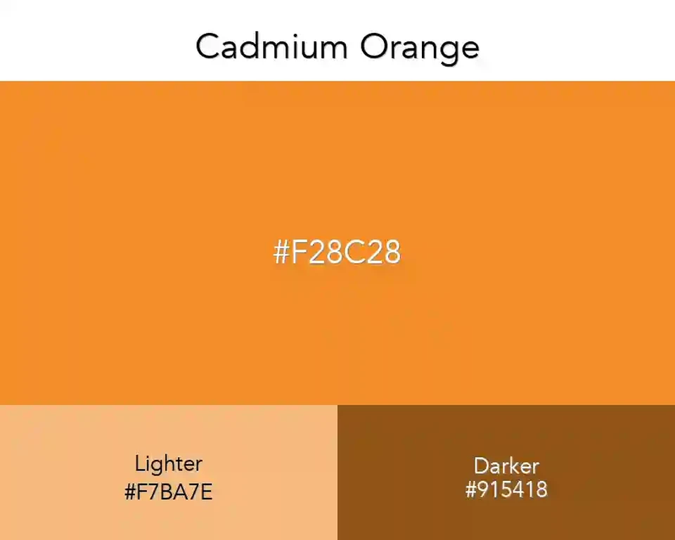
On a matte surface, Cadmium Orange feels like fresh paint; on a bright display it turns sharper and more insistent. A compact badge or button can carry that punch. Across a full screen, it needs quieter neighbors and generous empty space.
Pair it with Teal when the design needs a cool counterweight; the blue-green keeps the orange from reading as a warning. BurlyWood softens the contrast into a sun-baked, material-led set.
For small lettering, do not rely on white placed directly over this orange. Dark brown or deep blue-gray gives labels a firmer edge, while cream can sit nearby as a background rather than a text color.
Tints
#f28c28
#f3983e
#f5a353
#f6ae68
#f7ba7e
#f8c694
#fad1a9
#fbdcbe
#fce8d4
#fef4ea
#ffffff
Shades
#f28c28
#da7e24
#c27020
#a9621c
#915418
#794614
#613810
#492a0c
#301c08
#180e04
Triadic
#f28c28
#28f28c
#8c28f2
Monochromatic
#9d5b1a
#c67321
#f28c28
#f4a14f
#f7b473
Analogous
#f22829
#f28c28
#f2f128
Complementary
#f28c28
#288ef2