A faint gold glow runs through Champagne Pearl. It feels dressier than beige, though still quiet enough for a background.
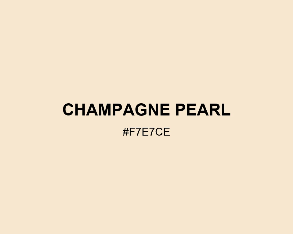
Champagne Pearl
Tone scale
Tints
Color Conversation
Color harmony
Dark text
13.79:1
White text
1.22:1
Save it for places where plain cream feels too flat.
#f7e7ce
#cedef7
#f7d4ce
#f7e7ce
#f4f7ce
#887f71
#f7e7ce
#fbf4e9
#faf8f4
A faint gold glow runs through Champagne Pearl. It feels dressier than beige, though still quiet enough for a background.