Its strongest partner may be aubergine, which makes the yellow feel richer. Mint ceramic offers freshness, and tamarind brown keeps the whole palette close to pantry materials.
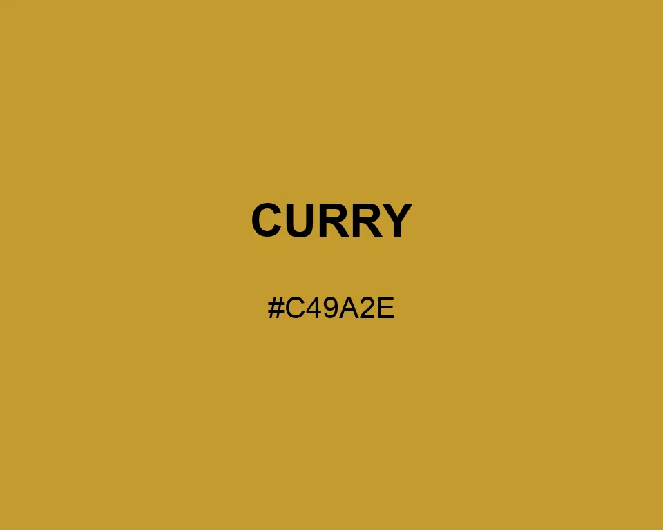
Color data for #C49A2E: R 196 / G 154 / B 46. The small final share moves Curry beyond plain yellow and into seasoned ochre.
A spoonful of spice leaves a deeper impression than lemon yellow. Curry carries that toasted warmth into packaging, recipe cards, and illustrations without looking sugary.
Tints
#c49a2e
#caa443
#d0ae58
#d6b86d
#dcc282
#e2cc96
#e7d7ab
#ede1c0
#f3ebd5
#f9f5ea
#ffffff
Shades
#c49a2e
#b08b29
#9d7b25
#896c20
#765c1c
#624d17
#4e3e12
#3b2e0e
#271f09
#140f05
Triadic
#c49a2e
#70ccb2
#b270cc
Monochromatic
#7f641e
#a17e26
#c49a2e
#cfac54
#d9bd77
Analogous
#cc8470
#c49a2e
#b8cc70
Complementary
#c49a2e
#708acc