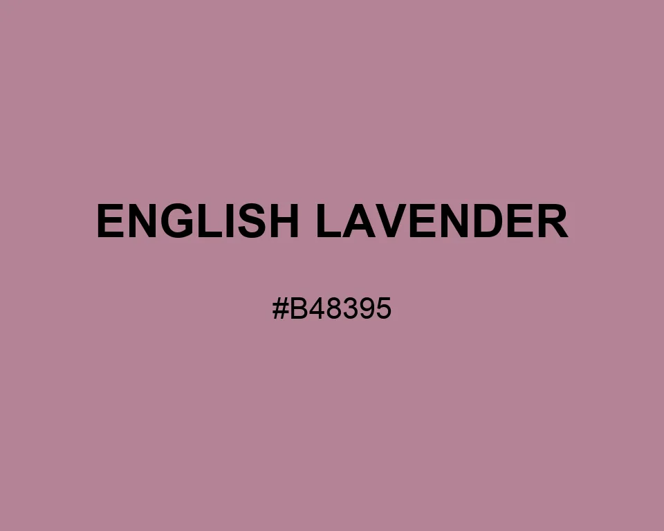
English Lavender is not the blue-purple of a flower field; it is dustier, rosier, and closer to a faded linen ribbon.
| Color model | Value | Common use |
|---|---|---|
| HEX | #B48395 | Web and interface color |
| RGB | rgb(180, 131, 149) | Digital screens |
| HSL | hsl(338, 25%, 61%) | Hue-based adjustments |
| HSV | hsv(338, 27%, 71%) | Color pickers |
| CMYK | 0%, 27%, 17%, 29% | Print reference |
#b48395
#228b22
#b8c4a9
#293a2b
#b48395
#6b4636
#c7a89c
#372a25
#b48395
#fdfbd4
#d2b8ba
#443239
#b48395
#000080
#a8a8c5
#29283f
Pinkish Gray continues English Lavender into a restrained neutral system. Evergreen gives stationery or textile labels a botanical anchor with enough depth.
English Lavender is warmer than field lavender and dustier than rose. That middle position makes it useful beside linen, old paper, muted mauve, and restrained botanical greens.
Picture a linen ribbon stored in a cedar drawer: the color has warmth and age, but it has not faded all the way to beige. A matte finish suits it. Satin makes the rose content louder.
#b48395
#bc8fa0
#c39caa
#caa8b5
#d2b5bf
#dac1ca
#e1cdd5
#e8dadf
#f0e6ea
#f8f3f4
#ffffff
#b48395
#a27686
#906977
#7e5c68
#6c4f59
#5a424a
#48343c
#36272d
#241a1e
#120d0f
#b48395
#356519
#193565
#755561
#946b7a
#b48395
#c299a8
#ceaeba
#65195b
#b48395
#652319
#b48395
#196549