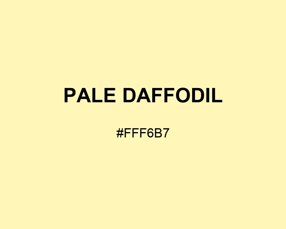
Pale Daffodil
Tints · 950
Pale Daffodil
#FFF6B7
HEX
Tone scale
Tints
Color Conversation
Color harmony
Accessibility
Aa
AAADark text
15.26:1
Aa
FailWhite text
1.10:1
Pale Daffodil
Tone scale
Tints
Color Conversation
Color harmony
Dark text
15.26:1
White text
1.10:1
Pale Daffodil #FFF6B7 is a washed yellow with a clean spring feel. It stays lighter and less buttery than most cream tones.
| Color model | Value | Common use |
|---|---|---|
| HEX | #FFF6B7 | Web and interface color |
| RGB | rgb(255, 246, 183) | Digital screens |
| HSL | hsl(52, 100%, 86%) | Hue-based adjustments |
| HSV | hsv(52, 28%, 100%) | Color pickers |
| CMYK | 0%, 4%, 28%, 0% | Print reference |
#fff6b7
#4f7457
#9db49a
#314238
#fff6b7
#9888b4
#d2c9e2
#4e4659
#fff6b7
#33383c
#90979b
#ffffff
#fff6b7
#91b9d0
#d5e8f1
#405866
Pale Daffodil is barely yellow. That is exactly why it works.
For this entry, Pale Daffodil is set to #FFF6B7, or RGB 255, 246, and 183.
It keeps full red, pulls green back a little, and leaves enough blue to make the finish look milky rather than golden.
It can cover a nursery card, a spring menu, or a soft dashboard panel without stealing focus.
Fern green adds a garden note. Lilac feels light beside it, and charcoal keeps small text readable.
#fff6b7
#fff7be
#fff8c5
#fff9cd
#fffad4
#fffadb
#fffbe2
#fffce9
#fffdf1
#fffef8
#ffffff
#fff6b7
#e6dda5
#ccc592
#b2ac80
#99946e
#807b5c
#666249
#4c4a37
#333125
#1a1912
#fff6b7
#ffffff
#ffffff
#a6a077
#d1ca96
#fff6b7
#fff8c4
#fff9d0
#ffffff
#fff6b7
#ffffff
#fff6b7
#ffffff