Pale Prim
Tints · 950
Pale Prim
#FDFEB8
HEX
Tone scale
Tints
Color Conversation
Color harmony
Accessibility
Aa
AAADark text
16.00:1
Aa
FailWhite text
1.05:1
Pale Prim
Tone scale
Tints
Color Conversation
Color harmony
Dark text
16.00:1
White text
1.05:1
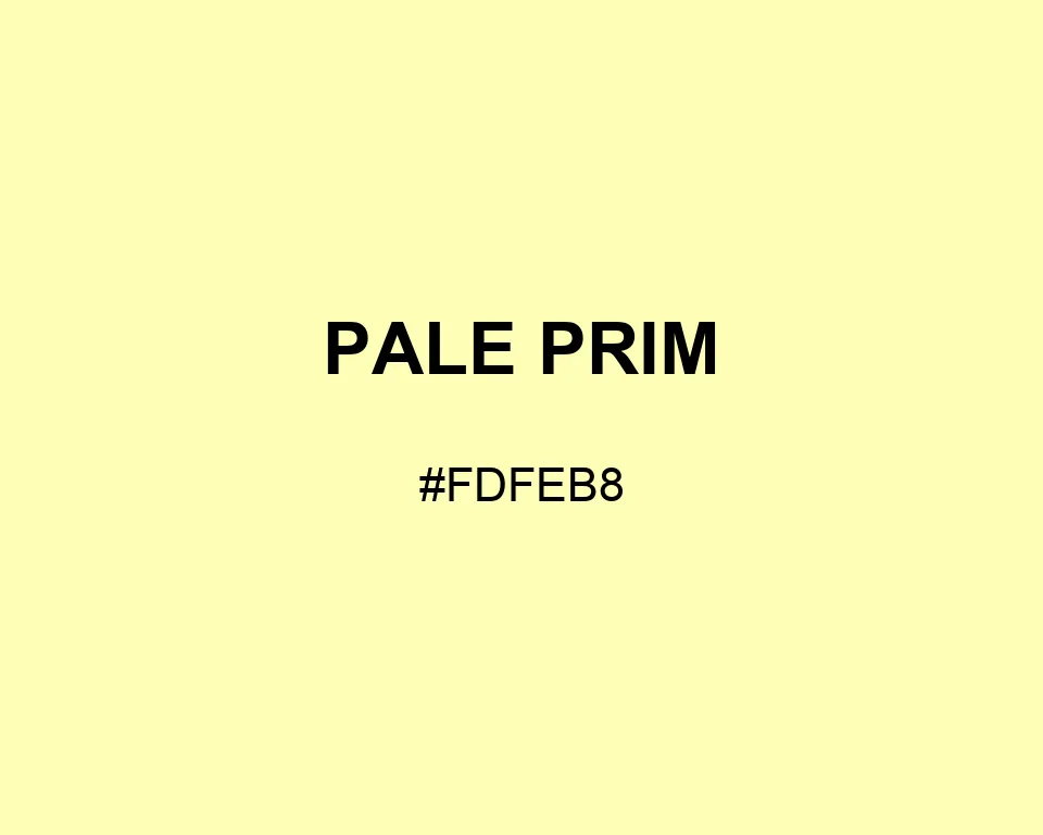
Pale Prim #FDFEB8 is yellow at its lightest edge. A faint green cast keeps the near-white swatch crisp beside cream and beige.
| Color model | Value | Common use |
|---|---|---|
| HEX | #FDFEB8 | Web and interface color |
| RGB | rgb(253, 254, 184) | Digital screens |
| HSL | hsl(61, 97%, 86%) | Hue-based adjustments |
| HSV | hsv(61, 28%, 100%) | Color pickers |
| CMYK | 0%, 0%, 28%, 0% | Print reference |
#fdfeb8
#243c5a
#8096ad
#162534
#fdfeb8
#55704d
#a1b796
#32442f
#fdfeb8
#c36f5d
#e3aaa0
#70433b
#fdfeb8
#454847
#929895
#ffffff
Pale Prim works when white looks empty but a full yellow background would take over. The difference is small. On a large panel, it is easy to see.
Try it on recipe cards, nursery storage labels, or the blank space around a botanical print. Ink blue makes type easy to read. Fern pulls out the green trace, while coral clay adds a warmer mark.
The swatch is #FDFEB8, or RGB 253, 254, and 184. Red and green are nearly full; blue sits lower, leaving a thin veil of yellow across the screen.
#fdfeb8
#fdfebf
#fdfec6
#fefecd
#fefed4
#fefedc
#feffe3
#feffea
#fffff1
#fffff8
#ffffff
#fdfeb8
#e4e5a6
#cacb93
#b1b281
#98986e
#7e7f5c
#65664a
#4c4c37
#333325
#191912
#fdfeb8
#f2fefe
#fef2fe
#a4a578
#cfd097
#fdfeb8
#fdfec5
#fefed1
#fef8f2
#fdfeb8
#f8fef2
#fdfeb8
#f2f2fe