Pastel Peach works well for invitations, nursery palettes, and low-contrast interfaces. Dusty lavender gives it a slightly cooler edge; olive keeps it grounded.
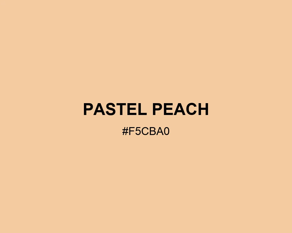
Pastel Peach
Tone scale
Tints
Color Conversation
Color harmony
Dark text
11.12:1
White text
1.51:1
Soft apricot light, with none of the sharpness.
Pastel Peach works well for invitations, nursery palettes, and low-contrast interfaces. Dusty lavender gives it a slightly cooler edge; olive keeps it grounded.