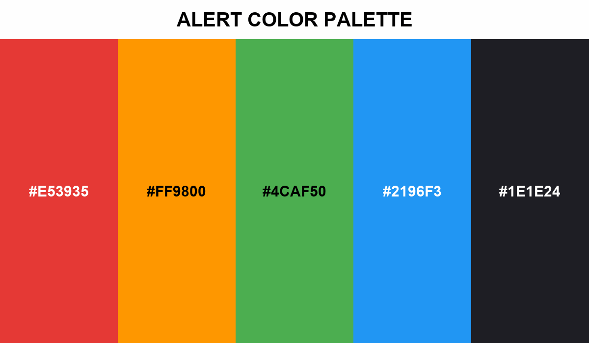
Alert Color Palette
This color selection gathers the main signaling colors used in modern digital design.
High-priority errors use a bright red to grab attention. Warnings use a warm orange to indicate caution, so they don't cause panic. Clean green confirms successful actions, and soft blue offers useful information.
Paired with dark charcoal for sharp contrast, it's a combination that makes user interfaces highly readable and clear.