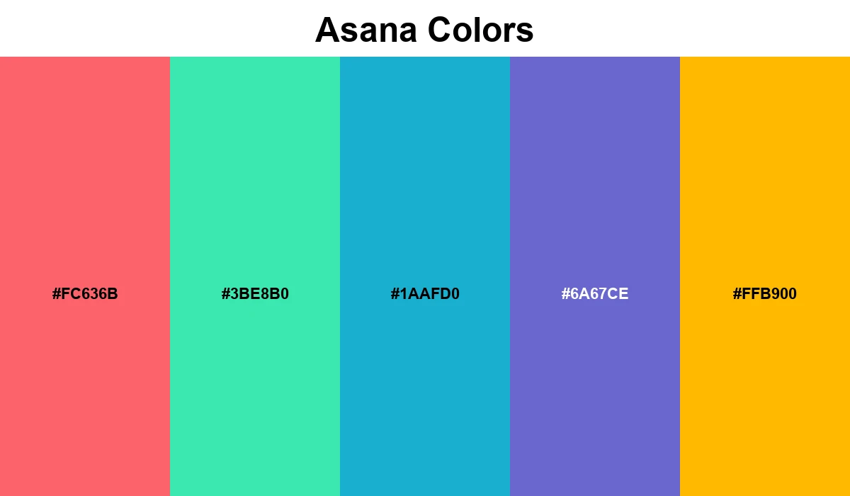
Asana Colors
Asana's brand identity uses a diverse range of secondary colors to denote different tasks and priorities. The core palette is playful yet organized.
The Asana color system is built to feel light and motivating. By using high-saturation tones like Coral (#FC636B) and Teal (#3BE8B0), the interface maintains a sense of progress and energy. These multi-colored accents are strategically used across the platform to help teams distinguish between project states, making the workspace feel both productive and visually engaging.