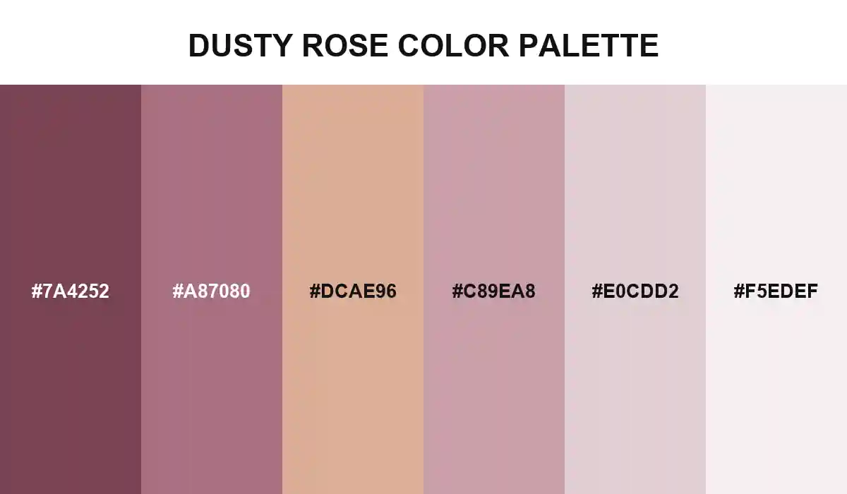
Dusty Rose Color Palette
Gray and brown undertones remove the shine from pink, leaving a rose family that feels worn, powdery, and gently faded.
Dusty rose is pink after some of its brightness has been quieted. The deepest swatch leans toward muted red, while mauve and rose beige introduce the gray and brown undertones that give the family its familiar softness.
Blush opens the lighter half before pale rose approaches an off-white finish. The progression resembles fabric fading over time or petals drying without completely losing their original color.