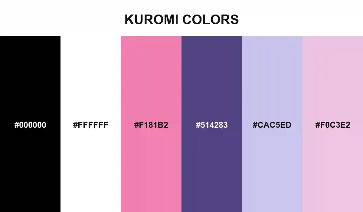
Kuromi Colors
A palette with two handwritings: one bold enough to challenge the page, the other soft enough to admit that rebellion and romance can occupy the same character.
Kuromi Colors begins with a public outline drawn in black: pointed ears, a jester hood, and just enough visual noise to make sweetness look suspicious.
Pink changes the reading. It appears as a skull, a blush, or a note written too honestly in a diary. Purple gives the mischief more depth, while lavender softens the space around it without erasing the attitude.
That double register makes the palette useful. Let black handle structure, white protect clarity, and pink trigger personality. Purple can carry headers or packaging panels; the two pastels work best for quieter surfaces where the character's romantic side gets room to show.