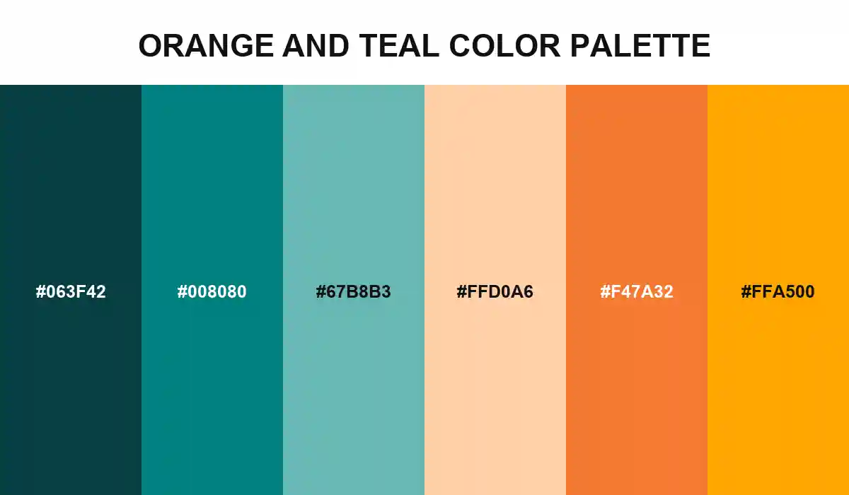
Orange and Teal Color Palette is built around unequal roles. Shadow Teal establishes depth, CSS Teal anchors the cool family, and Tide Tint opens enough space for the background to feel atmospheric rather than heavy.
Warm Highlight crosses the temperature boundary before Burnished Orange and CSS Orange take over as points of light. The transition prevents the complementary pair from behaving like two unrelated three-color palettes pushed together.
Adobe's familiar grading approach places teal in shadows and orange or yellow in highlights. Apply the same hierarchy in interfaces, posters, or packaging: let teal own most of the field, then use orange to explain priority. Test foreground contrast separately on every swatch.