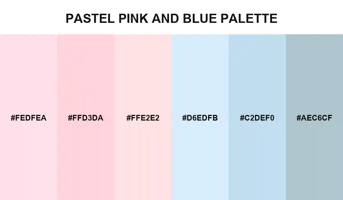
Pastel Pink and Blue Palette

Six low-saturation colors move from warm reflected light into a cool open-sky finish, giving calm layouts separation without breaking their visual flow.
#FEDFEA
#FFD3DA
#FFE2E2
#D6EDFB
#C2DEF0
No items found.

Pastel Pink and Blue Palette behaves like a change in daylight. The first three swatches hold a rosy warmth, while the blue half gradually introduces air and distance.

The combination stays quiet without becoming visually flat. Small temperature shifts separate cards, sections, and packaging surfaces while preserving one continuous atmosphere.

Use the warmer shades for welcoming moments and the cooler tones for structure, whitespace, or secondary panels. Dark charcoal text will keep interfaces readable against every color in the set.

Pastel Pink and Blue Palette
Build with ❤️ Anything