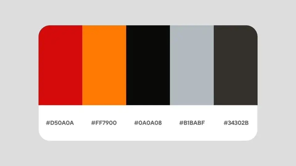
Tampa Bay Buccaneers Colors
Tampa Bay’s red and Bay Orange are the warm colors. Pewter adds a brown cast to the darker swatches.
Pewter can suggest a silvery metal, but this sample is a dark brown-gray. The brighter gray has the opposite cast, with slightly more blue than red. A label that says gray alone would hide both the temperature difference and the large step in lightness.
| Color | Screen HEX | RGB | Pantone reference | CMYK reference |
|---|---|---|---|---|
| Red | #D50A0A | 213, 10, 10 | PMS 186 C | (2, 100, 85, 6) |
| Bay Orange | #FF7900 | 255, 121, 0 | PMS 151 C | (0, 60, 100, 0) |
| Black | #0A0A08 | 10, 10, 8 | PMS BLACK 7 C | (38, 35, 33, 92) |
| Grey | #B1BABF | 177, 186, 191 | PMS 5517 C | (31, 20, 20, 0) |
| Pewter | #34302B | 52, 48, 43 | PMS 440 C | (65, 62, 67, 62) |