Light sky-blue tones lend a sense of freshness to the cover, whilst midnight blue offers a more mysterious and literary look.
Electric blue, on the other hand, works well for modern, energetic and slightly more experimental designs.
The effect of blue is often shaped by the colours used alongside it. Cream and off-white tones give blue a more elegant look.
Gold details make dark blues appear more premium.
Colours such as orange, coral or warm pink, on the other hand, create contrast, making the cover stand out more easily on the shelf. Blue tones combined with grey and black create a more serious look, whilst soft beige tones make the design feel warmer.
Whilst the cover sets the first impression of a book, organising the content is just as important as the visual design.
Tools such as OnlyDoc can be particularly useful when working on long PDF files, research papers or various drafts, as they allow you to identify the main points of the text more quickly. Once the direction of the content is clear, choosing the right cover style becomes much easier.
When designing a book cover, simply choosing a nice colour is not enough.
The book’s genre, the length of the title, the typeface and the visual density must all be taken into account.
In the examples below, you can see how different shades of blue can be used in novels, poetry, essays and non-fiction books.
The Quiet Horizon
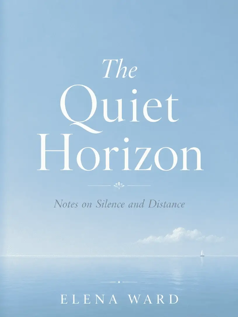
At first glance, this cover appears quite simple, yet it demonstrates just how powerful the use of negative space can be.
The subtle horizon line and light tones allow the design to create an emotional atmosphere without the need for a large visual element.
This approach works particularly well for books with a tranquil narrative.
For short stories, personal essays or texts centred on inner journeys, it is sometimes the best choice for the cover not to be too overpowering. Here, the blue does not overshadow the book; it merely sets its rhythm.
Midnight Letters
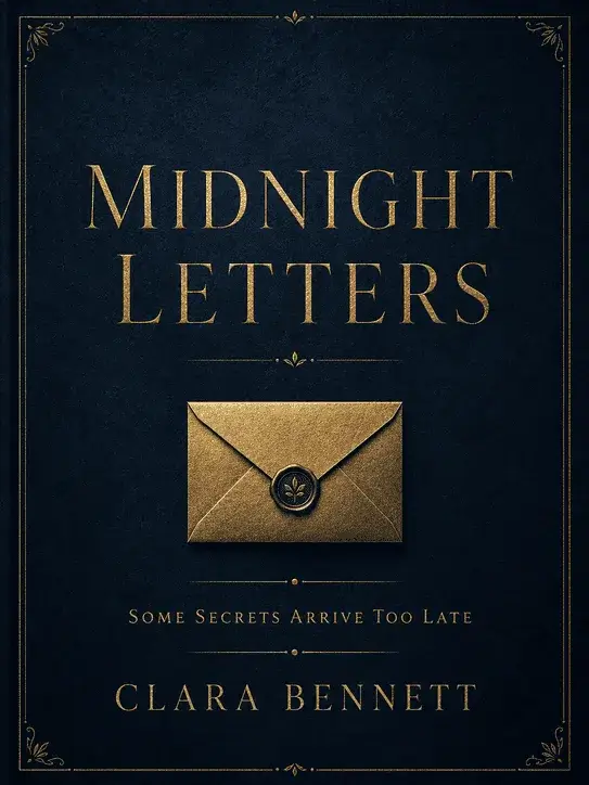
Some book covers leave the reader with a sense of curiosity rather than giving away the content outright.
This design does exactly that. The small gold symbol in the centre of the dark background encourages the reader to take a closer look at the cover without knowing the whole story.
Although the combination of navy blue and gold is a classic choice, it doesn’t feel heavy-handed here.
The simple typography prevents the cover from veering into an old-fashioned aesthetic. It could serve as a strong reference for mystery novels or stories connected to the past.
Cobalt City

It’s hard to find any sense of calm on this cover. The large typeface, sharp lines and vibrant cobalt hue bring the pace of the city to the design.
Even before the book is opened, you can sense a fast-paced, noisy and bustling world.
This visual language could be effective in stories centred on modern relationships, nightlife or the creative industries.
Particularly in young adult novels and contemporary fiction projects, a cover with an energetic look can help the book reach the right reader more quickly.
Blue Garden

Botanical illustrations are usually associated with shades of green.
This design, however, tweaks the traditional palette slightly by featuring blue flowers and navy-blue leaves. The result is both familiar and original.
The cream background helps the blue appear softer. A cover of this style could look quite elegant on poetry books or short story collections.
There are visual details, but the design never feels overly ornate.
Electric Blue
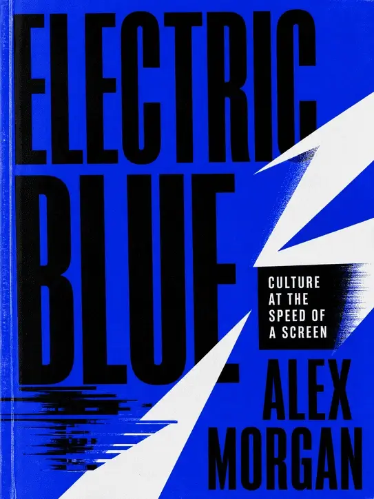
For a book cover that doesn’t want to blend into the background on the shelf, electric blue is a highly effective starting point.
In this example, the title, graphic elements and asymmetrical layout work together. No detail is merely decorative; they all serve to heighten the design’s energy.
For books on technology, digital culture or music, a classic look may not always yield the right result.
A cover like this creates a more contemporary, bolder and younger feel. The black details, in particular, make the bright blue appear even more striking.
The Sapphire Archive
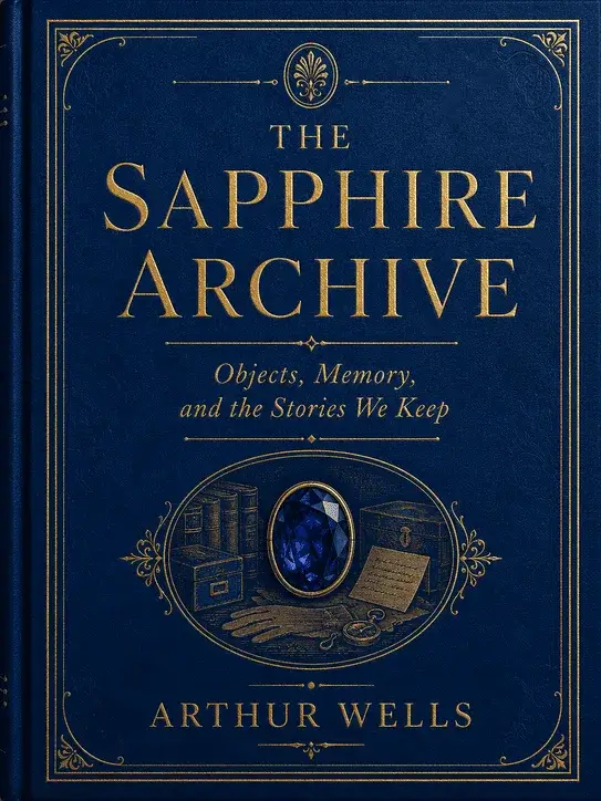
The delicate gold lines and sapphire-blue background give the cover an almost collector’s-item feel. Although the design does not contain too many elements, every detail has been placed with precision.
This ensures that the cover does not look hastily put together, but rather carefully considered.
When dealing with subjects such as history, art or architecture, it is important for the cover to inspire confidence.
This example demonstrates that a complex structure is not necessary to appear serious. A few well-chosen touches are sufficient.
Coastal Notes
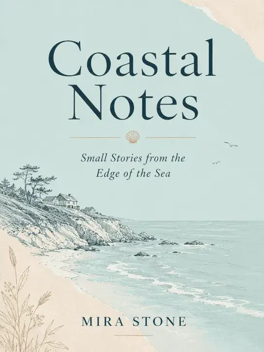
The overriding feeling conveyed by this book cover is one of comfort. The sea-foam blue and warm beige tones give the design the feel of a notebook left over from a holiday.
The small coastal illustration reinforces the theme without drawing undue attention to itself.
This approach is particularly well-suited to travel writing, memoirs or personal diaries. Not every cover needs to be dramatic or bold.
Sometimes, giving the reader a more approachable feel can become the design’s greatest strength.
The Shape of Distance

A single orange circle transforms the entire energy of this cover.
Whilst the dark blue background appears quite calm and balanced, the warm tone in the centre instantly makes the design more eye-catching.
A fine example of creating a striking cover without the need for excessive elements.
When blue and orange are used together, the result is modern, graphic and memorable.
This kind of minimalism could work particularly well for contemporary experiments or literary novels.
Powder Blue Stories
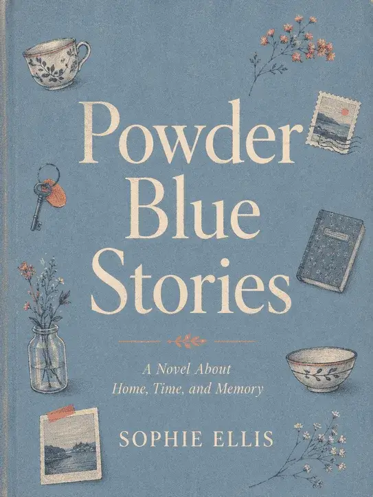
The strongest aspect of this design is its authentic feel.
The powder-blue background, small illustrations of everyday life and subtle coral details lend the cover a warm personality. It looks carefully crafted without trying too hard to appear overly professional.
A visual language like this might be more appropriate for topics such as family relationships, childhood memories or coming-of-age stories.
Rather than trying to impress the reader from a distance, it draws them in. This also complements the cover’s emotional tone well.
What should you bear in mind when designing a blue book cover?
As blue tones encompass a very wide range of emotions, the first step should be to choose the right shade.
Light blue appears calmer and more approachable. Navy and midnight blue lend the cover a more serious, sombre or literary feel.
Vibrant shades such as cobalt and electric blue, on the other hand, are more youthful, contemporary and suitable for graphic designs.
Complementary colours also determine the direction of the design. Cream and off-white tones make a blue cover appear more elegant.
Gold details work well with dark blues and create a premium look. Warm colours such as orange or coral, on the other hand, create a strong contrast with blue, making the cover more eye-catching.
When selecting typography, the book’s genre must be taken into account. In literary novels, serif fonts convey a more classic and refined feel, whilst in contemporary non-fiction books, sans-serif typefaces can be more impactful.
Large headlines create a more graphic effect; small, understated headlines, on the other hand, highlight the cover’s atmosphere.