Primary and supporting colors
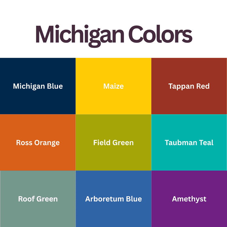
The university’s published palette lists Maize and Michigan Blue as primary colors, with the other shades below in its secondary palette. These ten HEX values match that reference.
Michigan Blue — #00274C
Michigan Blue is the darker half of the university’s primary pair. Its deep navy gives Maize lettering a strong light–dark separation.
Maize — #FFCB05
Maize text on Michigan Blue has a calculated sRGB contrast ratio of about 9.89:1. This figure applies to the exact HEX pair above.
Tappan Red — #9A3324
Tappan Red is a dark, earthy red in the supporting palette. A small red section marker can add variety without replacing Maize and Blue as the main identity.
Ross Orange — #D86018
Brighter than Tappan Red, this orange can mark a highlighted figure in a presentation.
Wave Field Green — #A5A508
Wave Field Green has a pronounced yellow cast. Beside Maize, it gives a smaller change in lightness than Michigan Blue does, so label chart segments directly rather than relying on the two fills alone.
Taubman Teal — #00B2A9
The teal color adds a blue-green direction to the supporting set. It is noticeably more saturated than Rackham Roof Green below.
Rackham Roof Green — #75988D
This gray-toned soft green gives photographs a quieter surround than a bright teal panel would.
Arboretum Blue — #2F65A7
Arboretum Blue sits between the deep primary blue and the lighter supporting colors. It can carry a secondary illustration while the darker blue anchors the page.
A2 Amethyst — #702082
A2 Amethyst introduces a redder purple than Matthaei Violet, with a strong visual contrast against a Maize field.
Matthaei Violet — #575294
Matthaei Violet is the bluer, more muted of the two purples.
How Maize and Blue became the school colors
In 1867, a student committee chose “azure blue and maize.” The exact shades varied: a later committee selected ribbon samples in 1912 to settle the differences. The Bentley Historical Library’s account traces that history.
Related Palettes: University of Utah Colors, Temple University Colors