CSS Examples
Ceramic Glaze Effect
.ceramic-glaze {
    background: linear-gradient(
        145deg,
        #ACE1AF 0%,
        #c7ebc8 50%,
        #e2f6e3 100%
    );
    border-radius: 12px;
    box-shadow:
        inset 0 2px 10px rgba(255,255,255,0.5),
        inset 0 -2px 10px rgba(0,0,0,0.1);
    opacity: 0.9;
}
Celadon Pattern
.celadon-pattern {
    background-color: #ACE1AF;
    background-image:
        radial-gradient(
            circle at 1px 1px,
            rgba(255,255,255,0.15) 2px,
            transparent 0
        );
    background-size: 20px 20px;
    box-shadow: inset 0 0 30px rgba(67,121,48,0.2);
}
Porcelain Button
.porcelain-button {
    background: linear-gradient(to bottom, #c7ebc8, #ACE1AF);
    color: #255629;
    border: none;
    padding: 10px 20px;
    border-radius: 8px;
    box-shadow:
        0 2px 4px rgba(0,0,0,0.1),
        inset 0 1px 2px rgba(255,255,255,0.5);
    transition: transform 0.2s ease;
}
Jade Ripple Animation
@keyframes jadeRipple {
    0% { transform: scale(0.95); opacity: 0.7; }
    50% { transform: scale(1.05); opacity: 0.9; }
    100% { transform: scale(0.95); opacity: 0.7; }
}
.jade-element {
    background: radial-gradient(#ACE1AF, #67c16d);
    animation: jadeRipple 4s infinite ease-in-out;
    border-radius: 50%;
}
Ancient Border
.ancient-border {
    border: 2px solid #ACE1AF;
    border-image: linear-gradient(
        45deg,
        #67c16d,
        #ACE1AF,
        #c7ebc8
    ) 1;
    padding: 20px;
    background:
        linear-gradient(rgba(172,225,175,0.1), rgba(172,225,175,0.1)),
        repeating-linear-gradient(
            45deg,
            transparent,
            transparent 10px,
            rgba(172,225,175,0.05) 10px,
            rgba(172,225,175,0.05) 20px
        );
}
Celadon Text
.celadon-text {
    color: #ACE1AF;
    text-shadow:
        1px 1px 1px rgba(103,193,109,0.3),
        -1px -1px 1px rgba(255,255,255,0.5);
    letter-spacing: 1px;
    background: linear-gradient(45deg, #67c16d, #ACE1AF);
    -webkit-background-clip: text;
    -webkit-text-fill-color: transparent;
}
Pottery Card
.pottery-card {
    background: #ACE1AF;
    background-image:
        radial-gradient(
            circle at center,
            rgba(255,255,255,0.2),
            transparent 80%
        );
    border-radius: 15px;
    box-shadow:
        0 5px 15px rgba(172,225,175,0.3),
        inset 0 -2px 5px rgba(103,193,109,0.2);
    border: 1px solid rgba(255,255,255,0.3);
}
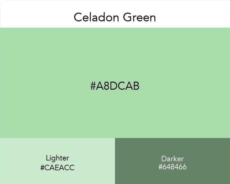
About Celadon Green
Celadon is a pale blue green named after a type of ceramic that originated in China. Celadon is both a color and a glaze that was developed and refined during the 10th and 11th centuries. Celadon, the color, has undertones of gray and jade.
Characteristics
Celadon is muted and understated and combines the tranquility and serenity of blue with the sense of growth and renewal of green. It looks good with other shades of greens and blues and anchors on neutrals and blushes.
Color Information
In a RGB color space, Celadon Green (#ACE1AF) is composed of:
- 67.5% red
- 88.2% green
- 68.6% blue
Color Space Values
In the CMYK color space, Celadon Green is composed of:
- 24% cyan
- 0% magenta
- 22% yellow
- 12% black
Usage in Design
Celadon Green is particularly effective in:
- Interior design for creating calm, serene spaces
- Ceramic and pottery designs
- Vintage-inspired designs
- Natural and organic branding
- Wellness and spa-related materials