Cherry Pink

No items found.
rgb(255,183,197)
#ffb7c5

The Cherry Pink colour's popularity is rising these days. Instead of investigating that issue, we can follow the trend and use it for our next design gigs. 


Keeping fresh your design with popular colour is a good idea. So your customers never think your company is not going out of business. 


And also, everyone likes cherries.

Best Combination

#ffb7c5
Cherry Pink
Cherry Pink Color Coe

Here are the shades of pink colour list. 

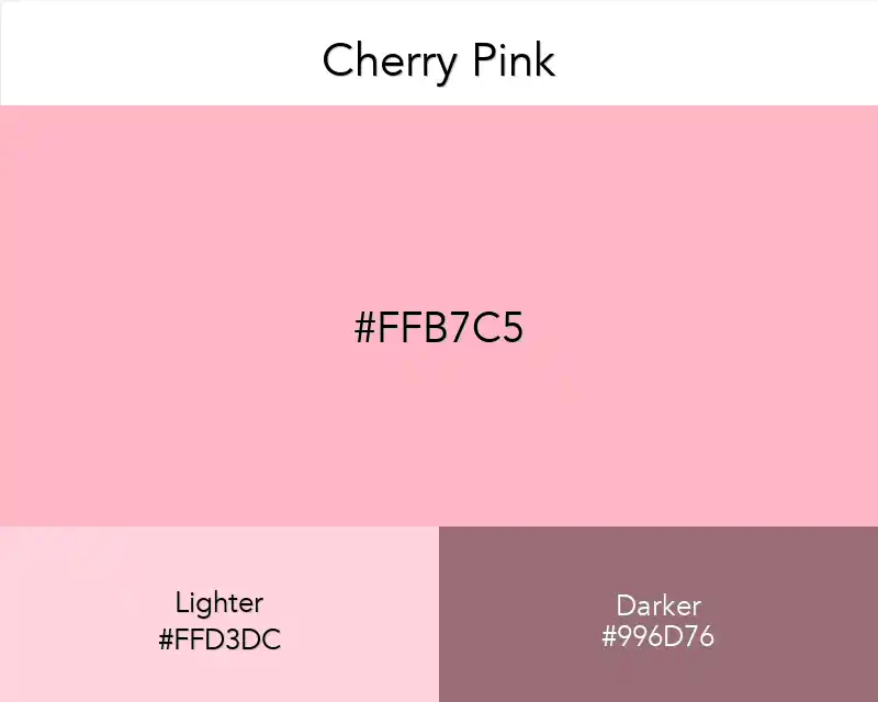
The hex of Cherry pink colour is #ffb7c5 (also called Cherry blossom pink) consists of 100 per cent red, 71.8% green and 77.3% blue. Whereas at a CMYK colour space, it consists of 0%cyan, 28.2percent magenta, 22.7% yellow and 0% black.

The hexadecimal colour code #edb9bb is a mild colour of pink-red. In the RGB colour model #edb9bb is constituted of 92.94% crimson, 72.55% green and 73.33% blue. 

Cherry pink colour is an essential colour in Western culture. In the spring, the Japanese men and women gather to see the cherry blossoms bloom throughout the Hanami festival. This tradition has spread into the United States of America with the establishment of the Cherry Blossom Festival in Washington, D.C.

Cherry Pink Color in Product Design

Cherry pink is a sweet combination of strength, trust, and determination. An intriguing color that might be attractive to both men and women alike, it portraits an honest person. 

If one were to mention cherry pink color in product design, right away you would think of something that is twofold. 

That the product in question is not only unique but possesses a complex character as well.

Although red, orange, and yellow may be the most prominent color hues used in product design, its appeal and popularity know no season. 

This publication aims to investigate cherry pink’s usage in branding and product design from a historical context, as well as paint a more recent portrait of its applied use.

Cherry Pink Color in Advertising

It is a mature shade of pink with a sweet and fun attitude. 

This warm yet feminine color brings to mind cheerfulness, fun and romance. 

It is perceived as being feminine without being too bright or loud. 

It is viewed by many as a friendly color

On the negative side, it denotes fragility, so avoid using in marketing or advertising campaigns targeted towards males.

Cherry pink is a very soothing color, which can be found in nature, as well as the human body and our daily surroundings. 

People, who are using cherry pink color, find this color being extremely attractive, full with high energy levels, more aggressive than other colors. 

Using cherry pink helps to connect your brand with positive feelings like joy, pleasure, love and affection. It blends perfectly with other colors of the spectrum and creates a romantic feeling.

Cherry Pink in Interior Design

You can use cherry pink for your dining room, bedroom, living room and even bathroom. Due to its vibrant color, a lot of accessories are also used along with it. 

While designing bedrooms if you include many colors in cherry pink then the face of your bedroom will definitely become beautiful and attractive.

You must know that cherry pink is mostly recommended for baby rooms because baby reacts very well to bright colors.It will be like a magnet which attracts children towards it and they keep homing into their rooms again and again.

Copied👏
Made ın webflow