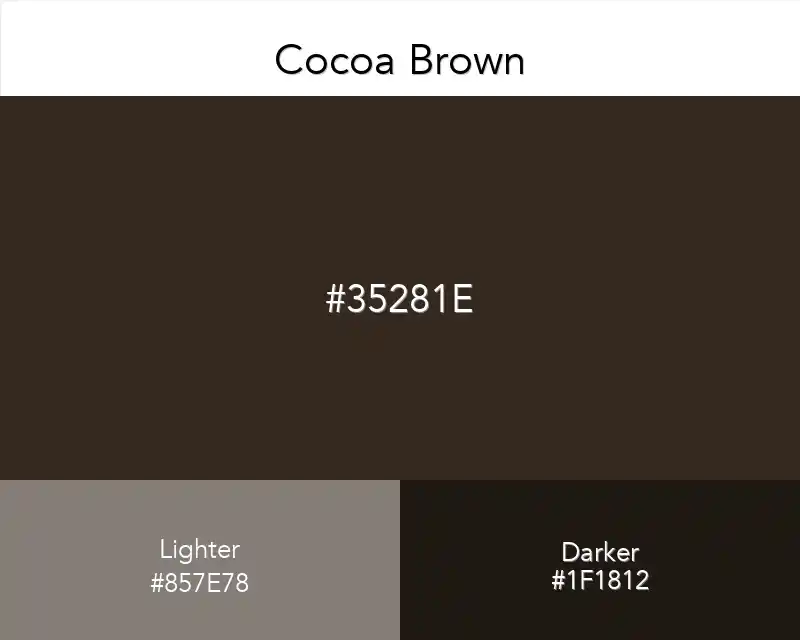
Cocoa Brown

No items found.
rgb(53,40,30)
#35281E

Cocoa brown, as you can tell by its name, is similar to the color of cocoa. It already has this name because it looks like this color. Simple.

Best Combination

#35281E
Cocoa Brown
Cocoa Brown

Cocoa brown color is considered to be the right balance of pink and brown that pleases almost everyone. It is an excellent choice for women who have had some experience with makeup, while it is simple enough for the novice.

It has a unique and deep shade that adds depth and dimension to your design. It's an excellent choice for adding depth and character to both light and dark designs.

For me it enhances my mood, but I listen to other people who say they hate cocoa brown.

Chocolate brown is a darker shade of brown, and is basically just brown with a slight red tone to it, so it's slightly warmer than e.g. Adobe RGB.

Brown is one of the most versatile colors that can be used for decorating. 

Since it is also a neutral color, you can pair any paint color with it. Because of these reasons, brown is one of the most popular colors for people who are looking to repaint their homes.

Cocoa Brown in Interior Design

That color is not just a flat and lifeless color, but it has the ability to produce a warm and cozy sensation. The color of berries and dark chocolate can be one of the most beautiful and shiny colors with a warm and rich texture. 

Brown accessories provide amazing contrast for more bright furniture in the environment. This brown is rather suitable for those who want to bring uniqueness into their living room interior design.

 If you can imagine, one of the most popular ways to use this color is in the interior design of the home. To accomplish this color scheme, you would first start with a cocoa tone colored wall and then contrast it by using some white and beige. 

You can go on and even complete the room by adding different colors like gold and bronze for some added elegance.

This scheme has subtle tones that are predominantly neutral to create a relaxing, calming atmosphere. The scheme’s 2 colors are so finely balanced, they create a harmonious palette or scheme well suited for living rooms, bedrooms, dens or family rooms.

Copied👏
Made ın webflow