Gainsboro is ideal for borders, large page surfaces, and quiet layers beneath content. It gives darker ink colors clarity and lets muted pastels remain visible.
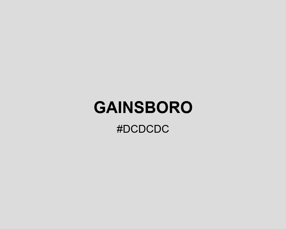
Gainsboro
Tone scale
Tints
Color Conversation
Color harmony
Dark text
12.22:1
White text
1.37:1
A bright gray that creates separation without looking cold.
Gainsboro is ideal for borders, large page surfaces, and quiet layers beneath content. It gives darker ink colors clarity and lets muted pastels remain visible.